Content from What is multiple testing
Last updated on 2025-01-14 | Edit this page
Overview
Questions
- What is multiple testing?
- How are false-positives related to the significance level?
Objectives
- Define multiple testing
What is multiple testing
Let’s approach this question through an example and a recap on hyptothesis testing: Suppose the prevalence of a disease in the general population is 4%. In this population, lives a group of individuals who have all been exposed to air pollution. Concerned about their health, we decide to embark on a quest to uncover whether being exposed to air pollution influenced the risk of contracting this disease.
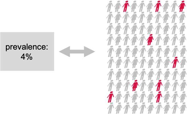
Setting the null and alternative hypothesis
We would like to conduct a hypothesis test to find out whether the prevalence in the test group differs from the known 4%. For this, we define the null and the alternative hypothesis.
Null Hypothesis (\(H_0\))
The prevalence of the disease within test group exposed to air pollution is the same as the known prevalence in the general population (4%). This means that the proportion of individuals exposed to air pollution in the test group who have the disease is also 4%.
Alternative Hypothesis (\(H_1\))
The prevalence of the disease within the test group exposed to air pollution is different from the known prevalence in the general population. This means that the proportion of individuals exposed to air pollution in the test group who have the disease is either higher or lower than 4%.
Data collection and testing
We assemble a group of 100 individuals who have been exposed to air pollution (test group) from the population and each individual is carefully examined, checking for any signs of the disease. Out of the 100 individuals, we discover that 9 of them were indeed suffering from the disease, so the observed proportion is 9%. This is different from 4%, but we are not satisfied with just this knowledge, since the observed difference in proportions could be due to chance. We want to know if this prevalence of the disease within the group exposed to air pollution was significantly different from the population’s average, meaning that it’s very unlikely to observe this difference just by chance. So, we decide to perform binomial test (please refer back to binomial test). With this test, we compare the observed prevalence within our group that has been exposed to air pollution to the known prevalence in the entire population.
We set our significance level beforehand, typically at \(\alpha=0.05\), to determine whether the results are statistically significant.
Here, we run the test in R:
R
#For known parameters (n=100, p=0.04), we calculates the the chances of getting the 9 individuals that indeed suffered from the disease.
n = 100 # number of test persons
p = 0.04 # Known prevalence of the disease in the general population
binom.test(x=9, n=n, p=p)
OUTPUT
	Exact binomial test

data:  9 and n
number of successes = 9, number of trials = 100, p-value = 0.01899
alternative hypothesis: true probability of success is not equal to 0.04
95 percent confidence interval:
 0.0419836 0.1639823
sample estimates:
probability of success
                  0.09
The obtained p-value is the probability of seeing an outcome as extreme as the observed one, assuming that the null hypothesis is true. If this probability is sufficiently low (below our chosen significance level), we reject the null hypothesis in favor of the alternative hypothesis.
The binomial test result (~0.02) reveals that the prevalence of the disease among the individuals exposed to air pollution is indeed significantly different from that of the population.
What if we did many similar experiments?
Conducting a single study might not provide conclusive evidence due to various factors such as sample variability, random chance, and other unknown influences.
We decide to investigate the potential impact of air pollution on disease prevalence in 200 various locations. We want to assess whether there is a significant difference in disease rates between groups exposed to air pollution and the average for the whole population.
Let’s now assume that in our scenario, there is no association between air pollution and the disease in any of the tested regions.
Vote
What kind of results would you expect from running a series of tests in 200 regions?
- no significant test
- all tests significant
- some tests significant
To find out, we can simulate the scenario where we conduct 200 tests, each with a 5% chance (\(\alpha = 0.05\)) of producing a significant result (i.e., a p-value less than 0.05) even when the null hypothesis is true.
Our null hypothesis in each location is that there is no real difference in disease rates between the groups exposed to air pollution and the average for the whole population.

To do this, we write a script in R, which simulates study results when the prevalence in the test group is 4% (null hypothesis is true). We run these experiments to see what would happen if we kept doing tests even when there was not actually any difference.
R
library(tidyverse)
set.seed(33)

# define lower and upper bounds: beyond these bounds, results are significant
lower <- qbinom(0.025, size=100, prob=0.04)
upper <- qbinom(0.975, size=100, prob=0.04)

# Generate simulated data
data <- data.frame(
  count = rbinom(n=200, size=100, prob=0.04)
)

# add significance
data <- data %>%
  mutate(significant = ifelse(
    (count < lower | count > upper), 1, 0))

data %>%
  ggplot(aes(x=count, fill=factor(significant)))+
  geom_histogram(binwidth=1,color="black")+
   scale_fill_discrete(type=c("darkslateblue","lightblue"))+
  guides(fill = "none")
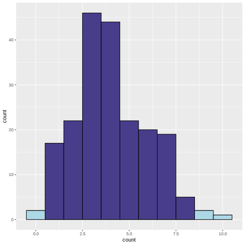 What does the above code do:
- Determine lower and upper bounds for significance: A two-tailed
binomial test calls counts significant that are either below the 2.5
percentile, or above the 97.5 percentile of the binomial distribution.
We determine these bounds using
qbinom. This gives us the bounds that contain 95% of the data under the null hypothesis. - Determine significance: We then classify a group as
significantif the observed number of patients falls below the 2.5th percentile or above the 97.5th percentile of the binomial distribution. - Plotting: We plot a histogram of the counts, and use the argument
fillto color by the variablesignificant. We usescale_fill_discreteto manually determine the colors for significant and non-significant.
In the resulting histogram, we find that even in a world where there was no true difference in disease prevalence, about 5% of our simulated experiments yielded statistically significant results purely by chance (the light blue bars).
It is important to note that the significance level (α) that we choose for each individual test directly impacts the rate of false positives. This is the Comparison-Wise Error Rate (CWER), the probability of making a Type I error (false positive) in a single hypothesis test. In our example, we have set α=0.05 for each individual test, which means we are willing to accept a 5% chance of making a false positive error for each test, and this means that for 100 tests, we expect about 5 false positives.
By running this simulation multiple times, we can observe how often we get false positive results when there should be none. This helps us understand the likelihood of obtaining a significant result purely by chance, even if there is no true effect or difference.
Challenge
- If we set α=0.01 for each individual test, what is the number of false positives we should expect for 100 tests?
We expect 1 false positive on average.
Summary
Multiple testing refers to the practice of conducting numerous hypothesis tests simultaneously or repeatedly on the same data set. It is typically motivated by the desire to explore different aspects of the data or to investigate multiple hypotheses. Researchers employ multiple tests to examine various relationships, comparisons, or associations within their data set, such as comparing means, proportions, correlations, or other statistical analyses that involve hypothesis testing.
When we increase the number of conducted tests, this also increases the number of false positives to be expected among the tests where the null hypothesis is true. The fraction of expected false positives among the cases with true null is equal to the significance level \(\alpha\) that we apply for each individual test.
Content from Types of errors and error rates
Last updated on 2025-01-14 | Edit this page
Overview
Questions
- What are false positives and false negatives and how do they manifest in a confusion matrix?
- What are some of real examples where false positives and false negatives have different implications and consequences?
- What are type I error rates?
Objectives
- Understand the concept of false positives and false negatives and how they are represented in a confusion matrix
- Analyse and discuss scenarios where false positives and false negatives pose distinct challenges and implications
- Highlight situations where minimizing each type of error is crucial
Types of errors
In hypothesis testing, the evaluation of statistical significance involves making decisions based on sampled data. However, these decisions are not without errors. In this tutorial, we will explore the concept of errors in hypothesis testing (Type I and Type II errors), and their implications.
Type I Error
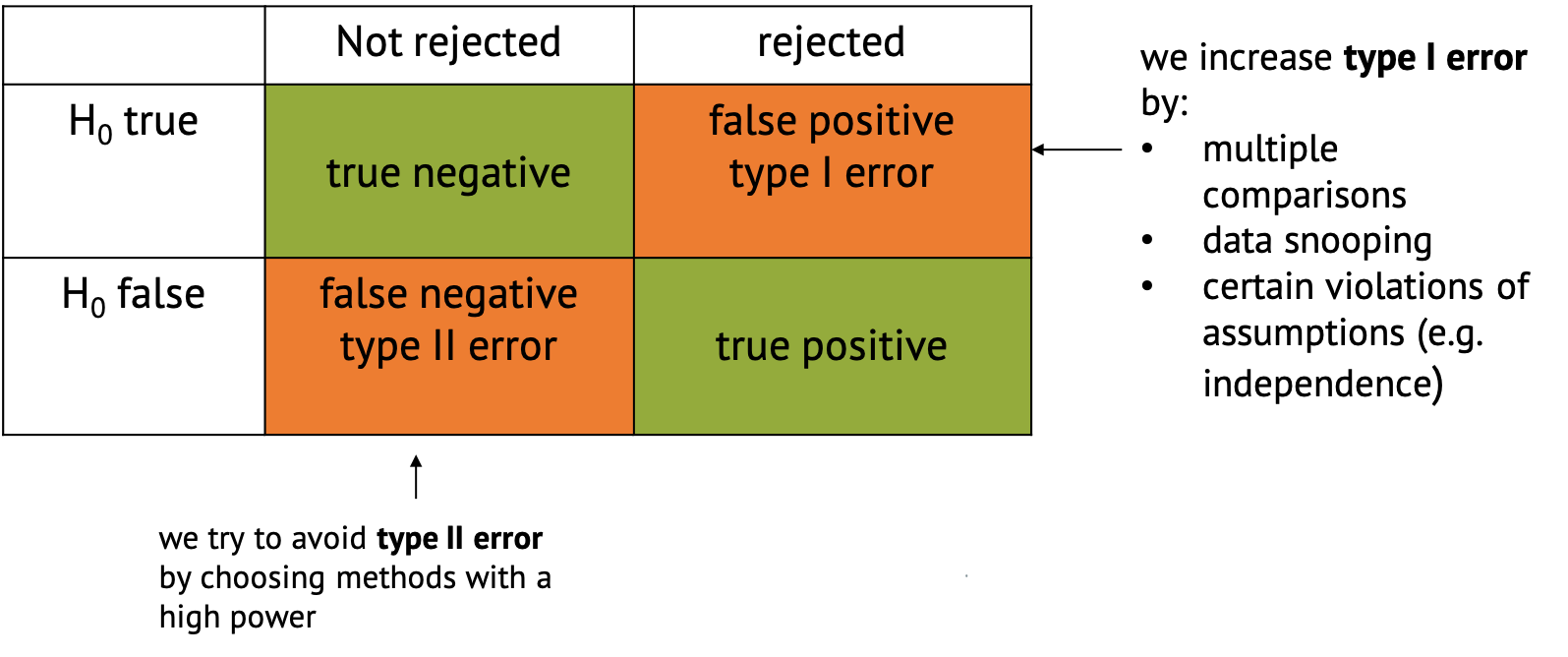
A type I error occurs when we reject a null hypothesis that is actually true. For example, in our previous example where we conducted many similar experiments, we experienced type I error by concluding that exposure to air pollution has an effect on disease prevalence (rejecting the null hypothesis) when it actually has no effect. Type I errors represent false positives and can lead to incorrect conclusions, potentially resulting in wasted resources or misguided decisions.
Type II Error
A type II error occurs when we fail to reject a null hypothesis that is actually false. For example, when we fail to conclude that exposure to air pollution has an effect on disease prevalence (failing to reject the null hypothesis) when it actually has a positive effect. Type II errors represent false negatives and can result in missed opportunities or overlooking significant effects.
Type II errors often occur when in settings with low statistical power is chosen. Statistical power refers to the probability of correctly rejecting the null hypothesis when it is indeed false. In simpler terms, it measures the likelihood of detecting a true effect or difference if it exists. Low power can be due to properties of the sample, such as insufficient number of data points, or high variance. But there are also tests that are better at detecting an effect than others in certain settings.
Confusion Matrix
In the context of hypothesis testing, we can conceptualize Type I and Type II errors using a confusion matrix. The confusion matrix represents the outcomes of hypothesis testing as True Positives (correctly rejecting H0), False Positives (incorrectly rejecting H0), True Negatives (correctly failing to reject H0), and False Negatives (incorrectly failing to reject H0).
Implications of type I and type II errors
In hypothesis testing, the occurrence of Type I and Type II errors can have different implications depending on the context of the problem being addressed. It is crucial to understand which errors are problematic in which situation to be able to make informed decisions and draw accurate conclusions from statistical analyses.
Type I errors are particularly problematic in situations where the cost or consequences of incorrectly rejecting a true null hypothesis are high. Again, if we refer back to our example, if we incorrectly conclude that there is a significant difference in disease rates between the test groups exposed to air pollution and the average for the whole population when, in fact, there is no such difference, it could lead to misguided policies or interventions targeting air pollution reduction. For instance, authorities might implement costly environmental regulations or public health measures based on erroneous conclusions. In this case, the consequences include misallocation of resources, leading to unnecessary financial burdens or societal disruptions. Moreover, public trust in scientific findings and policy decisions may be eroded if false positives lead to ineffective or burdensome interventions.
Type II errors are problematic when failing to detect a significant effect has substantial consequences. If we fail to detect a significant difference in disease rates between the test group and the population average when there actually is a difference due to air pollution exposure, it could result in overlooking a serious public health concern. In this case, individuals living in polluted areas may continue to suffer adverse health effects without receiving appropriate attention or interventions. The consequences include increased morbidity and mortality rates among populations exposed to high levels of air pollution. Additionally, delayed or inadequate response to environmental health risks may exacerbate inequalities in health outcomes.
An example of cancer screening
Cancer screening exemplifies a medical testing paradox, where the interpretation of test results can be influenced by factors such as disease prevalence, test sensitivity, and specificity.
Let us say that in a sample of 1000 women, 1% (10) have cancer, while the remaining 99% (990) do not have cancer. This gives us the prevalence of a disease. However, after testing, the test results show that out of the 10 women with cancer, 9 receive a true positive result (correctly identified as positive), and 1 receives a false negative result (incorrectly identified as negative). False negatives can delay the diagnosis and treatment of cancer, allowing the disease to progress unchecked and potentially reducing the effectiveness of treatment options. This can result in poorer outcomes and decreased survival rates for patients. In addition, out of the 990 women without cancer, 89 receive false positive results (incorrectly identified as positive), and 901 receive true negative results (correctly identified as negative). False positive can lead to unnecessary follow-up tests, procedures, and treatments for individuals who do not have cancer. It can cause anxiety, physical discomfort, and financial burden for patients, as well as strain on healthcare resources.
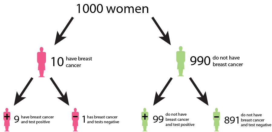
We could interpret that:
The probability that a woman who receives a positive result actually has cancer is ≈ 1/10 ( 9/ (9 + 89)). This is the positive predictive value (PPV) of the test.
The sensitivity of the test, which measures its ability to detect the presence of disease is 90% (9/10 * 100). This means that the false negative rate of the test is 10%.
The specificity of the test, which measures its ability to correctly identify individuals without the disease is ≈ 91% (901/990 * 100). Here, the false positive rate of the test is 9%.
While the test may have high accuracy in terms of sensitivity and specificity, the positive predictive value is relatively low due to the low prevalence of the disease in the population. This means that a positive result from the test does not strongly predict the presence of the disease in an individual. Similarly, false positives and false negatives can affect the negative predictive value of the test, which measures its ability to correctly identify individuals who do not have cancer. False negatives decrease the negative predictive value, while false positives increase it, potentially leading to misinterpretation of test results.
This example underscores the complexity of interpreting medical test results and emphasizes the need to consider factors such as disease prevalence, test sensitivity, and specificity in clinical decision-making. Increasing sensitivity may reduce false negatives but can also increase false positives, and vice versa. Thus, optimizing the trade-off between sensitivity and specificity is crucial to minimize false positives and false negatives while maximizing the accuracy of the screening test.
What do we learn?
In many real-world scenarios, there is a trade-off between Type I and Type II errors, and the appropriate balance depends on the specific goals and constraints of the problem. Reseachers may prioritize one over the other based on the severity of the consequences. For example, in cancer screenings, minimizing false negatives (Type II errors) is typically prioritized to avoid missing potential cases of cancer, even if it leads to an increase in false positives (Type I errors).
Effective evaluation of Type I and Type II errors necessitates a comprehensive consideration of the associated costs, risks, and ethical implications. This holistic approach enhances the validity and reliability of research findings by ensuring that decisions regarding hypothesis acceptance or rejection are informed not only by statistical significance but also by the potential real-world consequences of both false positives and false negatives. By carefully weighing these factors, researchers can make informed decisions that minimize the likelihood of erroneous conclusions while maximizing the practical relevance and ethical soundness of their findings.
Error rates
In the following chapters, we’ll see different methods that all aim to control for false positives in different settings.
The main distinction between these methods lies in the error rate that they control for. We’ll get to know three error rates:
- The comparison-wise error rate, where we use the p-value as we obtain it from each individual test (no correction).
- The family-wise error rate, where we like to avoid any false positives.
- The false-discovery rate, where we like to control the fraction of false positives within our hits.
We’ll see screening scenarios and multiple comparisons, and in both settings, different methods exist to control for the different error rates.
The plethora of methods can often be overwhelming. Therefore it’s good to keep in mind that in practice, most of the time the workflow can be broken down into three simple steps:
- Clearly define your research question, and describe
the testing scenario.
- Based on your research question, choose an appropriate error rate that you need to control for.
- Choose a method that controls for the selected error rate that applies for the testing scenario at hand.
Choosing the error rate is often a philosophical question. Before we dive into the details of the individual methods, let’s get an overview on the three error rates we’re considering. Which one to choose depends on how the hypothesis tests in your scenario are connected.
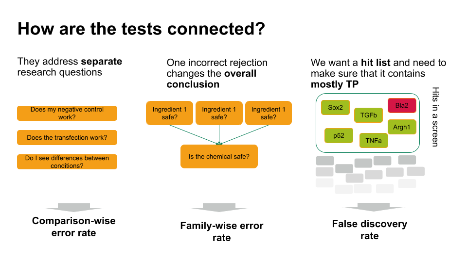
- If each of these tests answers a separate research question, you can apply the comparison-wise error rate, which means you don’t have to correct anything.
- Sometimes, one incorrect rejection changes the overall conclusion in your research setting. For example, if you decide on the safety of a chemical, which is a mixture of ingredients. You can ask for each ingredient whether it’s safe (null hypothesis: it’s safe). If all null hypohteses are true (all ingredients are safe), you’d like to conclude that the entire chemical is safe. However, if you falsely reject one individual null hypothesis, this will change the overall conclusion (you falsely call the chemical unsafe). Therefore, you’d like to control the probability of making any false rejections, which is called the family-wise error rate.
- In many scenarios, a few false positives won’t change the overall conclusion. For example, in biological screens, we aim for a hit list of candidate genes/proteins/substances that play a role in a process of interest. We can then further verify candidates, or identify pathways that are over-represented in the hits. For this, we can live with a few false positives, but we’d like to make sure that most of what we call a hit, actually is a hit. For such scenarios, we control for the false discovery rate: the percentage of false positives among the hits.
Content from Family-wise error rate
Last updated on 2025-01-14 | Edit this page
Overview
Questions
- What is the family-wise error rate (FWER), and why is it important in multiple testing scenarios?
- How does the Bonferroni procedure adjust p-values to control the FWER, and what are its limitations?
Objectives
- Understand the concept of the family-wise error rate (FWER) and its significance in multiple testing, including the implications of making multiple comparisons without controlling for FWER.
- Understand the Bonferroni procedure for adjusting p-values to maintain the FWER at a specified level, and recognize when alternative methods may be more appropriate or effective in controlling for multiple comparisons.
A Multi-Hypothesis Testing Framework
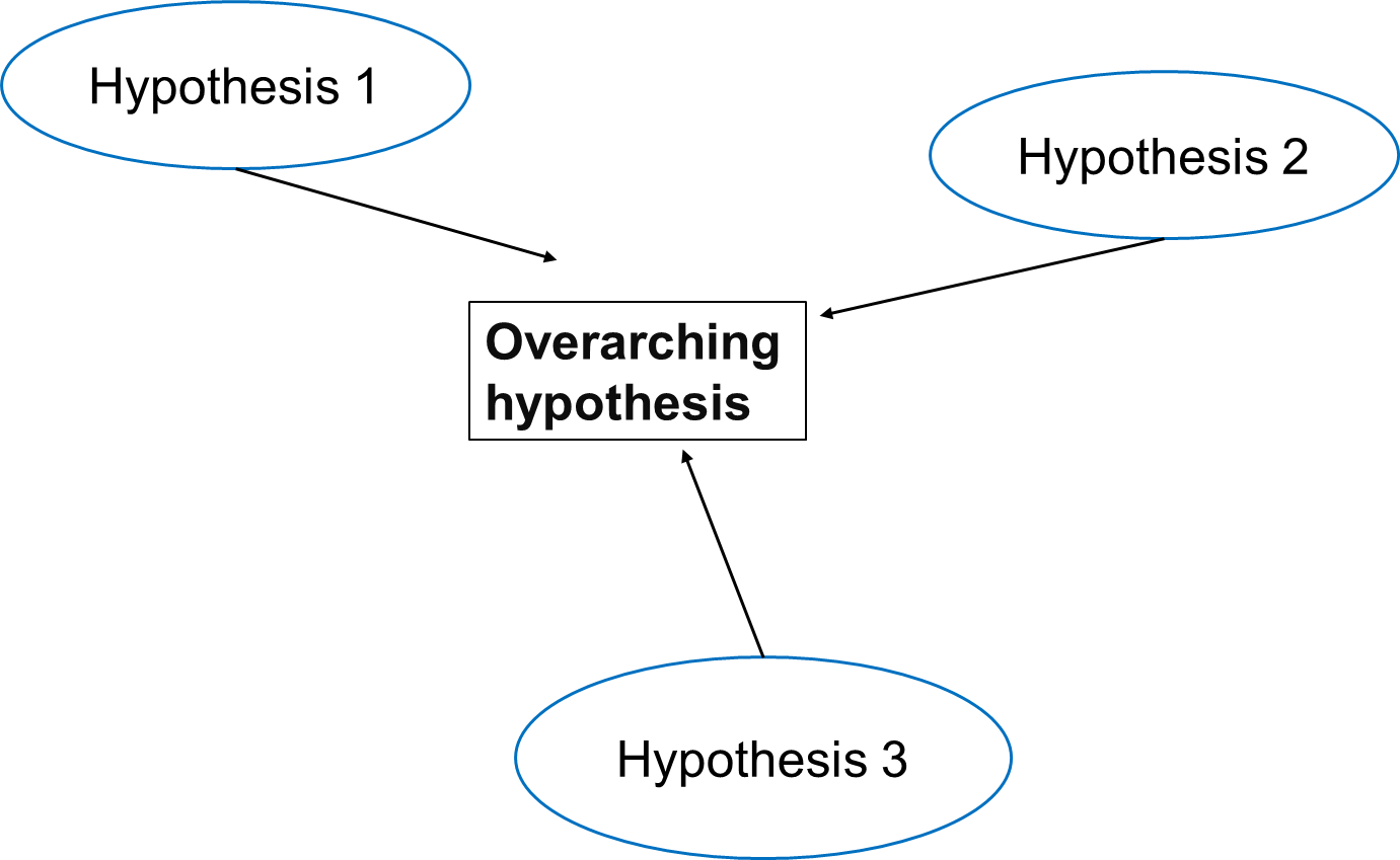
In multiple testing scenarios, we often have an overarching hypothesis that encompasses several individual hypotheses, each examining specific aspects or relationships within the data. This approach allows us to explore various facets of the research question comprehensively.
Going back to our study investigating the effects of air pollution on the prevalence of a disease, the overarching hypothesis could be formulated as follows:
Exposure to air pollution is associated with increased prevalence of the disease.
Under this overarching null hypothesis, several individual hypotheses can be formulated to examine different aspects of the relationship between air pollution exposure and disease prevalence. These individual hypotheses may focus on various pollutants, different health outcomes, or specific populations.
An example using three individual null hypotheses:
\(H_{0,1}\): Exposure to particulate matter is not associated with increased disease prevalence.
\(H_{0,2}\): Exposure to nitrogen dioxide is not associated with increased disease prevalence.
\(H_{0,3}\): Long-term exposure to ozone (O3) is not associated with an increased prevalence of the disease.
The three null hypotheses can be combined to the following overall null hypothesis:
\(H_{0}\): None of the air pollutants is associated with an increased prevalence of the disease.
Callout
As soon as one of the individual null hypotheses is rejected, we also reject the overall null hypothesis. Rejecting the overall null hypothesis means that at least one of the individual null hypotheses is false. Therefore, we will want to make sure that we have not a single false positive among our individual hypothesis tests.
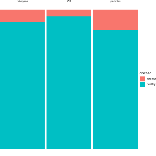
Now, let us assume that after data collection, for hypothesis 1, we find that 15 out of 100 individuals exposed to high levels of particulate matter develop the disease, for hypothesis 2, 20 out of 100 individuals exposed to high levels of nitrogen dioxide develop the disease and for hypothesis 3, 5 out of 100 individuals exposed to high levels of ozone develop the disease.
R
n = 100 # number of test persons
p = 0.04 # Known prevalence of the disease in the general population

individuals_suffered = c(15, 9, 5) # number of individuals who suffered from the disease for each hypothesis
We can visualise this as follows:
We can conduct binomial tests for each hypothesis and calculate the p-values in R.
R
#Calculate the p-values for each hypothesis using the binomial probability mass function
p_values = sapply(individuals_suffered, function(x) {
  p_value = binom.test(x,n=n,p=p)$p.value
  return(p_value)
})

for (i in 1:length(p_values)) {
  cat(sprintf("Hypothesis %d: p = %.4f\n", i, p_values[i]))
}# Print the p-values for each hypothesis
OUTPUT
Hypothesis 1: p = 0.0000
Hypothesis 2: p = 0.0190
Hypothesis 3: p = 0.6033
The probability of having at least one false positive among \(m\) tests (FWER)
Let us assume each test has a probability \(\alpha\) of producing a false positive, and that we have \(m\) independent tests.
The probability that a single test does not produce a false positive is calculated as: \[1-\alpha\]
Since the tests are independent, the probability that none of the \(m\) tests produces a false positive is calculated as: \[(1-\alpha)^m\]
Therefore, the probability of at least one false positive is the complement of the probability that none of the tests produce a false positive, and is calculated as: \[P(\text{at least one false positive})=1−(1−\alpha)^m\]
Challenge
- In the above example, we have three different tests. Will the probability of making one false positive still be 0.05?
- What can we do to decrease the probability of any false positive?
- We can use R to calculate the probability of at least one false positive for our example with three tests:
R
m <- 3
alpha <- 0.05

1 - (1-alpha)^m
OUTPUT
[1] 0.142625- By decreasing the alpha.
The Bonferroni correction
Adjusting the significance level
Now, to control the probability of having any false positive within the set of tests (also known as family-wise error rate or FWER), we can use methods such as the Bonferroni correction.
The Bonferroni procedure adjusts the significance level for each individual test by dividing the desired overall significance level by the number of tests conducted (m).
\[\alpha_{\text{Bonf}}= \alpha/m \]
Where:
α is the desired overall significance level.
m is the number of hypothesis tests conducted.
R
FWER <- 0.05# Define the desired Family-wise error rate

m <- length(p_values)# Calculate the number of hypothesis tests conducted (m)

alpha_bonf <- FWER / m # Calculate Bonferroni adjusted significance level

alpha_bonf
OUTPUT
[1] 0.01666667Since in our example above we have three tests, the Bonferroni corrected significance level is \(\alpha_{\text{bonf}} = 0.05/3 \approx 0.0167\).
In this lesson, we’ll not go into the proof for why this method works. But we can convince ourselves that it does, by calculating the FWER with the adjusted significance level, using the formula derived above.
R
1 - (1-0.0167)^3
OUTPUT
[1] 0.04926799With the adjusted significance level of \(\alpha \approx 0.0167\) for three tests, we are back to the desired \(FWER\) of 5%.
In our example
For each individual test, we compare the calculated p-value to the adjusted significance level. If the p-value is less than or equal to 0.0167, we reject the null hypothesis for that test.
Based on the Bonferroni correction, we reject the null hypothesis for Hypotheses 1, indicating significant associations between particulate matter with disease prevalence. However, for Hypothesis 2 (nitrogen dioxide exposure) and 3 (ozone exposure), we fail to reject the null hypothesis, suggesting no significant association with disease prevalence at the adjusted significance level. This adjustment for multiple testing helps control the overall probability of making at least one false-positive error across all tests conducted.
In this example, the evidence supports associations between certain air pollutants and disease prevalence, but not for others. For our overall null hypothesis - “None of the pollutants is associated with the disease” - this still means that we have to reject it.
After the correction with the Bonferroni procedure, we can now say that found particulate matter to be associated with disease, on a 5% family-wise error rate level. This means that under the assumption that all three null hypothesis are false, we expect the chance of having at least one false positive to be below 5%.
This finding suggests a nuanced interpretation wherein the relationship between air pollution exposure and disease prevalence may vary depending on the specific pollutant considered. Therefore, further investigation and analysis may be necessary to fully elucidate the relationship between air pollution exposure and disease prevalence and to refine the overarching null hypothesis accordingly.
Adjusting the p-value
Instead of changing the significance level, another (equivalent) calculation is adjusting the p-values obtained from individual hypothesis tests, followed by comparing the adjusted p-values to the desired FWER. With this procedure, we can reject those individual null hypotheses that have a p-value below the desired FWER (\(p < \text{FWER}\)).
\[p_{\text{Bonf}}= p \times m\]
Challenge
Look up
p.adjust. This function adjusts P-values for Multiple Comparisons.Using our previous example, can you adjust the p-values obtained from individual hypothesis tests?
Which of the individual hypotheses can will be rejected at a FWER=0.05?
- You can look up the function as follows:
R
help("p.adjust")
2.In R, one can adjust the p-values as follows:
R
p.adjust(p_values, method = "bonferroni")
OUTPUT
[1] 3.244612e-05 5.697576e-02 1.000000e+00- We can check which of the individual hypotheses will be rejected at a FWER=0.05:
R
p.adjust(p_values, method = "bonferroni") < 0.05
OUTPUT
[1] TRUE FALSE FALSEThe conclusion is the same as when changing the significance level for each test.
Family-wise error rate and power
What is statistical power?
Statistical power is the probability of detecting an effect with a statistical test, given that the effect really exists. Expressing this with the terms that we learned in this tutorial, power is defined as
\[ P(\text{rejection} | \text{null hypothesis is false}).\]
Challenge
Suppose we test a set of hypotheses. How does applying the Bonferroni correction impact the power of these tests?
The Bonferroni correction decreases the power of the test, especially when we have many tests.
The number of tests matters
Remember that the adjusted significance level depends on the number of tests that we conduct:
\[\alpha_{\text{Bonf}}= \alpha/m \]
Let’s look at some adjusted significance levels for different numbers of tests, given that we like to control the family-wise error rate at \(\alpha_\text{FWER} = 0.05\):
R
n_test <- seq(1,20000)
alpha_adjusted <- 0.05/n_test

data.frame(n_test,alpha_adjusted) %>%
ggplot(aes(x=n_test, y=log10(alpha_adjusted)))+
  geom_line()
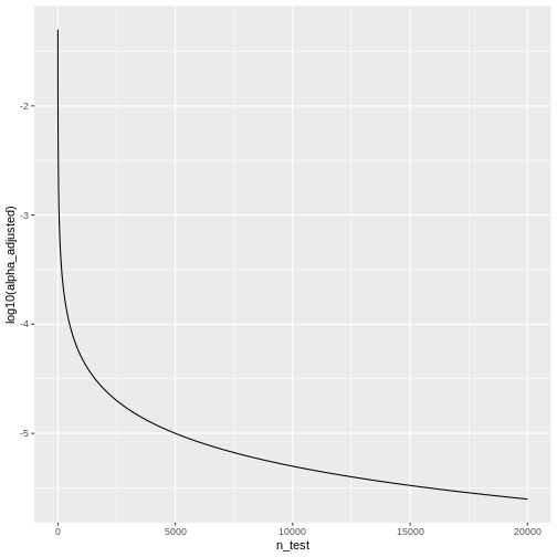 We see that the adjusted \(\alpha\) is
dropping quickly. For \(20000\) tests,
which is a reasonable number in genomic screens, alpha will be:
R
last(alpha_adjusted)
OUTPUT
[1] 2.5e-06We’ll only reject the null for tests that produce a p-value \(<0.0000025\), which means the chances of finding a hit are reduced drastically compared to before adjustment.
Content from False discovery rate
Last updated on 2025-01-14 | Edit this page
Overview
Questions
- How does correcting for the family-wise error rate (FWER) affect the number of significant hits in large-scale data, such as RNA-Seq analysis of 20,000 human genes?
- What is the interpretation of a p-value histogram?
- How can the Benjamini-Hochberg method be applied to control the false discovery rate (FDR) in RNA-Seq data, and what are the benefits of using this method over FWER correction?
Objectives
- Introduce the concept of p-value histograms and explain their interpretation.
- Explain the Benjamini-Hochberg method for controlling the false discovery rate (FDR).
- Provide practical examples and R code to apply the Benjamini-Hochberg method to RNA-Seq data.
- Discuss the advantages of controlling the FDR over FWER in the context of large-scale genomic data.
Introduction
In high-throughput experiments like RNA-Seq, we often conduct thousands of statistical tests simultaneously. This large number of tests increases the risk of false positives. While controlling the family-wise error rate (FWER), the probability of making at least one type I error, is one approach to address false positives, it can be too conservative, leading to few or no significant results. An alternative approach is to control the False Discovery Rate (FDR), the expected proportion of false positives among the rejected hypotheses, which offers a balance between identifying true positives and limiting false positives. In this tutorial, we will learn how each method affects the outcome.
Example: The Airway dataset in R
The Airway dataset contains gene expression data from a study
investigating the effects of dexamethasone (a corticosteroid medication)
on airway smooth muscle cells. The dataset is part of the
airway package in Bioconductor, a project that provides
tools for the analysis and comprehension of high-throughput genomic
data.
In differential expression analysis, thousands of statistical tests are conducted: For each gene, one can test whether its expression is different in cells with dexamethasone treatment, compared to cells without treatment. If the expression differs between the two conditions, we call the gene differentially expressed (DE). Like in the previous example, we have a set up null hypotheses:
\(H_{0,1}\): Gene 1 is not DE.
\(H_{0,2}\): Gene 2 is not DE.
…
\(H_{0,20000}\): Gene 20000 is not DE.
For each gene, we run a test (similar to a t-test) comparing the two treatment groups, which returns a p-value that summarizes the evidence we have for the respective null hypothesis.
Unlike in the air pollution example, our question is not whether any of the genes is DE, but rather which ones: We’d like to come up with a hit list of genes that can be further investigated.
In the following, we’ll work with a data.frame called
gene_pvalues, containing p-values for all genes in the
airway data set.
Coding along
If you’d like to follow the code that we run here, you can either
- run the differential expression analysis in
DESeq2to create the data or - download the p-values data.
This is how the p-values are created:
R
library(DESeq2)
library(airway)

#Load the Airway Dataset
data("airway")

#Create a DESeq2 dataset from the airway data
dds <- DESeqDataSetFromMatrix(countData = assay(airway),
                              colData = colData(airway),
                              design = ~ dex)#the design formula ~ dex specifies that we are interested in the effect of the treatment (dex), which indicates dexamethasone treatment.

# Pre-filter the dataset to remove rows with low counts  _Pre-filter low counts
keep <- rowSums(counts(dds)) > 10
dds <- dds[keep,]

#Perform the DESeq2 analysis to find DEGs between treated and untreated samples
dds <- DESeq(dds)

#Obtain the results of the differential expression analysis.
res <- results(dds)##By default, this will compare treated (dex) vs untreated samples

# Extract the p-values into a separate variable
pvalues <- res$pvalue


# Combine the gene names and their corresponding p-values
gene_pvalues <- data.frame(gene=rownames(res), pvalue=res$pvalue)
# Save to a CSV file
write.csv(gene_pvalues, file="data/DEG_pvalues.csv", row.names=FALSE)
If you like to work with them without running the code, you can load pre-computed p-values as follows:
R
gene_pvalues <- read.csv(url("https://raw.githubusercontent.com/sarahkaspar/Multiple-Testing-tutorial-project/main/episodes/data/DEG_pvalues.csv"))
The table below shows the first six rows of the generated p-values for each gene, the data which we are going use to see how using FWER and FDR to controlling for false positives differ.
| gene | pvalue |
|---|---|
| ENSG00000000003 | 0.0286313 |
| ENSG00000000419 | 0.0422631 |
| ENSG00000000457 | 0.7871234 |
| ENSG00000000460 | 0.6976522 |
| ENSG00000000971 | 0.0886259 |
| ENSG00000001036 | 0.0428887 |
20000 p-values are too many to list them all, but we can look at their distribution by visualizing a p-value histogram. A p-value histogram is a graphical representation that displays the distribution of p-values obtained from multiple hypothesis tests. It can help us in assessing the presence of true effects versus null effects and in understanding the overall behavior of the tests. It can also help us to better control for false positives. To understand how this works, we’ll have to look into the theory. In the next section, we’ll learn
- that a p-value histogram is composed of two fractions: the null and the alternative
- what behavior we expect from the null fraction
Understanding this will provide us with a tool for controlling the False discovery rate.
The theory of p-value Histograms
To create a p-value histogram, we plot the p-values on the x-axis,
typically ranging from 0 to 1. The y-axis represents the frequency (or
count) of p-values falling within specific bins (intervals) of the
x-axis. Let’s do this for the airway p-values.
R
gene_pvalues %>%
  ggplot(aes(x=pvalue))+
  geom_histogram(binwidth=0.01)

A p-value histogram is composed of two fractions
We can think of the p-value histogram as being composed of two fractions: the alternative and the null fraction.
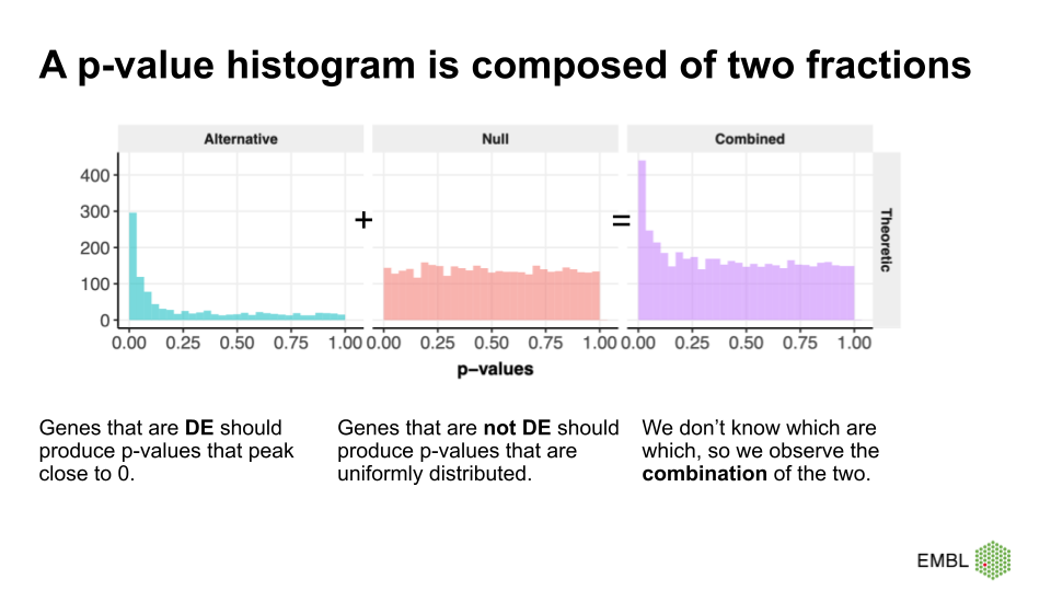
Together, the alternative and null fraction give us a p-value
histogram as the one observed for the airway data.
Why are these our expectations of the null and alterative fraction?
Let’s start with the easier case: If we use a statistical test that is good at detecting differentially expressed genes, then it will produce low p-values for the DE genes, resulting in a peak close to 0. Depending on the power of the test, the peak towards 0 is sharp (high power, all the DE genes have low p-values) or flat and less pronounced (low power, many DE genes have p-values >>0).
But why do we expect a uniform distribution of p-values that come from genes where the null hypothesis is true? This comes from the definition of p-values. We expect 5% of the p-values to be \(<0.05\), 10% of the p-vales to be \(<0.1\), etc. Unfortunately, this definition is not extremely intuitive. Therefore, we use a simulation of tests where the null hypothesis is true, and use it to recap the definition of p-values.
We learned that in the t-test, the test statistic \(t\) follows a t-distribution under the null hypothesis. So, when the null hypothesis is true, we expect the value of \(t\) to be randomly drawn from a t-distribution. For demonstration purposes, we can simulate 2000 draws from a t-distribution (here, I choose the degrees of freedom to be \(\nu = 5\), which is an arbitrary choice) and visualize their distribution.
R
set.seed(55)
ts <- rt(2000, df=5)
data.frame(t=ts) %>%
  ggplot(aes(x=t))+
  geom_histogram(binwidth=0.2)+
  labs(title="Null distribution of t")
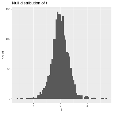
This is our null distribution!
Since we’ll decide significance based on the absolute value of t, \(|t|\), I’ll calculate it here:
R
abs_t <- abs(ts)# take their absolute values
data.frame(abs_t=abs_t) %>%
  ggplot(aes(x=abs_t))+
  geom_histogram(binwidth=0.1, boundary=1)+
  labs(title="Null distribution of |t|")
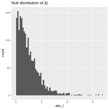
This is our null distribution of absolute t-values. In hypothesis testing, we ask: “What is the probability in the null distribution to observe a value at least as extreme as the observed \(|t|\)?” And to answer this question we look at the cumulative distribution of \(|t|\). While in practice, we’ll look up the theoretical cumulative distribution, we’ll here look at the cumulative distribution of our simulation, hence an empirical cumulative distribution.
R
data.frame(abs_t = abs_t) %>%
  ggplot(aes(x=abs_t))+
  stat_ecdf()
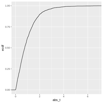 This cumulative distribution function answers the question “for a given
value of \(|t|\), how many other
elements of the simulation are smaller than this value?”. Which
is exactly the opposite of what we’re asking when calculating a p-value.
In fact, the p-value is defined as \(1-\text{CDF}(|t|)\), which looks like
this:
R
data.frame(abs_t = abs_t) %>%
  ggplot(aes(x=abs_t))+
  geom_line(aes(y = 1 - ..y..), stat='ecdf')+
  labs(y="1-ECDF")+
  geom_vline(xintercept =3.1, color="darkblue")+
  geom_hline(yintercept = 0.03, color="darkblue")
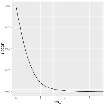
Code adapted from here.
So when we calculate a p-value, we (visually speaking) look up the
observed value of \(|t|\)
(abs_t) on the x-axis, and match it to the corresponding
1-ECDF on the y-axis, which is the resulting \(p\).
For example, if we observe \(t=3.1\) (darkblue vertical line), then this corresponds to \(1-ECDF = 0.03\) (darkblue horizontal line), meaning that under the null distribution, \(= 3%\) of the values are smaller than the observed \(t\). Our p-value for this test is \(p= 0.03\).
What does this tell us about the distribution of p-values? We could go and slice the 1-ECDF into chunks of 5% of the data points:
R
data.frame(abs_t = abs_t) %>%
  ggplot(aes(x=abs_t))+
  geom_line(aes(y = 1 - ..y..), stat='ecdf')+
  labs(y="1-ECDF")+
  geom_hline(yintercept = seq(0,1,by=0.05),
             col="gray")
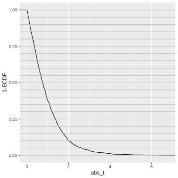
The observations in each slice will make up one bin in the p-value histogram which we’re going to create next.
All of these chunks should contain about 5% of the p-values - by the definition of the p-value via the cumulative distribution.
For instance, the upper 5% of the \(|t|\)-values are be between \(2.6\) and \(6.8\), so we give them p-values between 0.00 and 0.05. The next 5% of the \(|t|\)-values will be between \(2.0\) and \(2.6\), so we give them p-values between 0.05 and 0.10. And so on… resulting in the following p-value histogram again sliced by 5%-bins for demonstration:
R
data.frame(abs_t = abs_t) %>%
  mutate(p = pt(abs_t, df=5,lower.tail=FALSE)*2) %>%
  ggplot(aes(p))+
  geom_histogram(binwidth=0.05, boundary=0)
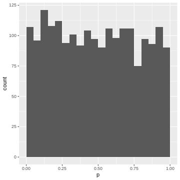
We could also define the p-value via the empirical null distribution:
R
abs_t_vec <- abs_t
data.frame(abs_t = abs_t) %>%
  rowwise() %>%
  mutate(p = mean(abs_t>abs_t_vec)) %>%
  ggplot(aes(p))+
  geom_histogram(binwidth=0.05, boundary=0)
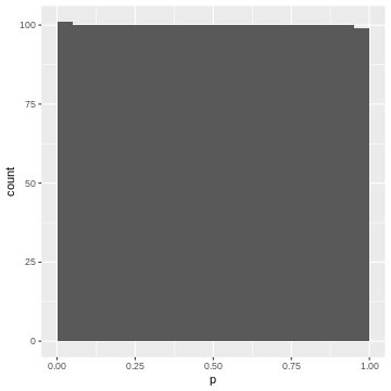
Again, each 5% bin contains 5% (=100) of the p-values, because the p-values are defined by the percentage of values of \(|t|\) in the simulated null distribution which are smaller than the observed one.
Recap
- p-values are defined via the cumulative distribution of the test statistic under the null hypothesis
- They answer the question: what percentage of values is expected more extreme than the observed one?
- If we bin our data into equally-sized quantiles, we expect to see roughly the same number of p-values in each quantile.
- Therefore: In a set of tests where the null hypothesis is true, and where the test statistic behaves like expected in theory, we will see a uniform distribution of p-values
- This works for any test statistic, as long as we know its distribution.
The False Discovery Rate
Let’s come back to our p-value histogram of differentially expressed genes. We learned that it is composed of null and alternative fraction, and we learned that in theory, the null fraction is uniformly distributed.
We can use this knowledge to estimate the fraction of false positives among the positives at an arbitrary p-value cut-off. This is illustrated below.
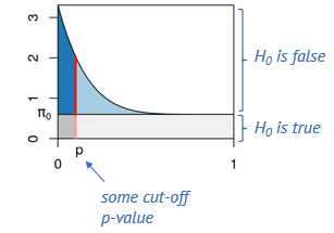
Say, we determine some cut-off p-value, indicated by the red line. Then we can visually estimate what percentage of tests right at this threshold are false positives, namely by dividing the length of the light red segment by the overall length of the line. That’s the local fdr, and it applies to tests rejected just at this threshold. Now we will probably reject all the tests below the threshold, and to get the fraction of false positives within those, we divide the dark gray area by the the total area to the left of the red line. This is the capital letter FDR and it’s an average property of all tests rejected below the threshold.
The false discovry rate is defined as \(FDR = \frac{FP}{TP+FP}.\)
In our example
Let’s come back to our example and assume a significance level \(\alpha=0.05\). If we use this p-value cut-off, we can make a rough visual estimate of the \(FDR\).
R
gene_pvalues %>%
  ggplot(aes(x=pvalue))+
  geom_histogram(binwidth = 0.01)+
  geom_hline(yintercept=160)+
  geom_vline(xintercept=0.05)
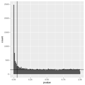
Left to the vertical line, we have the area of the FP fraction (below the horizontal line), and the TP fraction (above the horizontal line). We can guess that around \(2/3\) of the hits are TP.
Adjusted p-values
At any given p-value cut-off, we can estimate the FDR. So we could take each p-values in our screen, use it as a cut-off and return the estimated FDR. This is the adjusted p-value. It tells us the FDR that we would have for our hits if we rejected the null for all genes with a p-value equal to or lower than that for this gene. We can then decide to call all tests a hit, for which the adjusted p-value is smaller than the desired \(\alpha_\text{FWER}\).
Trade-off FP and FN
If we set the threshold very low, we will have a low FDR (low fraction of false positives), but will miss many of the differentially expressed genes. When we move the red line to the right, that is increase the threshold, we’ll capture more and more of the differentially expressed genes, but at the cost of more and more false positives, and if we go too far, we will almost exclusively admit more False Positives.
Controlling FDR Using the Benjamini-Hochberg Method
The Benjamini-Hochberg (BH) method is a statistical procedure used to control the FDR in multiple hypothesis testing, where the chance of obtaining false positives increases. The BH method helps control the proportion of false positives (false discoveries) among the rejected hypotheses, thus providing a more balanced approach than traditional methods like the Bonferroni correction, which can be overly conservative. The BH procedure adjusts the p-values from multiple tests to control the FDR. These adjusted p-values can be compared to a significance threshold to determine which results are significant.
Steps of the Benjamini-Hochberg Procedure
First the observed p-values are arranged in ascending order. Next, ranks are assigned to the p-values, with the smallest p-value getting rank 1, the next smallest rank 2, and so on. Then, for each p-value, the BH critical value is calculated as;
\[\text{BH critical value} = \frac{i}{m} \times Q\]
where, i is the rank, m is the total number of tests, and Q is the desired FDR level (e.g., 0.05).
After this calculation, the largest p-value that is less than or equal to its BH critical value is identified. This p-value and all smaller p-values are considered significant. Optionally, one can adjust the p-values to reflect the BH correction using software functions.
Now, let us continue with the generated p_values to
apply the Benjamini-Hochberg correction in R, and also plot the adjusted
p values for comparison.
What the Benjamini-Hochberg algorithm does, is that it estimates the null component, and finds the threshold below which we should reject for a desired FDR. Equivalently, and that’s the way it’s implemented in R, we can say it produces adjusted p-values. If we reject everything below a certain adjusted p-value (say 5%), this will lead to an FDR of 5%, meaning that 5% of the hits are estimated to be false-positives.
Wrap up
We discussed that controlling the FDR trades some false positives for the chances to discover more hits. Let’s compare the three error rates that we encountered so far
- comparison-wise error rate
- family-wise error rate
- false discovery rate
in terms of the number of hits they return.
We can check how many genes were significantly differentially expressed between the treated and untreated cells at α=0.05 before we apply any type 1 error correction method:
R
gene_pvalues <- na.omit(gene_pvalues)  # Removes rows with NA values
sum(gene_pvalues$pvalue < 0.05)
OUTPUT
[1] 4646Now, if we proceed to apply the Bonferroni method to correct the family-wise error rate (FWER), we can then determine the number of genes that show significant differential expression after the correction.
Challenge
- Use
p.adjustto calculate adjusted p-values using Benjamini Hochberg. How many hits do you get if you control the FDR at 10%? - Do the same with Bonferroni
- What fraction of false positives do you estimate if we use a comparison-wise error rate with \(\alpha=0.5\)?
R
alpha=0.1
# Apply Benjamini-Hochberg correction
p_adjusted_BH <- p.adjust(gene_pvalues$pvalue, method = "BH")
significant_bh <- p_adjusted_BH < alpha
Benjamini_Hochberg_genes<-sum(significant_bh) # Number of significant hits after Benjamini-Hochberg correction
Benjamini_Hochberg_genes
OUTPUT
[1] 3234R
alpha=0.1
# Apply Bonferroni correction
p_adjusted <- p.adjust(gene_pvalues$pvalue, method = "bonferroni")
significant_bonferroni<- p_adjusted < alpha
bonferroni_genes<-sum(significant_bonferroni) # Number of significant hits after bonferroni correction
bonferroni_genes
OUTPUT
[1] 797Estimated fraction of FP at \(\alpha=0.5\):
R
data.frame(p=gene_pvalues$pvalue ,padj =p_adjusted_BH) %>%
  filter(p<0.05) %>%
  pull(padj) %>%
  max()
OUTPUT
[1] 0.2362799This is in line with our visual estimate.
What control method should we choose?
It is essential to understand the difference between controlling the False Discovery Rate (FDR) and the Family-Wise Error Rate (FWER) as each applies to different research scenarios.
Controlling the FDR is suitable in situations where it is often acceptable to have some false positives, such as in large-scale biological screenings (e.g., genomics, proteomics). The goal is to identify as many true positives as possible, knowing that some false positives can be filtered out in subsequent validation steps.
On the other hand, controlling FWER is suitable in high-precision scenarios requiring strict control of false positives. In scenarios where false positives can have significant consequences (e.g., clinical trials, diagnostic tests), it is crucial to minimize even a single false positive. Here, FWER control is more appropriate because it ensures a lower risk of making any type I error.
Therefore, it is important to understand that in exploratory research, where the aim is to generate hypotheses or discover potential leads, FDR control is preferred due to its higher power. In confirmatory research, where results need to be highly reliable, FWER control is more suitable.
Take home message
While FDR control is widely used in biological research due to its balance between discovery and false positive control, FWER control is crucial in settings where the cost of even a single false positive is high. Each method serves its purpose depending on the specific goals and acceptable risk levels of the research context. Understanding the trade-offs between these approaches allows researchers to choose the most appropriate method for their specific scenario.
More on p-value histograms
If you encounter p-value histograms that don’t fit the expectation we just discussed, have a look at this post in varianceexplained.org
Content from Pairwise comparisons
Last updated on 2025-01-14 | Edit this page
Overview
Questions
- What are pairwise comparisons, and how do they relate to the broader concept of multiple testing in statistical analysis?
- How can we effectively conduct and interpret pairwise comparisons to make valid statistical inferences while controlling for the family-wise error rate?
Objectives
- Understand the Concept of Pairwise Comparisons
- Learn how to conduct and interpret Pairwise Comparisons
Pairwise comparisons
Pairwise comparisons are a fundamental concept in statistical analysis, allowing us to compare the means or proportions of multiple groups or conditions. In this episode, we will explore the concept of pairwise comparisons, their importance in statistical testing, and how they relate to the broader context of multiple testing.
An example: Air pollution in four different exposure groups
In our example of air pollution, fine particulate matter and other pollutants can induce systemic inflammation in the body, leading to an increase in circulating inflammatory markers like C-reactive protein (CRP). Suppose we decide to divide the population into four groups based on different levels of exposure to air pollution. Lets assume these groups are as follow:
- Low exposure: Individuals living in rural areas with minimal industrial activity and low traffic density.
- Moderate exposure: Individuals living in suburban areas with some industrial activity and moderate traffic density.
- High exposure: Individuals living in urban areas with significant industrial activity and high traffic density.
- Very high exposure: Individuals living near industrial zones, major highways, or heavily polluted urban areas.
The table below shows the first six rows of CRP values of individuals in the four exposure groups.
| CRP | Exposure |
|---|---|
| 1.379049 | Low |
| 2.039645 | Low |
| 5.617417 | Low |
| 2.641017 | Low |
| 2.758576 | Low |
| 5.930130 | Low |
In this case the “Exposure” column is a categorical variable with
four groups of exposure levels (Low, Moderate,
High, and Very_high).
Coding along
If you like to reproduce the example we use here, you can download the data as follows:
R
exp_data <- read_csv(file=url("https://raw.githubusercontent.com/sarahkaspar/Multiple-Testing-tutorial-project/main/episodes/data/exposure_data.csv"))
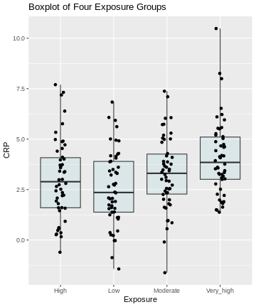
Here, we visualize the data as a boxplot, together with the individual data points:
R
# Visualize the data
ggplot(exp_data, aes(x = Exposure, y = CRP)) +
  geom_boxplot(coef = 5, fill = "lightblue", alpha = 0.25) +
  geom_point(position = position_jitter(width = .1)) +
  labs(title = "Boxplot of Four Exposure Groups")
Pairwise comparisons
In the above example:
- How many pairwise comparisons are possible?
- What is a suitable test for making these comparisons?
- If we choose \(\alpha =0.05\), what is the probability of seeing at least one significant difference, if in fact all differences are 0?
- 6 pairwise comparisons are possible.
- t-test
- \(1-(0.95)^6 \approx 0.26\)
Defining the question
Generally, from the above plot, as the exposure level increases from low to very high, we might expect to see a corresponding increase in the median exposure level and higher median C-reactive protein (CRP) values.
On this type of data, we can run different types of analyses, depending on the question we ask. Let’s look at two different scenarios:
Scenario 1: This is an exploratory analysis. We are interested in finding out whether there is any difference between the four exposure groups at all.
Scenario 2: We have one or more particular exposure groups of interest, which we like to compare to the low exposure group. In this case, the low exposure group serves as a reference.
Scenario 1: ANOVA
In this scenario, we’re basically comparing all against all.
Our null hypothesis is that there are not any differences in CRP amounts in the different groups. From the challenge above, we learned that 6 individual comparisons are not unlikely to produce at least one false positive. In case that there are no differences at all, this probability is estimated to be \(P=0.26\).
Recall that in this situation, we like to control for the family-wise error rate. Our null hypothesis is that there’s nothing going on at all, and once we reject the null for one of our individual comparisons, we also reject this overall null hypothesis.
In this kind of situation, the ANOVA F-test is the method of choice. It is a method that
- is used to compare means between different groups and
- controls for the family-wise error rate.
- It’s applicable when the data points are normally distributed around the group means and the variances are similar among the groups. This appears to be the case in our example.
In general, a one-way ANOVA for \(t\) groups tests the null hypothesis:
\[H_0: \mu_1 = \mu_2 = ... = \mu_t,\] where \(\mu_i\) is the mean of population \(i\).
The alternative hypothesis is:
\[H_A: \mu_i \neq \mu_j \text{ for some i and j where i}\neq \text{j}\]
For this, we use an F-statistic:
\[F= \frac{\text{between group variance}}{\text{within group variance}}\] \(F\) becomes large, if the groups differ strongly in their group means, while the variance within the groups is small. ANOVA is closely related to the t-test. In fact, if we perform an ANOVA on a data set with two groups only, it is equivalent to performing a t-test. For more details on ANOVA, see the PennState online materials.
We can perform an ANOVA in R as follows:
R
anova_result <- aov(CRP ~ Exposure, data = exp_data)
summary(anova_result)
OUTPUT
             Df Sum Sq Mean Sq F value  Pr(>F)
Exposure      3   60.8  20.268   5.754 0.00086 ***
Residuals   196  690.4   3.523
---
Signif. codes:  0 '***' 0.001 '**' 0.01 '*' 0.05 '.' 0.1 ' ' 1
The ANOVA output above shows statistically significant differences among the means of the four exposure groups. We therefore reject the null hypothesis of equal means.
Post-hoc tests
ANOVA alone does not tell us which specific groups differ significantly from each other. To determine this, we need to conduct further analysis. Post-hoc tests are follow up procedures, used to compare pairs of groups in order to identify where the differences lie. These tests provide more detailed information about which specific group means are different from each other.
Parametric methods, such as Tukey’s HSD, are used when assumptions of
normality and homogeneity of variance are met. Non-parametric methods,
such as pairwise Wilcoxon tests, are suitable when data do not meet the
assumptions of parametric tests. In R, performing pairwise comparisons
is straightforward using built-in functions and packages. We perform a
Tukey post-hoc test using TukeyHSD() to determine which
specific exposure group means differ significantly from each other.
R
tukey_result <- TukeyHSD(anova_result)
tukey_result
OUTPUT
  Tukey multiple comparisons of means
    95% family-wise confidence level

Fit: aov(formula = CRP ~ Exposure, data = exp_data)

$Exposure
                         diff        lwr       upr     p adj
Low-High           -0.4233920 -1.3960536 0.5492695 0.6727404
Moderate-High       0.3006174 -0.6720442 1.2732790 0.8539510
Very_high-High      1.0854145  0.1127530 2.0580761 0.0219956
Moderate-Low        0.7240094 -0.2486521 1.6966710 0.2193881
Very_high-Low       1.5088066  0.5361450 2.4814681 0.0004795
Very_high-Moderate  0.7847971 -0.1878644 1.7574587 0.1597266
The results provide pairwise comparisons of group means including
-
diff: the estimated difference between the two groups - the lower (
lrw) and upper (upr) bounds of a 95% family-wise confidence interval and -
p adj: the adjusted p-value which can be used to control for the FWER.
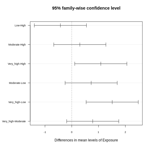
You often read that the Tukey procedure calculates simultaneous confidence intervals, which implies that the confidence intervals are dependent on how many comparisons we make. They grow (more uncertainty), the more comparisons we make, and they can also be used to determine whether two groups are significantly different. In the plot below, each comparison has an estimate, and a confidence interval. We call the difference significant with a 95% family-wise confidence level, if the confidence interval excludes 0.
R
library(multcompView)
par(mar=c(5,6,4,1)+1)
plot(tukey_result,
     las=1,
     cex.axis=0.7)
Interpreting Pairwise Comparison Results
Adjusted p-values reflect the probability of observing a given result (or more extreme) under the assumption that all null hypotheses are true, while accounting for the number of comparisons made. Here, we interpret pairwise comparison results with adjusted p-values from the Tukey test by assessing whether the adjusted p-value is less than the chosen significance level (α) (0.05). If the adjusted p-value is below the significance level, we conclude that the observed difference is statistically significant after correcting for multiple comparisons.
In our example above, we observe significant differences in CRP level
- between the exposure groups
very_highandhigh - between the exposure groups
very_highandlow
Consistent with that, the respective confidence intervals of these two comparisons exclude zero.
Scenario 2
In the second scenario, we aim to determine risk areas of increased CRP concentration. Our control are low exposure regions, and we aim to find out which of the other groups differ significantly from the control in terms of CRP concentration, which classifies them as risk regions.
If this is our question, in theory, we don’t need all six comparisons. We just want to compare each group to the control. In biology, this is a common scenario. We might have a small screen, where we test several substances against a control, and need to determine which of these has an effect. In this scenario, Tukey is overly conservative, because it corrects for more tests than we actually like to perform. We can, however apply the Dunnett procedure, which
- controls for the FWER
- in a scenario where we’d like to compare a number of groups to a control.
We can run the Dunnett test in R by using the function
DunnettTest. As input, we supply
-
x: a numeric vector of data values, or a list of numeric data vectors -
g: a vector or factor object giving the group for the corresponding elements of x -
control: the level of the control group against which the others should be tested
R
library(DescTools)
dunnett <- DunnettTest(x =exp_data$CRP,
            g= exp_data$Exposure,
            control = "Low")
dunnett
OUTPUT
  Dunnett's test for comparing several treatments with a control :
    95% family-wise confidence level

$Low
                   diff     lwr.ci   upr.ci    pval
High-Low      0.4233920 -0.4652856 1.312070 0.53610
Moderate-Low  0.7240094 -0.1646682 1.612687 0.13711
Very_high-Low 1.5088066  0.6201290 2.397484 0.00023 ***

---
Signif. codes:  0 '***' 0.001 '**' 0.01 '*' 0.05 '.' 0.1 ' ' 1
R
par(mar=c(5.1, 7.1, 4.1, 1.1))
plot(dunnett, las=1)
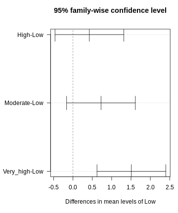
Discussion
Why can’t we just run t-tests and then apply Bonferoni?
This would not be wrong. It doesn’t produce confidence intervals though. It’s sometimes a matter of convention.
Be honest!
In some cases, Dunnett is the way to go. But take a minute and think about whether you’re not interested in the other comparisons as well. For instance, when studying air pollution in different groups, you might also be interested in whether there are differences between moderate and high exposure. The fact that we don’t see large differences between those two groups in the data is not a good reason for leaving out this comparison!
Pretty figures
In publications, you often find p-values plotted next to the comparison in a figure. These plots can be produced in R.
Publication-ready plots
The R package ggpubr comes with the promise of producing
publication-ready plots. Let’s explore some of the functions and
practice our plotting skills. We use the PlantGrowth data
set.
- Explore the data set. Which variables are there?
- Use the following template to create a meaningful plot, comparing
the groups in the data set using ANOVA. You can look up the function
stat_compare_meansin the R help section.
R
library(ggpubr) # load the required library

PlantGrowth %>%
  ggplot(aes(x=, y=))+
  geom_jitter(width=0.1)+ # feel free to replace by, or add, another type of plot
  stat_compare_means()
Consult
?PlantGrowth, or checknames(PlantGrowth). The data set compares the biomass (weight) in a control and two treatment conditions.
R
library(ggpubr)
PlantGrowth %>%
  ggplot(aes(x=group, y=weight))+
  geom_jitter(width=0.1)+
  stat_compare_means(method="anova")
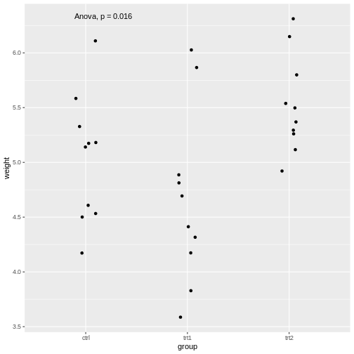
The stat_compare_means function infers the comparisons
to be made from the x and y that we supplied
in the aes.
We saw that the stat_compare_means function allows you
to conveniently add the p-value of an ANOVA in the plot. We can also add
the p-values for individual comparisons:
R
PlantGrowth %>%
  ggplot(aes(x=group, y=weight))+
  geom_jitter(width=0.1)+
  stat_compare_means(method="anova", label.y = 7)+
  stat_compare_means(comparisons=list( c("ctrl", "trt1"), c("ctrl", "trt2")), method="t.test")
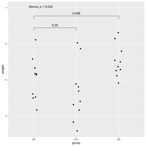
Explanations on the code above:
- The setting
label.y = 7shifts the result of the ANOVA to a height ofweight=7, so it won’t overlap with the individual results. - If we self-define the comparisons, we can do this via the
comparisonsargument by supplying a list of the comparisons to be made.
For more examples with the package, look up this page.
p-value hacking and data snooping
We learned in this lesson that performing a series of tests increases the chances of having at least one false positive. Therefore, it is important to be transparent about which tests were conducted during a study. If we run a large screen and reported only the tests that came out as hits, we’re skipping the type-I error control, and for someone else it is not comprehensible how much the results can be trusted. In fact, we could perform a screen of 1000 biological samples, where there are no true positives. Still, if we run each test at \(\alpha=0.05\), we would have around 50 hits, which are all false positives. The practice of analyzing data extensively, testing multiple hypotheses, or making comparisons until finding a statistically significant result or an interesting pattern, is called p-value hacking.
But even if this is not your intention, you may still sometimes be tempted to snoop in the data, which is a more subtle way of increasing type I error.
Reconsider the air pollution example above:
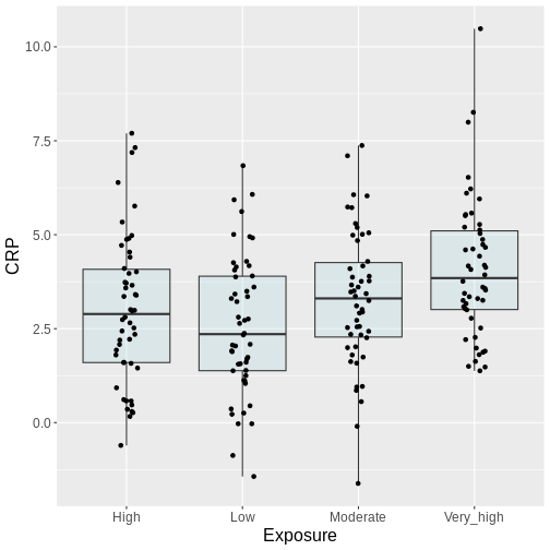
In this example, we might visually inspect our plot, and decide to perform only the comparison between very high and low. Why? Because it looks most promising. With only one test performed, there is also no possibility to perform correction for multiple testing, which may seem sound, while in reality, you performed all the pairwise comparisons by eye, without correcting for them. Therefore, unless you pre-specified one particular test before you inspected the data, all tests should be performed and reported. Otherwise, this approach will lead to inflated Type I error rates.
Additional resources
For further reading and hands-on practice with pairwise comparisons in R, refer to R documentation on pairwise comparisons, Applied Statistics with R and book by Oehlert 2010 resources.
Content from Summary
Last updated on 2025-01-14 | Edit this page
Error rates
We have seen that when dealing with multiple testing, it is crucial to understand the different types of error rates that can be controlled. Comparison-Wise Error Rate (CWER), which is the probability of making a Type I error (false positive) in any single hypothesis test, does not account for the multiplicity of tests and is only applicable when each performed test answers a separate research question. Family-Wise Error Rate (FWER), the probability of making at least one Type I error among all the hypothesis tests, is a stringent error rate control method, suitable for situations where even one false positive is highly problematic. This is the case when we have one overarching null hypothesis that is rejected, as soon as we reject one inidiviual null hypothesis. Methods like the Bonferroni correction and Holm’s are often used to control FWER. False Discovery Rate (FDR), the expected proportion of Type I errors among the rejected hypotheses, is less conservative than FWER and is useful in large-scale testing scenarios, like genomic studies, where some false positives are tolerable in exchange for higher power to detect true positives. The Benjamini-Hochberg procedure is a common method to control the FDR.
The choice of error rate to control depends on the research question and the context of the study.
A Cook book to navigate multiple testing effectively
To navigate multiple testing effectively, we should:
start by clearly defining our research question, stating the specific hypothesis or set of hypotheses we aim to test, and considering the implications of potential false positives and false negatives.
Next, we decide on the appropriate error rate to control, based on our research context and tolerance for Type I errors. This means assessing how critical it is to avoid any false positives (favoring FWER) versus allowing some false positives to increase detection power (favoring FDR).
Finally, we select a suitable statistical method that controls our chosen error rate and aligns with our data type and experimental design, ensuring it is well-suited to the specifics of our study.
Content from References and Further Reading
Last updated on 2025-01-14 | Edit this page
Online Resources
- Post on p-value histograms on varianceexplained.org
- PennState Eberly College of Science materials on ANOVA (link)
