False discovery rate
Last updated on 2024-07-16 | Edit this page
Estimated time: 12 minutes
Overview
Questions
- How does correcting for the family-wise error rate (FWER) affect the number of significant hits in large-scale data, such as RNA-Seq analysis of 20,000 human genes?
- What is the interpretation of a p-value histogram, and how can it be used to assess the distribution of p-values in multiple testing scenarios?
- How can the Benjamini-Hochberg method be applied to control the false discovery rate (FDR) in RNA-Seq data, and what are the benefits of using this method over FWER correction?
Objectives
- Demonstrate how correcting for the family-wise error rate (FWER) using methods like Bonferroni correction can lead to few or no significant hits in large-scale testing scenarios.
- Introduce the concept of p-value histograms, explain their interpretation, and illustrate how they can be used to visualize the distribution of p-values in multiple testing.
- Explain the Benjamini-Hochberg method for controlling the false discovery rate (FDR).
- Provide practical examples and R code to apply the Benjamini-Hochberg method to RNA-Seq data.
- Discuss the advantages of controlling the FDR over FWER in the context of large-scale genomic data.
Introduction
In high-throughput experiments like RNA-Seq, we often conduct thousands of statistical tests simultaneously. This large number of tests increases the risk of false positives. While controlling the family-wise error rate (FWER), the probability of making at least one type I error, is one approach to address false positives, it can be too conservative, leading to few or no significant results. An alternative approach is to control the False Discovery Rate (FDR), the expected proportion of false positives among the rejected hypotheses, which offers a balance between identifying true positives and limiting false positives. In this tutorial, we will learn how each method affects the outcome.
Example: The Airway dataset in R
The Airway dataset contains gene expression data from a study investigating the effects of dexamethasone (a corticosteroid medication) on airway smooth muscle cells. The dataset is part of the airway package in Bioconductor, a project that provides tools for the analysis and comprehension of high-throughput genomic data.
In differentially expressed genes (DEGs) analysis, thousands of statistical tests (one for each gene) are conducted, which increases the chance of false positives. Using the airway dataset, we can decide to analyze DEGs between treated and untreated samples. Here, the null hypothesis would state that there is no difference in gene expression between the two groups ( dexamethasone treated and untreated). The Table 1 below shows the first six rows of the generated p-values for each gene, the data which, we are going use to see how using FWER and FDR to controlling for false positive differ.
| gene | pvalue |
|---|---|
| ENSG00000000003 | 0.0286636 |
| ENSG00000000419 | 0.0428183 |
| ENSG00000000457 | 0.7874802 |
| ENSG00000000460 | 0.6972820 |
| ENSG00000000938 | 0.6215698 |
| ENSG00000000971 | 0.0885597 |
The Theory of P-value Histograms
A p-value histogram is a graphical representation that displays the distribution of p-values obtained from multiple hypothesis tests. When conducting a large number of statistical tests, such as in genome-wide association studies or RNA-Seq analysis, p-value histograms provide a visual tool to assess the behavior and distribution of p-values across all tests. This helps in assessing the presence of true effects versus null effects and in understanding the overall behavior of the tests.
In hypothesis testing, a p-value represents the probability of observing the test results, or more extreme results, given that the null hypothesis is true. When performing multiple hypothesis tests, we obtain a set of p-values, one for each test.
To create a p-value histogram, we plot the p-values on the x-axis, typically ranging from 0 to 1. The y-axis represents the frequency (or count) of p-values falling within specific bins (intervals) of the x-axis.
Decompose a P-value Histogram
Decomposing a p-value histogram involves analyzing the distribution of p-values to understand the underlying behavior of your hypothesis tests. This process can help you identify whether your results are due to true effects, random chance, or other factors.
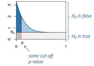
in reference to figure 8, We think of the p-values as coming from two components: The uniform component (the area in gray) which comes from tests where the null hypothesis is true, and an alternative component (the area in blue) which comes from tests where the alternative is true. These tend to have lower p-values.
Say, we determine some cut-off p-value, indicated by the red line. Then we can visually estimate what percentage of tests right at this threshold are false positives, namely by dividing the length of the light red segment by the overall length of the line. That’s the local fdr, and it applies to tests rejected just at this threshold. Now we will probably reject all the tests below the threshold, and to get the fraction of false positives within those, we divide the dark gray area by the the total area to the left of the red line. This is the capital letter FDR and it’s an average property of all tests rejected below the threshold.
 We can visualize again the connection of the p-value histogram to the
confusion matrix. The four areas (dark blue, light blue, dark gray and
light gray) correspond to the fractions of True Positives, False
Negatives, False Positives and True Negatives, respectively, for the
p-value threshold indicated by the red line. in the sace of differential
expression of genes, if we set the threshold very low, we will have a
low FDR (low fraction of false positives), but will miss many of the
differentially expressed genes. When we move the red line to the right,
that is increase the threshold, we’ll capture more and more of the
differentially expressed genes, but at the cost of more and more false
positives, and if we go too far, we will almost exclusively admit more
False Positives.
Interpretation of P-value Histograms
If all the null hypotheses are true (i.e., there is no effect), p-values should follow a uniform distribution. This means the histogram should show a relatively flat distribution of p-values across the range from 0 to 1, with each bin having roughly the same height (Figure 8).
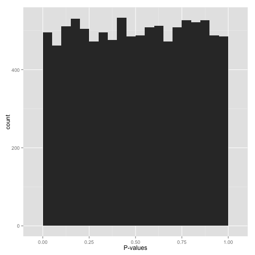
However, seeing this does not mean they actually are all null. It means that at most a small percentage of hypotheses are non-null and could be identified by a correction method. That is why applying an uncorrected rule like “Accept everything with p-value less than 0.05” is certain to give you many false discoveries.
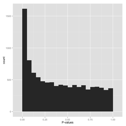
If there are true effects present, you would expect to see an excess of low p-values (close to 0) compared to what would be expected under a uniform distribution (Figure 9). This indicates potential significant findings. A large spike near zero can indicate that many tests are finding significant results, suggesting the presence of true positives.
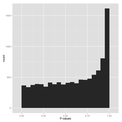
A right-skewed distribution, with most p-values clustering towards 1 (Figure 10), might suggest that most tests are not finding significant results, indicating that there may be few true effects in the data.
P-values are designed to be uniform under the null hypothesis. Therefore, if we observe deviations from this expectation, it should not lead us to conclude that there are no significant hypotheses. Instead, it suggests that there may be issues with our testing methodology. For example, our test assumptions might not align with the actual data distribution. It is possible that the test assumes a certain data distribution (like continuous or normal), which doesn’t match the actual characteristics of our data—such as it being discrete or highly non-normal.
Some histogram like shown in Figure 11 might exhibit pronounced spikes at p-values near zero and near one.
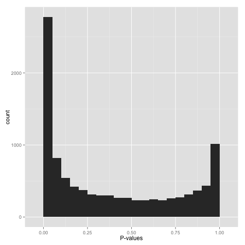
This behavior often signals potential issues such as p-hacking or deficiencies in experimental design. For instance, in the context of a one-tailed test (e.g., assessing whether each gene increases expression in response to a drug), p-values nearing 1 may indicate significance in the opposite direction—instances where genes decreased their expression. If you wish to identify such cases, consider switching to a two-sided test. Alternatively, if these cases are irrelevant, filtering out instances where estimates point in that direction could be effective.
Moreover, in RNA-Seq data, for example, certain genes may show no reads across all conditions, leading some differential expression tools to return a p-value of 1. Identifying and filtering out such problematic cases beforehand can help streamline our analysis without sacrificing information.
Understanding the distribution of p-values can inform the choice of multiple testing correction methods. For example, if there is an excess of low p-values, controlling the false discovery rate (FDR) might be more appropriate than controlling the family-wise error rate (FWER). After applying a multiple testing correction (such as the Benjamini-Hochberg method), a p-value histogram of the adjusted p-values can help evaluate the effectiveness of the correction in controlling false positives.
Here, we will use our previously generated p-values for each analysed gene to create a histogram.
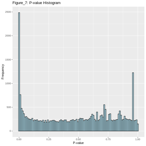
We will also find out how many genes were significantly differentially expressed between the treated and untreated cells at α=0.05 before we apply any type 1 error correction method.
OUTPUT
4655 is the number of significant differentially expressed genes before FWER correctionR
alpha = 0.05
binw =0.01
pi0 = 2 * mean(gene_pvalues$pvalue > 0.5)
ggplot(gene_pvalues,
  aes(x = pvalue)) +
  geom_histogram(binwidth = binw, boundary = 0,fill = "lightblue", color = "black") +
  geom_hline(yintercept = pi0 * binw * nrow(gene_pvalues), col = "blue") +
  geom_vline(xintercept = alpha, col = "red")
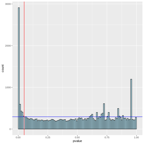
Notice that there are many null hypotheses that appear at low p-values. Therefore, indiscriminately declaring all p-values less than 0.05 as significant will lead to a high number of false discoveries. Additionally, some true alternative hypotheses may have high p-values, leading to missed detections (false negatives) that our test cannot identify.
The impact of correcting for the family-wise error rate (FWER) using Bonferroni correction
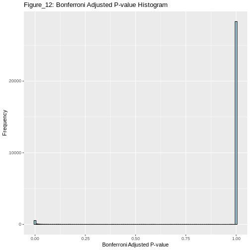
Now, if we proceed to apply the Bonferroni method to correct the family-wise error rate (FWER), we can then determine the number of genes that show significant differential expression after the correction.
OUTPUT
706 is the number of significant differentially expressed genes after Bonferroni correction for FWERControlling FDR Using the Benjamini-Hochberg Method
The Benjamini-Hochberg (BH) method is a statistical procedure used to control the FDR in multiple hypothesis testing, where the chance of obtaining false positives increases. The BH method helps control the proportion of false positives (false discoveries) among the rejected hypotheses, thus providing a more balanced approach than traditional methods like the Bonferroni correction, which can be overly conservative. The BH procedure adjusts the p-values from multiple tests to control the FDR. These adjusted p-values can be compared to a significance threshold to determine which results are significant.
Steps of the Benjamini-Hochberg Procedure
First the observed p-values are arranged in ascending order. Next, ranks are assigned to the p-values, with the smallest p-value getting rank 1, the next smallest rank 2, and so on. Then, for each p-value, the BH critical value is calculated as;
\[\text{BH critical value} = \frac{i}{m} \times Q\]
where, i is the rank, m is the total number of tests, and Q is the desired FDR level (e.g., 0.05).
After this calculation, the largest p-value that is less than or equal to its BH critical value is identified. This p-value and all smaller p-values are considered significant. Optionally, one can adjust the p-values to reflect the BH correction using software functions.
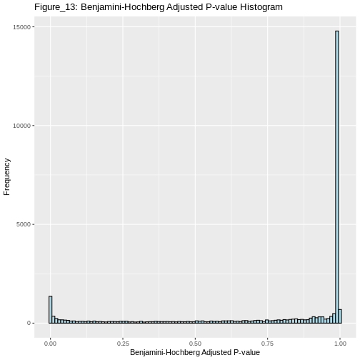
Now, let us continue with the generated p_values to apply the Benjamini-Hochberg correction in r, and also plot the adjusted p values for comparison.
What the Benjamini-Hochberg algorithm does, is that it estimates the null component, and finds the threshold below which we should reject for a desired FDR. Equivalently, and that’s the way it’s implemented in R, we could say it produces adjusted p-values. And if we reject everything below a certain adjusted p-value (say 5%), this will lead to an FDR of 5%, meaining that 5% of the hits are false-positives.
OUTPUT
2357 is the number of significant differentially expressed genes that pass the FDR thresholdInterpretation
The Benjamini-Hochberg method controls the FDR, allowing for a greater number of significant differentially expressed genes (2357) compared to the Bonferroni correction (706). This approach provides a more balanced and powerful method for identifying true positives in large-scale data.
R
alpha=0.1
# Apply Benjamini-Hochberg correction
p_adjusted <- p.adjust(gene_pvalues$pvalue, method = "BH")
significant_bh <- p_adjusted < alpha
Benjamini_Hochberg_genes<-sum(significant_bh) # Number of significant hits after Benjamini-Hochberg correction
Benjamini_Hochberg_genes
OUTPUT
[1] 2908R
alpha=0.1
# Apply Bonferroni correction
p_adjusted <- p.adjust(gene_pvalues$pvalue, method = "bonferroni")
significant_bonferroni<- p_adjusted < alpha
bonferroni_genes<-sum(significant_bonferroni) # Number of significant hits after bonferroni correction
bonferroni_genes
OUTPUT
[1] 759Advantages of controlling the FDR over FWER in the context of large-scale genomic data
Higher statistical power: FDR control allows for higher power compared to FWER control. In large-scale genomic studies, this means detecting more true positives while still controlling false discoveries. Therefore, since FDR methods are less stringent than FWER methods like Bonferroni correction, they balance between controlling false discoveries and maximizing true positives, reducing false negatives.
Consistency across studies: By setting a fixed FDR threshold (e.g., 5%), results are more comparable across different studies and meta-analyses, enhancing consistency in statistical inference.
It is important to note that while FDR is preferred in many genomic screens due to its ability to handle a large number of hypotheses, FWER control remains appropriate in scenarios where minimizing any false positives is critical. Each method has its place depending on the research context and goals.
What control method should we choose?
It is essential to understand the difference between controlling the False Discovery Rate (FDR) and the Family-Wise Error Rate (FWER) as each applies to different research scenarios.
Controlling the FDR is suitable in situations where it is often acceptable to have some false positives, such as in large-scale biological screenings (e.g., genomics, proteomics). The goal is to identify as many true positives as possible, knowing that some false positives can be filtered out in subsequent validation steps.
On the other hand, controlling FWER is suitable in high-precision scenarios requiring strict control of false positives. In scenarios where false positives can have significant consequences (e.g., clinical trials, diagnostic tests), it is crucial to minimize even a single false positive. Here, FWER control is more appropriate because it ensures a lower risk of making any type I error.
Therefore, it is important to understand that in exploratory research, where the aim is to generate hypotheses or discover potential leads, FDR control is preferred due to its higher power. In confirmatory research, where results need to be highly reliable, FWER control is more suitable.
Take home message
While FDR control is widely used in biological research due to its balance between discovery and false positive control, FWER control is crucial in settings where the cost of even a single false positive is high. Each method serves its purpose depending on the specific goals and acceptable risk levels of the research context. Understanding the trade-offs between these approaches allows researchers to choose the most appropriate method for their specific scenario.
