Visualizing categorical data
Last updated on 2026-05-05 | Edit this page
Overview
Questions
- How can I visualize categorical data in R?
Objectives
- Learn to make a mosaic plot in base R and using
ggplot2.
R
mytable <- rbind(c(4,96), c(10,90))
rownames(mytable) <- c("not exposed","exposed")
colnames(mytable) <- c("diseased", "healthy")
You now know how to calculate a measure for association from your table - great! But so far, we’ve only looked at numbers, and you’ve also learned that you should also visualize your data. Yes, even if it’s only 4 data points!
Using base R
There is a very simple way to do this using base R:
R
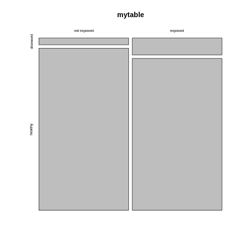
mosaicplot(mytable)
 The mosaic plot consists of rectangles representing the
contingency table’s cells. The areas of the rectangles are proportional
to the respective cells’ count, making it easier for the human eye to
compare the proportions.
Note that the above mosaicplot is arranged such that the rectangles of one column are neatly stacked on top of each other. At the same time, it has flipped the table such that the rows of our matrix have become the columns and vice versa.
This might not always be how you want your plot to look. For example, consider the smokers example from the previous episode:
R
smokers <- rbind(
  c(688, 650),
  c(21, 59)
)

rownames(smokers) <- c("yes", "no")
colnames(smokers) <- c("cases", "controls")
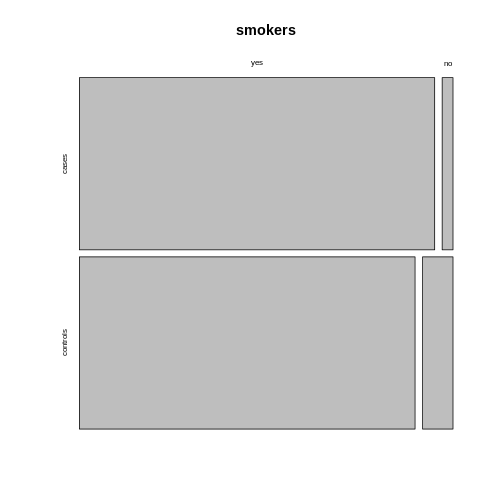
If we apply the mosaicplot here, it’ll look like
this:
R
mosaicplot(smokers)
 Using the argument
 sort, you can determine how the
rectangles are aligned. You can align them by rows as follows:
R
mosaicplot(smokers,
           sort = c(2,1))
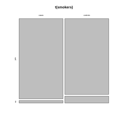
 Alternatively, you can run the plotting function on the
transposed contingency table:
R
mosaicplot(t(smokers))

Using ggplot2
We recommend using the tidyverse for data analysis in
general, and in particular ggplot2 for plotting. The above
function is perfect for getting a quick overview on the data. For
creating high-quality, customized graphics, ggplot2 is
usually the better choice.
This gives us a great opportunity to talk about tidy data: In a tidy table
- each variable is a column and
- each observation is a row.
Challenge
What would the mice table look like in tidy format?
It would have three columns, according to the variables:
exposure (exposed or not), outcome (diseased
or healthy), and count.
Let’s code up the table in tidy format:
R
mice <- data.frame(
  exposure = c("yes", "yes", "no", "no"),
  outcome = c("diseased", "healthy", "diseased", "healthy"),
  count = c(10, 90, 4, 96)
)

mice
OUTPUT
  exposure  outcome count
1      yes diseased    10
2      yes  healthy    90
3       no diseased     4
4       no  healthy    96
This tidy table can be the input for the ggplot
function. There are multiple ways and possible designs for mosaic plots
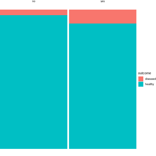
using ggplot2. We’ll demonstrate one here:
R
library(tidyverse)
mice %>%
  group_by(exposure) %>%
  mutate(sumcount = sum(count)) %>%
  ggplot(aes(x=exposure, y = count, fill=outcome, width=sumcount)) +
  geom_bar(stat="identity", position = "fill") +
  facet_grid(~exposure, scales = "free_x", space = "free_x")+
  theme_void()

The above code is borrowed from this post.
The argument width=sumcount adjusts the width of the
bars according to the sum of counts per group (exposed / not exposed).
Since both groups have the same size in the above example, it doesn’t
actually have an effect here. It will make a difference once the groups
differ in size.
