All in One View
Content from Introduction to Categorical Data
Last updated on 2026-05-05 | Edit this page
Overview
Questions
- What is categorical data and how is it usually represented?
Objectives
- Introduce the contingency table.
- Learn to set up a contingency table in R.
Introduction
In biological experiments, we often compare what categories observations fall into. For example, we might look at cells in microscopy images and categorize them by the cell cycle, or by whether they carry a certain marker. We could categorize individuals (animals of humans) by whether they received a treatment in an experimental set-up, or by sex.
In this lesson, you’ll learn
- how to handle data sets containing categorical data in R,
- how to visualize categorical data,
- how to calculate effect sizes,
- how to test for a difference in proportions, and
- what to watch out for when applying these methods to biological data.
Contingency tables
Let’s start by looking at how categorical data is usually presented
to us.
The most common format to communicate categorical data is by using a
contingency table. The following example describes an
experiment that aims at finding out whether exposure to a chemical in
question increases the risk of getting a certain disease. In the
experiment, 200 mice were either exposed to the chemical (N=100) or not
(N=100). After 4 weeks, the mice were tested for whether they had
developed the disease. In the non-exposed group, 4 mice had the disease,
and within the exposed group, 10 mice developed teh disease. This
information can be displayed as follows:
| diseased | healthy | |
|---|---|---|
| non-exposed | 4 | 96 |
| exposed | 10 | 90 |
Each mouse either was either exposed, or not. So
exposure is a categorical variable with two levels,
exposed and non_exposed. Similarly, we have a
variable which we might call outcome, with the categories
healthy and diseased.
The above contingency is a so-called 2x2 table, because it has two rows and two columns. There are also variables with more than two categories, which lead to larger tables.
In a contingency table, the rows and columns specify which categories
the two variables can take. The cells of the table represent the
possible combinations of the variable (for example healthy
and exposed is a possible combination), and the cell gives
the count how many times this combination was observed in the study or
experiment at hand.
Some terminology
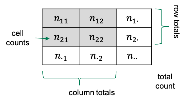
If we have a 2x2 table, then there are four squares with numbers in
them, which we refer to as the cells of the
table.
Each cell contains a count, which we call \(n\), and we index it by the rows and
columns of that table. So the count in row 1 and column 2 will be called
\(n_{12}\).
Sometimes we also look at row totals or column totals, and in this
lesson we use a dot (\(\cdot\)) to
indicate when a row or column is summed over). The total counts in row
2, for example would be referred to as \(n_{2\cdot}\).
Contingency tables in R
Let’s suppose you have some observations, and you want to code them up in a contingency table in R. For most of the analysis that we’ll see in this lesson, it’s most useful to store the data in a matrix.
One way of constructing a matrix is by using the function
rbind, which “binds rows”: It takes vectors as arguments,
and stacks them as the rows of a matrix.
For the above table, the function call looks like this:
R
mytable <- rbind(
  c(4,96),
  c(10,90)
)
mytable
OUTPUT
     [,1] [,2]
[1,]    4   96
[2,]   10   90
Now, to remember which cell represents which observations, I find it useful to name the rows and columns:
R
rownames(mytable) <- c("non-exposed","exposed")
colnames(mytable) <- c("diseased", "healthy")
mytable
OUTPUT
            diseased healthy
non-exposed        4      96
exposed           10      90
Later in this lesson, we’ll also see how to tabulate observations from data frames, and how to turn contingency tables into a tidy format for modeling. But first, let’s get started with analyzing the table.
Content from Quantifying association
Last updated on 2026-05-05 | Edit this page
Overview
Questions
Objectives
Here’s the table again:
| diseased | healthy | |
|---|---|---|
| not exposed | 4 | 96 |
| exposed | 10 | 90 |
What we probably want to find out in a study as described in the previous episode, is whether the
chemical has an effect on the risk for getting the disease. We could
also say, that we’d like to know whether the variables
outcome and exposure are associated.
Yet another way to express this question in quantitative terms is asking
whether the proportions of diseased mice are the same for exposed and
non-exposed mice.
So, it’s rather obvious that the proportions differ between the two test groups in this specific sample:
- \(4/100 = 4\%\) in the non-exposed group
- \(10/100 = 10\%\) in the exposed group.
But since sampling includes randomness, it could be that the difference is just by chance. Later in this lesson we’ll learn how to test whether the difference in proportions is significance, by asking how likely it is to see this difference just by chance, given the number of test mice at hand.
For now, we’ll start by quantifying the effect that we observe in this sample. There are different options to express the effect of the exposure from this sample. After all we’re summarizing 4 counts into one value, and there are more than one way of doing so.
Measures for association
Difference in proportions: The difference in proportions is the most intuitive way of summarizing the contingency table. We subtract the proportion of diseased mice in one group from the proportion in the other. In our example
\[ D = \hat{P}(\text{disease}|E) - \hat{P}(\text{disease} | N) = 0.06\] In the formula above, we subtract two conditional probabilities from each other. The notation \(P(\text{event} | \text{condition})\) describes the probability of an event, given a condition. I use \(N\) and \(E\) for describing the non-exposed and exposed group, respectively. So \(P(\text{disease}|N)\) is the probability of getting the disease, given that a mouse belongs to the non-exposed group.
Why the hat? Well, we’d sure like to learn something about the true probabilities of getting the disease under some condition, but in fact we only have a sample of 200 mice, which means the proportions don’t correspond to the true probabilities, generalized over all mice in the world. The notation \(\hat{P}\) acknowledges the fact that the sample proportions are our current best estimate for the true probabilities.
Relative risk: You may have noticed a problem about the difference in proportion: It depends on how high the prevalence of the disease is in the first place. For a disease with a very low prevalence, we might see a difference between 8/1000 and 4/1000 test subjects of the exposed and non-exposed group, which is only \(0.4\%\). But in relative terms, the prevalence is twice as high in the exposed group compared to the non-exposed group.
We can account for that by reporting the ratio between the proportions in both groups:
\[RR = \frac{\hat{P}(\text{disease} | E)}{\hat{P}(\text{disease} | N)} = 2.5 \]
The result \(RR=2.5\) tells you that the proportion of mice who developed the disease was \(2.5\) times higher in the exposed group than in the non-exposed group.
The relative risk has its origin in epidemiology, which means that the name is meaningful in many clinical settings, but not necessarily in with regard to every wet lab experiment. The important part here is to first phrase the research question carefully, and then think about which measure can be helpful in answering it. If the \(RR\) is useful in your case, but the name doesn’t make sense regarding your data, you can still use the measure and think about a more useful terminology.
Odds ratio: Often, the association between two variables (in this case: disease and exposure) is also expressed in terms of odds ratios. If a disease has the probability of \(p=0.1\) of occurring in a mouse within a given time, then the odds of getting the disease is \(\frac{p}{1-p}=\frac{0.1}{0.9}=0.11\). The odds ratio compares the odds of getting the disease between two conditions. In our example the odds ratio is
\[OR = \frac{\hat{P}(\text{disease}|E) / (1 - \hat{P}(\text{disease}|E)) }{\hat{P}(\text{disease}|N) / (1 - \hat{P}(\text{disease}|N))} \approx 2.7\]
We say that the odds for getting the disease is 2.7 higher in the exposed group compare to the non-exposed group. For calculating the sample odds ratio, you can use the following simple formula:
\[ OR = \frac{n_{1,1} / n_{1,2}}{n_{2,1} / n_{2,2}}\]
Admittedly, the odds ratio is not a very intuitive measure for association, but it has some useful mathematical properties (which won’t concern us in this lesson). The odds ratio is
\[OR = \begin{cases} >1 & \quad \text{if there is a positive association}\\ \,1 & \quad \text{if there is no assocation}\\ <1 & \quad \text{if there is a negative association} \end{cases}\]
Note that the \(OR\) depends on how you order your table.
Log odds ratio: The log odds ratio is simply the logarithm of the odds ratio, \(\log(OR)\). One nice thing about this value is that it’s zero when there’s no association between the two variables.
\[\log OR = \begin{cases} >0 & \quad \text{if there is a positive association}\\ \,0 & \quad \text{there is no association}\\ <0 & \quad \text{there is a negative association} \end{cases}\]
This scale is useful for plotting data, because it’s good at resolving strong negative associations (for example, if a treatment decreases the risk for disease), which would be very small numbers when expressed as relative risk, or odds ratios.
Knowing about log odds and log odds ratios is also useful for interpreting some statistical models (for example Poisson GLM, or logistic models) where the model parameters are expressed in terms of log odds.
Challenge
Consider the following data: 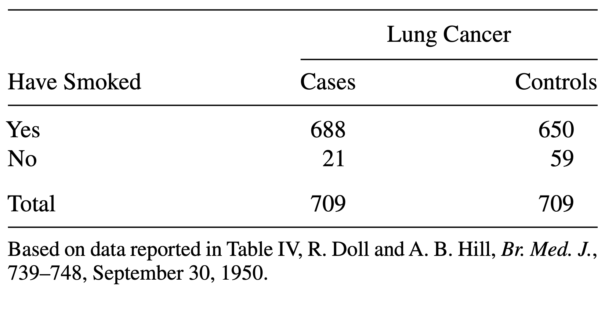
The above table comes from one of the first studies of the link between lung cancer and smoking, by Richard Doll and A. Bradford Hill. In 20 hospitals in London, UK, patients admitted with lung cancer in the previous year were queried about their smoking behavior. For each patient admitted, researchers studied the smoking behavior of a non-cancer control patient at the same hospital of the same sex and within the same 5-year grouping on age. A smoker was defined as a person who had smoked at least one cigarette a day for at least a year.
- Construct a table that represents this study in R.
- Calculate a measure for association that you find useful in this scenario.
- Construct a contingency table:
R
mytable <- rbind(
  c(688, 650),
  c(21, 59)
)

rownames(mytable) <- c("yes", "no")
colnames(mytable) <- c("cases", "controls")
- Since this is a case control study, comparing the proportions of cancer patients between smokers and non-smokers makes no sense. They don’t reflect the true probabilities of getting cancer, because by design the same number of cancer and no cancer subjects were included in the study. Instead, you can compare the proportions of smokers between the groups:
R
# 1. difference in proportions of smokers between cases and controls
688/(21+688) - 650/(59+650)
OUTPUT
[1] 0.05359661R
# ratio in proportions of smokers between cases and controls
(688 / (21+688)) / (650 / (59+650))
OUTPUT
[1] 1.058462R
# --> The proportion of smokers was 1.05 times higher for the cases

# odds ratio
(688 / 21) / (650/59)
OUTPUT
[1] 2.973773R
# --> The odds for having smoked was 3 times higher in the cases group

# log odds ratio
log((688 / 21) / (650/59))
OUTPUT
[1] 1.089831Content from Visualizing categorical data
Last updated on 2026-05-05 | Edit this page
Overview
Questions
- How can I visualize categorical data in R?
Objectives
- Learn to make a mosaic plot in base R and using
ggplot2.
R
mytable <- rbind(c(4,96), c(10,90))
rownames(mytable) <- c("not exposed","exposed")
colnames(mytable) <- c("diseased", "healthy")
You now know how to calculate a measure for association from your table - great! But so far, we’ve only looked at numbers, and you’ve also learned that you should also visualize your data. Yes, even if it’s only 4 data points!
Using base R
There is a very simple way to do this using base R:
R
mosaicplot(mytable)
 The mosaic plot consists of rectangles representing the
contingency table’s cells. The areas of the rectangles are proportional
to the respective cells’ count, making it easier for the human eye to
compare the proportions.
Note that the above mosaicplot is arranged such that the rectangles of one column are neatly stacked on top of each other. At the same time, it has flipped the table such that the rows of our matrix have become the columns and vice versa.
This might not always be how you want your plot to look. For example, consider the smokers example from the previous episode:
R
smokers <- rbind(
  c(688, 650),
  c(21, 59)
)

rownames(smokers) <- c("yes", "no")
colnames(smokers) <- c("cases", "controls")
If we apply the mosaicplot here, it’ll look like
this:
R
mosaicplot(smokers)
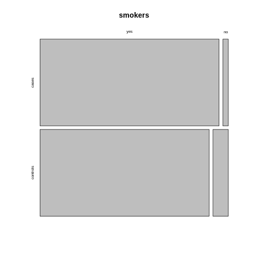
 Using the argument
 sort, you can determine how the
rectangles are aligned. You can align them by rows as follows:
R
mosaicplot(smokers,
           sort = c(2,1))
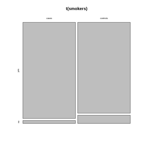
 Alternatively, you can run the plotting function on the
transposed contingency table:
R
mosaicplot(t(smokers))
Using ggplot2
We recommend using the tidyverse for data analysis in
general, and in particular ggplot2 for plotting. The above
function is perfect for getting a quick overview on the data. For
creating high-quality, customized graphics, ggplot2 is
usually the better choice.
This gives us a great opportunity to talk about tidy data: In a tidy table
- each variable is a column and
- each observation is a row.
Challenge
What would the mice table look like in tidy format?
It would have three columns, according to the variables:
exposure (exposed or not), outcome (diseased
or healthy), and count.
Let’s code up the table in tidy format:
R
mice <- data.frame(
  exposure = c("yes", "yes", "no", "no"),
  outcome = c("diseased", "healthy", "diseased", "healthy"),
  count = c(10, 90, 4, 96)
)

mice
OUTPUT
  exposure  outcome count
1      yes diseased    10
2      yes  healthy    90
3       no diseased     4
4       no  healthy    96
This tidy table can be the input for the ggplot
function. There are multiple ways and possible designs for mosaic plots
using ggplot2. We’ll demonstrate one here:
R
library(tidyverse)
mice %>%
  group_by(exposure) %>%
  mutate(sumcount = sum(count)) %>%
  ggplot(aes(x=exposure, y = count, fill=outcome, width=sumcount)) +
  geom_bar(stat="identity", position = "fill") +
  facet_grid(~exposure, scales = "free_x", space = "free_x")+
  theme_void()
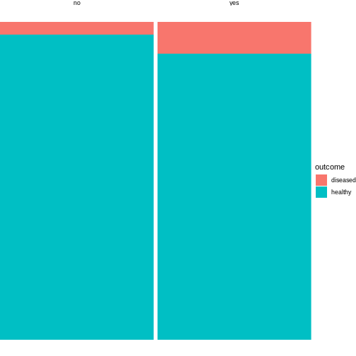
The above code is borrowed from this post.
The argument width=sumcount adjusts the width of the
bars according to the sum of counts per group (exposed / not exposed).
Since both groups have the same size in the above example, it doesn’t
actually have an effect here. It will make a difference once the groups
differ in size.
Content from Sampling schemes and probabilities
Last updated on 2026-05-05 | Edit this page
Overview
Questions
- Question 1
Objectives
- Understand the how counts are generated.
Where do the counts in the contingency table come from? Answering this question is an important part of understanding how we expect them to behave in scenarios where two variables are independent or associated.
Let’s switch to a different toy example: We have a contingency table with frogs, which can either be male or female, and they can be either light or dark green.
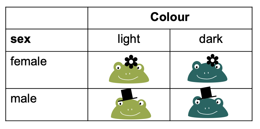
To fill this table with counts, we can imagine different study designs that correspond to different sampling schemes.
Sampling schemes
1. Poisson sampling: Frogs of both sexes and colors could be collected for a fixed period of time, let’s say 10 minutes. They are then sorted into the four categories (male-light, male-dark, female-light, and female-dark).
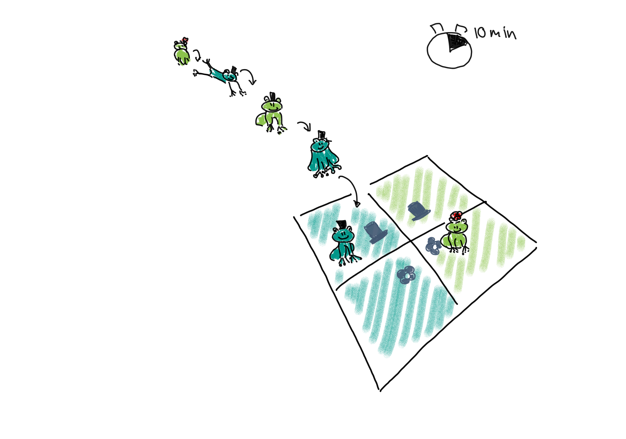
We could describe this process as Poisson sampling, where each category has its own Poisson rate \(\lambda_{r,c}\). We also know that the Poisson distribution is an approximation of binomial distribution, with a rate of
\[\lambda_{r,c} = n * p_{r,c},\]
where in this example, \(n\) is the number of frogs we usually see during the 10 min, and \(p_{r,c}\) is the success probability of a frog belonging to the respective category. The rate \(\lambda_{rc}\) is the expected count for the cell in row \(r\) and column \(c\).
2. Binomial sampling: Maybe there are many more female than male frogs in the lake, and therefore the researchers decided to balance the study by catching 50 male and 50 female frogs, and comparing the proportions or light and dark between those.
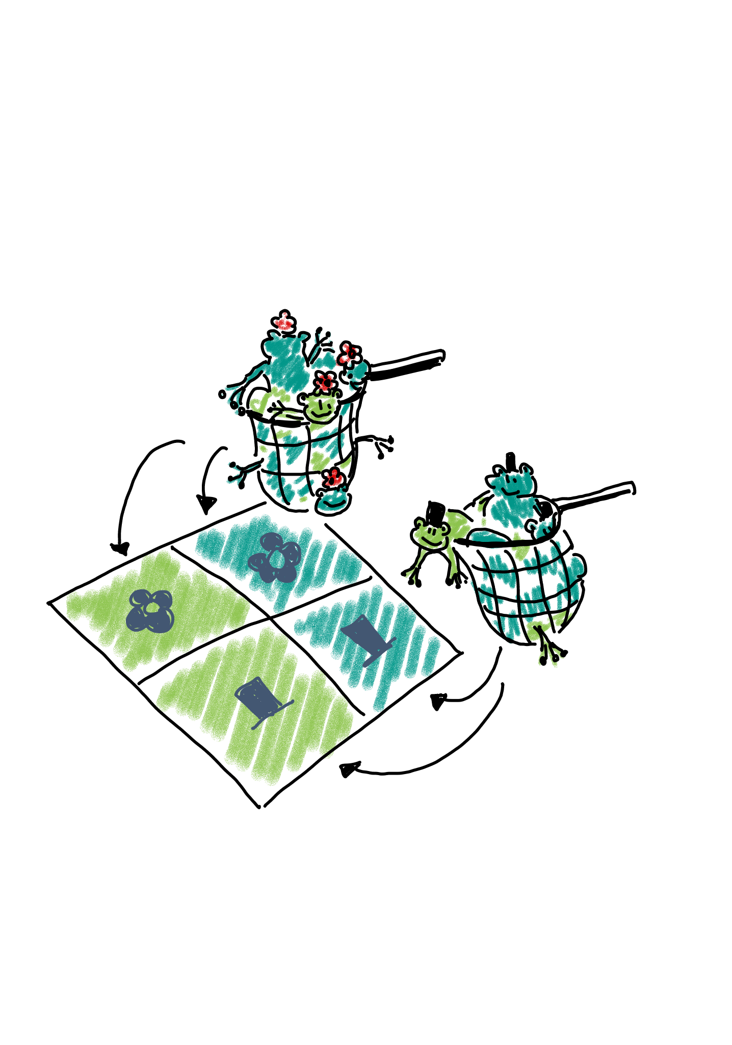
In this case, we could describe the scenario as two binomial sampling processes. In one of them, we have
- a fixed number of \(n_{1\cdot}\) female frogs, and a probability of \(p_{xx}\) for each of them of being light.
- a fixed number of \(n_{2\cdot}\) male frogs, and a probability of \(p_{x}\) for each of them of being light.
The expected count for each cell is \(p_{xx}n_{1\cdot}\).
Multinomial sampling: One could also set up a study in which the total number of frogs is fixed from the beginning, for example the researchers could fill a net with 100 frogs and then sort them into the four categories.
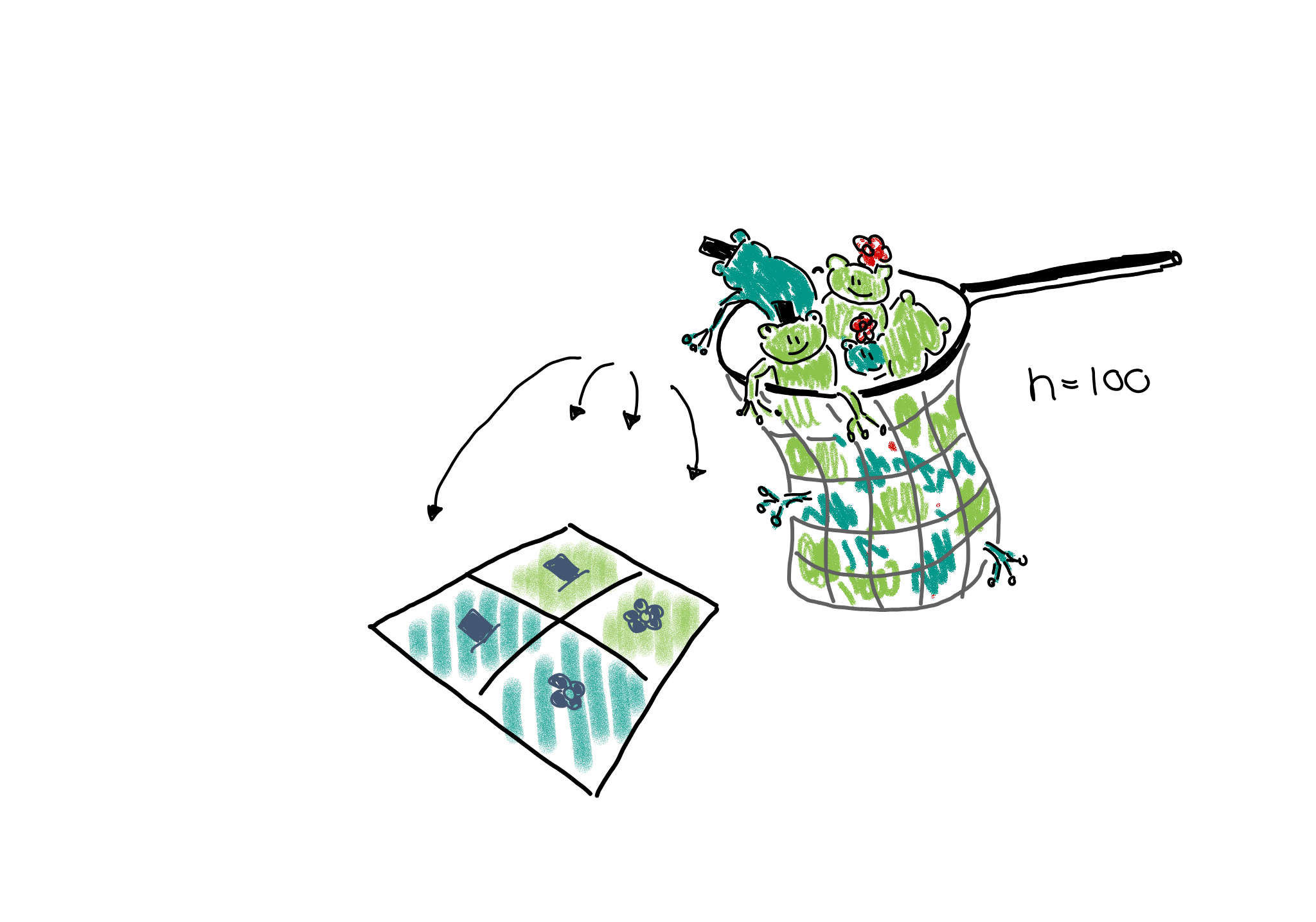
This would be described as a multinomial sampling. There is a fixed number of \(n_{\cdot,\cdot}\) frogs (=events), and there are four different outcomes for each event, each with its own probability \(p_{r,c}\). The expected count in each cell is thus \(n_{\cdot\cdot}p_{rc}\).
If the terms I’m using above sound unfamiliar to you, please revisit the lesson on statistical distributions.
Expected counts
You probably noticed that, irrespective of the sampling scheme, i.e. the data generating process, the expected count for each cell is some multiplication of a probability \(p\) and a number of observations \(n\). If we collect data, we can control the sampling scheme, but, of course, we don’t know the true \(p\)s. If we knew them, we could answer right away whether the proportions of dark frogs are different among female and male frogs.
However, we can make a prediction about how we expect the probabilities – and thus counts – to behave in case the proportions of dark frogs are the same for both sexes. For this, we need an excursion to probability theory.
Probability rule for independence
When we are asking whether the proportions of dark frogs are the same for both sexes, we can rephrase this question and ask: Are the sex and the color independent of each other.
Let’s look at two examples, one for independent and one for dependent probabilities.
As an example for independent events, consider two coins that are being flipped. If no black magic is at work, then the outcome of the first coin flip shouldn’t influence the outcome of the second. The probability of seeing two times head up is therefore
\[P(\text{head},\text{head}) = \overbrace{P(\text{head})}^{\text{first coin}} \cdot \overbrace{ P(\text{head})}^{\text{second coin}} = \frac{1}{2} \cdot \frac{1}{2} = \frac{1}{4} \]
More generally, we can say that if two events \(A\) and \(B\) are independent, then the probability of them occuring together is
\[P(A,B) = P(A) \cdot P(B)\]
This probability rule doesn’t hold when two outcomes are associated with each other. For example, we know that hair and eye color are associated. The probability of having blond hair and blue eyes can not be calculated by multiplying the individual probabilities. Why? Because once we know that someone has blond hair, the probability of also observing blue eyes is much higher than the marginal probability of having blue eyes. The marginal probability is the probability of having blue eyes, averaged over all people of all hair colors. We’d have to calculate
\[P(\text{blond},\text{blue}) = P(\text{blond}) \cdot \overbrace{P(\text{blue|blond})}^{\text{conditional probability}},\] where \(P(\text{blond})\) is the overall (marginal) probability of having blond hair, and \(P(\text{blue|blond})\) is the conditional probability of having blue eyes, for those that have blond hair.
The important part for us to move on with the contingency table analysis is that, when two events or variables \(A\) and \(B\) are associated, then
\[P(A,B) \neq P(A) \cdot P(B).\]
Content from The Chi-Square test
Last updated on 2026-05-05 | Edit this page
Overview
Questions
- What are the null and alternative hypothesis of the chi-square test?
- What are the expected counts under the null hypothesis?
- What is the test statistic for the chi-square test?
- How can I run the chi-square test in R?
Objectives
- Understand the principle behind the chisquare test.
- Be able to apply the chisquare test in R.
A hypothesis test for independence
So far, we have learned that
- in a \(2\times 2\) contingency table, we tabulate the counts according to two variables.
- We are usually interested in whether the two variables are associated.
- If the variables are associated, they should not follow the probability rules for independence.
If we’d like to set up a hypothesis test for whether the two variables are associated, then we have to formulate a null hypothesis, and then calculate the probability of the observed counts under this hypothesis.
Let’s start with the null and alternative hypothesis. The
null hypothesis is that the two variables are
independent.
If we can reject the null hypothesis, we will take on the
alternative hypothesis is that the two variables are
associated.
Expected counts under then null hypothesis
In the chi-square test, which tests the above hypothesis, we start by calculating the expected counts under the null hypothesis, and then check how far the actual data are away from the expectation.
For this, we need to calculate the marginal frequencies of the outcomes of each variable. Remember, the marginal frequencies could also be translated as the overall frequency of this outcome.
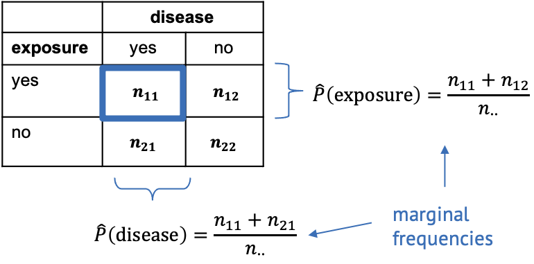
The marginal frequencies are our estimate for the true marginal probabilities, which is why they are noted as \(\hat{P}\) (p hat). Remember that the hat indicates that the quantity below the hat is an estimate.
In the exposure/disease example, we can calculate the estimate for the marginal disease probability as
\[\hat{P}(\text{disease}) = \frac{n_{11}+n_{21}}{n_{\cdot\cdot}}.\]
This means we take the total number of diseased mice in the experiment (those that have been exposed, and those that haven’t been) and divide it by the total number of mice in the experiment. In other words, we calculate the proportion of mice with disease, ignoring that some of them have been exposed to the chemical and others haven’t.
Likewise we can calculate the marginal proportion of exposed mice as
\[\hat{P}(\text{exposed}) = \frac{n_{11} + n_{12}}{n_{\cdot\cdot}},\] meaning we divide the number of all exposed mice (ignoring whether they contracted the disease) by the total number of mice in the experiment.
Let’s add some numbers to this:

In the above table, I’ve added the marginal totals on the sides (I think that’s where the term “marginal” comes from). We see that, in total, 100 out of the 200 mice were exposed to the chemical (by design of the experiment), which gives a marginal proportion of \[\hat{P}(\text{exposure})=\frac{100}{200}=0.5\] of exposed mice. On the other hand, ignoring exposure, 14 out the 200 mice caught the disease during the experiment, giving an estimated marginal probability of
\[\hat{P}(\text{disease})=\frac{14}{200}=0.07.\]
Now, the key point is that we estimated the probabilities of exposure and disease, while ignoring the respective other variable – which is exactly what’s valid to do when the two variables are not associated. So, assuming the null hypothesis is true and the variables are in fact nor associated, we can use these estimated probabilities and apply the probability rule for independence to calculate the estimated counts under the null.
For example, the expected count for exposed, diseased mice is
\[E(n_{11}) = \hat{P}(\text{exposed}) \cdot \hat{P}(\text{disease}) \cdot n_{\cdot\cdot} = 0.5 \cdot 0.07 \cdot 200 = 7.\]
Challenge
Can you calculate the expected count for non-exposed diseased mice under the assumption of independence?
\[E_{22} = \hat{P}(\text{non-exposed}) \cdot \hat{P}(\text{healthy}) \cdot n_{\cdot\cdot} = 0.5 \cdot 0.93 \cdot 200 = 93\]
The Chi-square statistic
If we have expected counts under the assumption of independence, the natural thing to do is compare them with the actual counts. For a hypothesis test, we’d like to have the probability of the observed counts under the assumption of independence, which is one value, while we have four counts. Therefore, in the chi-square test, the discrepancy between observed and expected counts is summarized into one statistic called \(\chi^2\) (chi square):
\[\chi^2 = \sum_{ij}\frac{(O_{ij}-E_{ij})^2}{E_{ij}}\]
where
- \(i\) and \(j\) are the row and column indices,
- \(O\) is the observed count, and
- \(E\) is the expected count.
The value \(\chi^2\) is the sum of squares of the differences between observed and expected counts, normalized by the expected counts, and it quantifies the deviation from independence.
Now we need the probability of the \(\chi^2\) calculated from our data under the assumption of independence. To find a null distribution for \(\chi^2\), you could repeatedly simulate data from a model in which the two variables are independent, and then compare the observed value to the resulting distribution. Since in the previous lessons, we haven’t yet learned how to do this, we’ll stick with textbook knowledge for now:
The textbook tells us that the test statistic \(\chi^2\) follows a so-called \(\chi^2\) distribution (just like the t-statistic follows a t-distribution) with \((r-1)\cdot(r-2)\) degrees of freedom, where \(r\) and \(c\) are the numbers of rows and columns in the contingency table, respectively.
The Chi-square test in R
Let’s look at some results in practice. The test itself is really just one line of code.
R
chisq.test(mytable, correct=FALSE)
OUTPUT
	Pearson's Chi-squared test

data:  mytable
X-squared = 2.765, df = 1, p-value = 0.09635
The output is also rather compact. We learn that R has calculated a
value for \(\chi^2=2.765\).df=1 tells us that it has compared this value to a \(\chi^2\)-distribution with one degree of
freedom. p-value = 0.09635 means that the probability of
observing a \(\chi^2\geq 2.765\) is
around 10%.
We could also perform this calculation ourselves:
R
pchisq(2.765,df=1, lower.tail=FALSE)
OUTPUT
[1] 0.09634669Conclusion: The difference in proportions of diseased mice are not significantly different in the exposure and no-exposure groups.
As a reminder: This doesn’t mean that exposure and disease are not associated, but that the data doesn’t hold enough evidence for a potential association, at a significance level of \(\alpha=0.05\).
Look into the help for the chisq.test function. Why is
there no option to choose between a one-sided and a two-sided test?
Note
In the function call to chisq.test, we used the argument
correct=FALSE. This argument determines whether or not
Yates continuity correction is used. If you want to learn more
about it, have a look here.
My suggested default is to not use it.
Challenge
Assign the output of the chisq.test function call to a
variable, and apply the names function on it. Can you look
at the expected counts for the exposure/disease table?
R
mytest <- chisq.test(mytable, correct =FALSE)
names(mytest)
OUTPUT
[1] "statistic" "parameter" "p.value"   "method"    "data.name" "observed"
[7] "expected"  "residuals" "stdres"
R
mytest$expected
OUTPUT
            diseased healthy
non-exposed        7      93
exposed            7      93
When to apply
The \(\chi^2\) test is applicable to 2-dimensional contingency tables for testing the hypothesis of independence.
- It assumes that all observations are independent (one observation is an event that leads to the count in one cell being increased by 1).
- A rule of thumb is that the expected values of all cells in the contingency table should be >5 in at least 80% of the cells, and the expected cells should not be <1 in any of the cells. If this isn’t the case, an alternative is Fisher’s exact test (see next episode).
Content from Categorical data and statistical power
Last updated on 2026-05-05 | Edit this page
Overview
Questions
- What determines the power of a chi-square test?
- Why is it difficult to determine significance for discrete data?
- What is the Fisher test and when should I use it?
Objectives
- Introduce Fisher’s exact test.
- Explain difficulties with significance testing for discrete p-values.
Statistical power
Statistical power is the probability that an effect is detected as significant with a given method, provided that the effect really exists.
In the lesson on hypothesis testing, we learned that the power depends on
- the size of the effect,
- the significance level,
- the method we choose for testing, and
- the sample size.
In this lesson’s example, the estimated association is not quite small (\(6\%\) difference in proportions, or the risk for getting the disease is more than twice as high for exposed mice), the significance level was the usual \(5\%\), and a sample size of 200 doesn’t seem small, either. Still, the effect is not significant. Does this mean that the \(\chi^2\)-test is useless?
They key here is the low overall probability of mice contracting the disease. Even though there were 200 mice, only a total of 14 out of them actually contracted the disease. And it’s this low number of cases that limits the power of the study.
In fact, if there was a sample of 2000 mice, and only 14 of them caught the disease, then the p-value would hardly change:
R
chisq.test(rbind(
  c(4,996),
  c(10,990)),
correct=FALSE)
OUTPUT
	Pearson's Chi-squared test

data:  rbind(c(4, 996), c(10, 990))
X-squared = 2.5896, df = 1, p-value = 0.1076
Intuitively, we still have 14 cases, and the question is how we’d expect them to distribute among the two groups (exposure and no exposure) by chance.
Thus, the power of the study is limited by the lowest counts in the table. We could also say that extreme frequencies (a low probability of one outcome always corresponds to a high probability of the other outcome) are unfavorable in terms of power. To overcome the problem of a low number of cases, clinical studies are often conducted as case-control studies. In those, the same number of cases and controls are sampled by design. One can then compare the occurrence of certain risk factors (e.g. smoking, exposure, …) between the two groups.
The Fisher test
There is another test, called Fisher test, which is also used on contingency tables, and which tests exactly the same hypothesis as the \(\chi^2\) test. It doesn’t sum up the differences between observed and expected counts, but instead calculates the probability of the observed data using a hypergeometric distribution. The hypergeometric distribution is similar to the multinomial distribution (except that it assumes draws without replacement) and gives exact probabilities for counts to fall into different categories (in this case the cells of the table) under the assumption of independence. See here for more details on the Fisher test.
Apply the Fisher test
Consider the table we’ve been looking at throughout this lesson.
| diseased | healthy | |
|---|---|---|
| not exposed | 4 | 96 |
| exposed | 10 | 90 |
Look up the help for fisher.test. Can you apply this
test on the above data? How do you interpret the result? How does it
compare to the outcome of the \(\chi^2\) test?
R
fisher.test(rbind(c(4,96), c(10,90)))
OUTPUT
	Fisher's Exact Test for Count Data

data:  rbind(c(4, 96), c(10, 90))
p-value = 0.164
alternative hypothesis: true odds ratio is not equal to 1
95 percent confidence interval:
 0.08322597 1.36465456
sample estimates:
odds ratio
 0.3767541
The p-value for the Fisher test is higher than for the \(\chi^2\) test (without correction), but
almost identical to the \(\chi^2\) test
with Yates continuity correction (see below). The conclusion stays the
same: Not significant at \(\alpha=0.05\). The fisher.test
function also gives an odds ratio \(\approx
0.37\). The part that I don’t like about this output is that we
have to guess which odds are being compared. If you look up the measures for
association, you’ll notice that the calculated odds ratio for the
same table was \(\approx 2.7\). There
we looked at the odds of getting the disease in case of exposure,
relative to non-exposure, because this seemed natural. In the
fisher.test function, the ratio was calculated the other
way round. We could change this by switching the rows of the table:
R
fisher.test(rbind(c(10,90),c(4,96)))
OUTPUT
	Fisher's Exact Test for Count Data

data:  rbind(c(10, 90), c(4, 96))
p-value = 0.164
alternative hypothesis: true odds ratio is not equal to 1
95 percent confidence interval:
  0.7327862 12.0154803
sample estimates:
odds ratio
  2.654251
Alternatively, we can calculate the inverse of the result:
R
1/0.3767
OUTPUT
[1] 2.654632If you do your research on which test to use (e.g. ask google),
you’ll stumble upon statements like “the Fisher test is more
conservative”, or “the \(\chi^2\)-test
overestimates significance for small counts”. What does this mean? These
statements both concern errors in hypothesis testing: If the Fisher test
is conservative, this means that it is prone to failing to detect cases
where an effect exists, i.e. it has a low power. On the other hand, if
the \(\chi^2\)-test overestimates
significance, then we have a problem with false positives.
In the next sections, we’ll learn why p-values are a bit tricky to
interpret for categorical data, and how this leads to discussions on
when to use which test.
Significance for discrete data
Let’s recap what it means to choose a significance level of \(\alpha=5\%\): We decide to reject the null hypothesis if the probability of seeing the observed data under the null is \(\leq5\%\).
For continuous probability distributions like the t-distribution used in the t-test, this means that the probability of getting a p-value \(<0.05\) is \(5\%\), the probability of getting a p-value \(<0.1\) is \(10\%\), and so on. This is the definition of the p-value.
So if you have \(1000\) scenarios where nothing is going on and calculate a p-value using a one-sample t-test:
R
set.seed(30)
pvals <- rep(NA,1000)
for(i in seq_along(pvals)){
  pvals[i] <- t.test(rnorm(100), mu=0)$p.value
}
Then in roughly \(10\%\) of the cases, the p-value is below \(0.1\):
R
mean(pvals <0.1)
OUTPUT
[1] 0.111Then in roughly \(20\%\) of the cases, the p-value is below \(0.2\):
R
mean(pvals <0.2)
OUTPUT
[1] 0.218If you make a histogram of the p-values, it will be roughly uniform:
R
data.frame(pvals) %>%
  ggplot(aes(x=pvals))+
  geom_histogram()
OUTPUT
`stat_bin()` using `bins = 30`. Pick better value `binwidth`.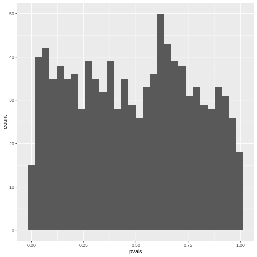
Unfortunately, for discrete data, this is not actually the case.
The following simulation is an attempt to demonstrate this. Suppose
we test the association between the preferred animal of a person (we
give the choice between cat and dog), and their handedness. And let’s
say that being left-handed gives absolutely no information on whether a
person likes cats more than dogs, i.e. the null hypothesis of
independence is true. Further, we assume that the probability of being
left-handed is \(P(L)=0.1\) and the
probability of preferring cats is \(P(C)=0.6\). The hypothetical experiment
will sample 50 left-handed and 50 right-handed persons, and ask them
about their preference for cats or dogs. With this information, we can
simulate such a study using rbinom for generating random
binomial numbers:
R
set.seed(30)
n <- 25
cats_l <- rbinom(n=1, size=n,prob = 0.6)
dogs_l <- n-cats_l
cats_r <- rbinom(n=1, size=n,prob = 0.6)
dogs_r <- n-cats_r

simtable <- rbind(c(cats_l, dogs_l),
                  c(cats_r, dogs_r))
We can also compute the p-value from this table:
R
chisq.test(simtable)
OUTPUT
	Pearson's Chi-squared test with Yates' continuity correction

data:  simtable
X-squared = 0.35651, df = 1, p-value = 0.5505
To see how the p-values behave, let’s run 2000 such simulations and
report the p-value. For this, I use a for-loop around the above code. In
each iteration of the loop, a contingency table under always the same
assumptions is generated, and the p-value is stored in a variable calle
p_vals.
R
set.seed(20)
N=2000
p_vals <- rep(NA,2000)

for(i in seq_along(p_vals)){ # as many iterations as p_vals is long
  cats_l <- rbinom(n=1, size=n,prob = 0.9)
  dogs_l <- n-cats_l
  cats_r <- rbinom(n=1, size=n,prob = 0.9)
  dogs_r <- n-cats_r

  p_vals[i] <- chisq.test(rbind(c(cats_l, dogs_l),
                    c(cats_r, dogs_r)))$p.value
}
As a result of the simulation, p_vals contains 2000
p-values under the assumption that the null hypothesis is true.
R
head(p_vals)
OUTPUT
[1] 1 1 1 1 1 1What percentage of the p-values is smaller than \(0.05\)?
R
mean(p_vals<0.05, na.rm=TRUE)
OUTPUT
[1] 0.004515805We can also make a histogram of all the p-values in the simulation:
R
data.frame(p_vals) %>%
  ggplot(aes(x=p_vals))+
  geom_histogram()
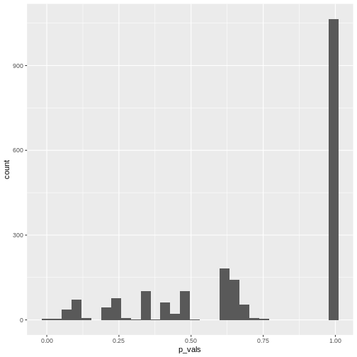 In theory, the histogram should show a uniform distribution (the
probability of getting a p-value \(<0.05\) is \(5\%\), the probability of getting a p-value
\(<0.1\) is \(10\%\), and so on…). But here, instead, the
p-values are discrete: They can only take certain values,
because there’s only a limited number of options how 25 observations can
fall into two categories (dogs/cats).
Since for small counts, the chances to get a p-value \(p<0.05\) are actually below 5% – and this holds also for other values of \(p\) which are not exactly \(0.05\) – we say that the Fisher test is conservative. It means that interpreting the discrete hypergeometric probabilities as continuous p-values will lead us to overestimated p-values. This also holds true when the null hypothesis is actually false, so we’re reducing our chances to run a significant test, even if there’s something to detect.
For a more detailed explanation, see An introduction to Categorical Data Analysis by Alan Agresti.
Now what?
The Fisher test is conservative, especially for low counts. The \(\chi^2\)-test doesn’t have this problem, but at the same time should not be applied to tables with low counts, because it might produce false positives (see the rule of thumb). So what should we do? There is not one commonly accepted answer to this. Some suggestions are:
- Use Fisher’s exact test and accept that it can be conservative. In the end, low counts indicate a small amount of evidence anyways, and you might need to collect more data to detect or confirm an effect.
- In Agresti’s book, you’ll find mid p-values and similar methods that aim at correcting the p-value for its discreteness.
- You can use the \(\chi^2\)-test in conjunction with Yates continuity correction. It applies a correction on the \(\chi^2\) statistic for tables with low expected counts to avoid underestimating the p-value. This method is not perfect either, and can lead to over-correcting.
The important part is that you don’t choose the method based on the p-value it produces for your specific data set. The worst thing you can do is try 3 different methods, choose the one with the lowest p-value and report this one. This is a form of p-value hacking called method hacking and increases your chances to produce false positive results. If your test comes out significant in only one of the tests you tried, be honest and report all of them, or otherwise investigate further, for example by collecting more data.
Content from Complications with biological data
Last updated on 2026-05-05 | Edit this page
Overview
Questions
- When are Fisher- and Chisquare test not applicable for biological data?
- What are alternative methods?
Objectives
- Explain overdispersion and how it can lead to false positives.
- Explain random effects.
- Name some alternative methods.
Overview
The lesson has been using a very simple example to illustrate the principles behind analyzing categorical data.
Of course, biological data are often more complex than can be captured by a \(2\times2\) table.
Some examples for this are:
- There are more than two categories per variable. For instance, 3 different treatments are applied on cultured cells, and individual cells are subsequently categorized into 4 mutually exclusive phenotypes.
- There are more than two variables. For instance, the above experiments could have been carried out in three replicates, such that replicate is the third variable. We are looking for an effect that is consistent across replicates.
Larger tables
Let’s start with the first example, where 3 different treatments are applied on cultured cells, and individual cells are subsequently categorized into 4 mutually exclusive phenotypes. The resulting contingency table could look like this:
| round | spiky | stretched | flat | |
|---|---|---|---|---|
| treatment 1 | 5 | 15 | 30 | 3 |
| treatment 2 | 10 | 37 | 21 | 29 |
| treatment 3 | 1 | 40 | 0 | 14 |
How to visualize the proportions?
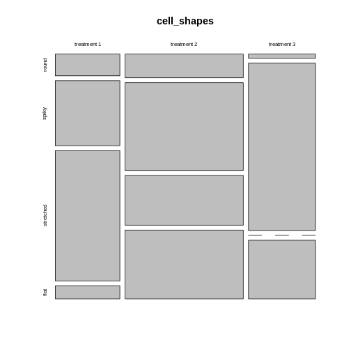
We can still use mosaic plots to visualize the proportions:
R
cell_shapes <- rbind(c(5,15,30,3), c(10,37,21,29), c(1,40,0,14))
rownames(cell_shapes) <- c("treatment 1","treatment 2", "treatment 3")
colnames(cell_shapes) <- c("round", "spiky", "stretched", "flat")

mosaicplot(cell_shapes)
For the brave
Can you turn the cell_shapes table into tidy data, and
make a mosaic plot with ggplot2?
The tricky part is data wrangling:
R
tidy_shapes <- data.frame(cell_shapes, treatment=c("treatment1", "traetment2","treatment3")) %>%
  pivot_longer(cols = 1:4,
               names_to = "shape",
               values_to = "count")

tidy_shapes
OUTPUT
# A tibble: 12 × 3
   treatment  shape     count
   <chr>      <chr>     <dbl>
 1 treatment1 round         5
 2 treatment1 spiky        15
 3 treatment1 stretched    30
 4 treatment1 flat          3
 5 traetment2 round        10
 6 traetment2 spiky        37
 7 traetment2 stretched    21
 8 traetment2 flat         29
 9 treatment3 round         1
10 treatment3 spiky        40
11 treatment3 stretched     0
12 treatment3 flat         14
For plotting, all you need to do is exchange the variable names from the instructions in episode 3:
R
tidy_shapes %>%
  group_by(treatment) %>%
  mutate(sumcount = sum(count)) %>%
  ggplot(aes(x=treatment, y = count, fill=shape, width=sumcount)) +
  geom_bar(stat="identity", position = "fill") +
  facet_grid(~treatment, scales = "free_x", space = "free_x")+
  theme_void()
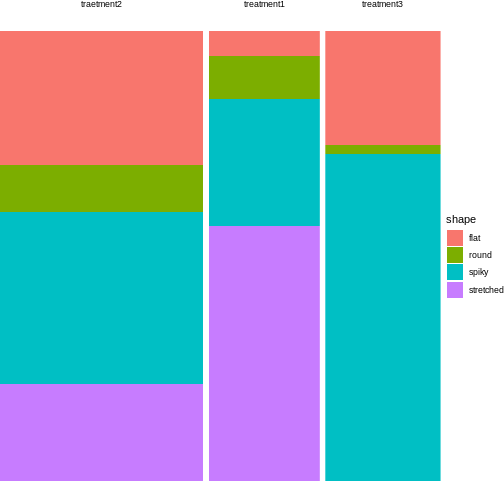 Looks much nicer, doesn’t it?
What are suitable measures for association?
All the measures you learned about are require a \(2\times2\) table. The good news is that you can subset or summarize your \(4\times3\) table into smaller tables and calculate odds ratios or differences in proportions on them.
For example, you could compare treatment 2 and 3 with regards to the ratio of flat and round cells. For this, you subset the table to the relevant rows and columns:
R
shapes_subset <- cell_shapes[2:3,c(1,4)]
shapes_subset
OUTPUT
            round flat
treatment 2    10   29
treatment 3     1   14
The odds for being round (vs. flat) in treatment 2 compared to treatment 3 are:
R
(10/29)/(1/14)
OUTPUT
[1] 4.827586If you are rather interested in the overall proportion of round cells, still comparing treatment 2 and 3, you can subset the columns and summarize some of the rows:
R
round <- cell_shapes[2:3,1,drop=FALSE]
others <- cell_shapes[2:3,2:4,drop=FALSE] %>% rowSums

shapes_summary <- cbind(round,others)
shapes_summary
OUTPUT
            round others
treatment 2    10     87
treatment 3     1     54
Now you can compare the proportions of round cells between the treatments 2 and 3:
R
(10/(10+87)) / (1/(1+54))
OUTPUT
[1] 5.670103The proportion of round cells is 5 times higher in the experiment with treatment 2.
You probably noticed that with larger tables, you have many more options of sub-setting or summarizing them into \(2\times2\) tables. Think carefully about your research question and then decide which comparison you’d like to make.
How to calculate significance?
As soon as you have subset or summarized your larger table into a \(2\times2\) one, you can apply the standard Fisher or \(\chi^2\) test on it, and we’ll come back to this very soon.
But luckily, Fisher’s exact test and the \(\chi^2\) test can also be applied to 2D tables with more than two categories in each dimension, and this should actually be the first step in your hypothesis testing workflow.
A Fisher test on the above \(3\times 4\) table will answer the following question: Is there a difference in phenotype composition between the three treatments?
This is an overall question and it’s controlling for the family-wise error rate. If this test comes out significant, it tells you that under the assumption that phenotype and treatment are not associated in any way (i.e. for each phenotype, the underlying proportion doesn’t vary between treatments), your results are very unlikely.
For the above example, the \(\chi^2\) test is clearly significant:
R
chisq.test(cell_shapes)
WARNING
Warning in chisq.test(cell_shapes): Chi-squared approximation may be incorrectOUTPUT
	Pearson's Chi-squared test

data:  cell_shapes
X-squared = 62.024, df = 6, p-value = 1.744e-11
Now you could do follow-up tests in order to find out which phenotypes are different in their proportions between treatments, for example:
R
fisher.test(shapes_summary)
OUTPUT
	Fisher's Exact Test for Count Data

data:  shapes_summary
p-value = 0.05797
alternative hypothesis: true odds ratio is not equal to 1
95 percent confidence interval:
   0.8335549 273.9339822
sample estimates:
odds ratio
  6.154128
Just as for calculating measures of association, you should ask yourself what information you’re after, before running 10 or more individual comparisons.
3D tables
Note: The notation for this section is borrowed from these materials.
For higher-dimensional tables, life gets yet a bit more complicated. Again, there are different ways of analyzing them, dependent on your research question.
Let’s consider a similar experiment to the one above, where a control and a treatment are compared with respect to the phenotype composition of cells. In this experiment, there are only two possible phenotypes: round and stretched.
A resulting table might look like this:
| round | stretched | |
|---|---|---|
| ctrl | 9 | 39 |
| trt | 21 | 42 |
This still looks familiar. But now, the biologist at work was concerned about the reproducibiliy of the experiment, so she performed it three times. And as a result, we look at a 3-dimensional table, with the replicate as third dimension:
|
|
|
How to create a 3-D table in R
In this lesson, you have seen two versions of representing count data:
- As an array
- As a data frame in tidy format
Coding up the data
R
table1 <- rbind(c(9, 39), c(21,42))
table2 <-  rbind(c(16, 59), c(51,99))
table3 <- rbind(c(7, 40), c(22,41))

table3d <- array(c(table1, table2, table3), dim = c(2,2,3))
table3d
OUTPUT
, , 1

     [,1] [,2]
[1,]    9   39
[2,]   21   42

, , 2

     [,1] [,2]
[1,]   16   59
[2,]   51   99

, , 3

     [,1] [,2]
[1,]    7   40
[2,] 22 41A data frame in tidy format would look like this:
R
rep1 <- data.frame(
  replicate = rep("1",4),
  trt = c(rep("ctrl",2), rep("trt",2)),
  shape = c("round","stretched", "round", "stretched"),
  count = c(9, 39, 21 ,42)
)

rep2 <- data.frame(
  replicate = rep("2",4),
  trt = c(rep("ctrl",2), rep("trt",2)),
  shape = c("round","stretched", "round", "stretched"),
  count = c(16, 59, 51, 99)
)

rep3 <- data.frame(
  replicate = rep("3",4),
  trt = c(rep("ctrl",2), rep("trt",2)),
  shape = c("round","stretched", "round", "stretched"),
  count = c(7, 40, 22, 41)
)

tidy_table <- rbind(rep1, rep2, rep3)
tidy_table
OUTPUT
   replicate  trt     shape count
1          1 ctrl     round     9
2          1 ctrl stretched    39
3          1  trt     round    21
4          1  trt stretched    42
5          2 ctrl     round    16
6          2 ctrl stretched    59
7          2  trt     round    51
8          2  trt stretched    99
9          3 ctrl     round     7
10         3 ctrl stretched    40
11         3  trt     round    22
12         3  trt stretched    41
We’ll come back to the tidy format later in this lesson. For this episode, we stay with the 3D table in array format.
Conditional independence
In data with replicates, we usually expect that the replicates behave
similarly and that evidence from the replicates can be aggregated. In
our example, we expect similar odds ratios in all three replicates. We
can confirm this by extracting the odds ratio estimates in the
fisher.test function for each of them:
R
fisher.test(table1)$estimate
OUTPUT
odds ratio
 0.4647027
R
fisher.test(table2)$estimate
OUTPUT
odds ratio
 0.5278675
R
fisher.test(table3)$estimate
OUTPUT
odds ratio
 0.3293697
We can also look at the p-value for each \(\chi^2\)-test:
R
chisq.test(table1)$p.value
OUTPUT
[1] 0.1340615R
chisq.test(table2)$p.value
OUTPUT
[1] 0.0712236R
chisq.test(table3)$p.value
OUTPUT
[1] 0.03239296The p-value of the \(\chi^2\)-test is only \(<0.05\) for the third replicate, meaning that for replicates 1 and 2 there is not enough evidence for an association between treatment and morphology. But if we take the three replicates together, what will the overall conclusion look like?
Discussion
We could easily bring the above scenario down to a classical \(2\times2\) table by pooling the counts across replicates. What could be problematic about this approach?
The replicate might have an effect on the row and column sums. Have a look at the Simpson’s paradox.
Let’s try it
Use the above code for creating an array and sum up the counts across replicates.
R
rowSums(table3d, dims=2)
OUTPUT
     [,1] [,2]
[1,]   32  138
[2,]   94  182
To avoid the danger of replicates being confounded with a variable of interest, one should stratify by replicate. Stratify means: split the analysis by replicate, and then combine the results.
This is what the Cochran-Mantel-Haenszel test does. It calculates
- a common odds ratio and
- a modified chi-square,
taking the replicates into account.
Let’s stay with the examples above:
| 9 | 39 |
| 21 | 42 |
| 16 | 59 |
| 51 | 99 |
| 7 | 40 |
| 22 | 41 |
We’d like to test whether the composition of cell types is independent of the treatment, and at the same time stratify by replicate (i.e. look at the replicates separately).
We say that we test for conditional independence, because we are interested in the independence of cell type composition and treatment, and we test conditional on the replicate.
The null hypothesis is:
\(H_0: \Theta_{XY(1)} = \Theta_{XY(1)} = ... = \Theta_{XY(K)}=1\)
with \(\Theta_{XY(i)}\) being the odds ratio between the variables X and Y for repliate \(k\).
How can we do this? For each replicate, we have a \(2\times 2\) table, on which we could run a \(\chi^2\)-test, based on the \(\chi^2\) statistic. The Cochran-Mantel-Haenszel test is based on a very similar statistic:
\[ M^2 = \frac{\lbrack\sum_k(n_{11k}-\mu_{11k})\rbrack^2}{\sum_k Var(n_{11k})} \] with
\[\mu_{11k} = E(n_{11}) = \frac{n_{1+k} n_{+1k}}{n_{++k}}\] and
\[\text{Var}(n_{11k}) = \frac{n_{1+k}n_{2+k} n_{+1k} n_{+2k}}{n^2_{++k}(n_{++k}-1)}\]
Under the null hypothesis, \(M^2\) follows a chi-square distribution with 1 degree of freedom.
We don’t need to go into the details of how variance is calculated, but notice that in the numerator, the counts for each replicate \(n_{11k}\) are compared to an expected value \(\mu_{11k}\) (expected under the null), which is calculated from that same replicate \(k\). The squared differences between expected and observed from each replicate are then summed up to constitute the across-replicates statistic \(M^2\). That way, each replicate is first treated separately, and then results are combined.
The p-value from the Cochran-Mantel-Haneszel test tells us whether we have enough evidence to reject the null hypothesis that the odds ratios for all replicates are 1.
In R, we can run this test on a 3D table like the one created above:
R
mantelhaen.test(table3d)
OUTPUT
	Mantel-Haenszel chi-squared test with continuity correction

data:  table3d
Mantel-Haenszel X-squared = 10.895, df = 1, p-value = 0.000964
alternative hypothesis: true common odds ratio is not equal to 1
95 percent confidence interval:
 0.2869095 0.7185351
sample estimates:
common odds ratio
        0.4540424
The test is highly significant. By aggregating the information from all three replicates, we were able to increase the power of the test.
The test also gives a common odds ratio, which is estimated as \(\widehat{OR}_{MH} = 0.780\).
It is calculated as follows:
\[\widehat{OR}_{MH} = \frac{\sum_k(n_{11k}n_{22k})/n_{++k}}{\sum_k(n_{12k}n_{21k})/n_{++k}}\]
Remember that the odds ratio for a \(2\times2\) table is calculated as
\[\widehat{OR}=\frac{n_{11}n_{22}}{n_{12}n_{21}}.\] So the common odds ratio is similar to a weighted sum of individual odds ratios, where those partial tables (=replicates) with more total counts have more impact on the OR estimate.
Homogeneous association
The common odds ratio and the Cochran-Mantel-Haenszel test assume homogeneous association: the conditional odds ratios (i.e. odds ratios for each replicate) don’t depend on the replicate. The marginal distributions of the two variables might still change between replicates, this is not contradicting homogeneous association.
For example:
- If the fraction of treated cells is different in replicate 1 than in replicate 2, this is alone doesn’t exclude homogeneous association. The odds ratios could still be the same in both replicates.
- If in replicate 1 the fraction of untreated round cells is twice the fraction of treated round cell, while in replicate 2 the fraction of untreated round cells is half the fraction of treated round cells, then homogeneous association is (likely) not met.
Ways to check for homogeneous association include:
- calculating individual odds ratios for the partial tables
- eye-balling the data, e.g. through the mosaic plots
- formal testing using the Breslow-Day-test
- formal testing for a three-way interaction (see below).
Three-way interactions
There are situations where you may be interested in how a third variable influences the association between the other two. Let’s assume in the example above, you don’t have two replicates, but instead measured the association between treatment and cell shape in two different temperatures. Your hypothesis is that the effect of the treatment on cell shape composition is temperature-dependent. This question does not come with an off-the-shelf test to address it.
Instead, we have to switch to a method called generalized linear model. Actually, it’s not so much of a switch, but a change in perspective, as both Fisher test and Cochran-Mantel-Haenszel test can be seen as special cases of generalized linear models. In a generalized linear model, an association between two variables - such as cell shape and treatment, which we investigated using the Fisher test - is called a two-way interaction, and the association between three variables - such as cell shape, treatment and temperature - is called a three-way interaction. In the next episode, we’ll explain generalized linear models in more detail.
Additional variance
When we’re using Fisher’s or \(\chi^2\) test, we model the data as having been obtained from a particular sampling scheme, like Poisson, binomial or multinomial sampling. These assume that there is an underlying rate, or probability, at which events occur, and which doesn’t vary. For example, we could say that patients show up at a hospital at an average rate of 16 patients per day (\(\lambda=16\)), and if we took 5 samples at 5 different days, we’d assume the same Poisson rate for each day. The counts would vary from day to day, but with a variance of \(var=\lambda\), which is the expected randomness for a Poisson counting process. See also the lesson on distributions.
The problem is, that in biology, we often have experiments where we deal with additional variance that can’t be explained by the normal variance that’s inherent to Poisson counting. For example, if we model read counts from RNA sequencing, it turns out that the (residual) variance is much higher than \(\lambda\), because the expression of a particular gene usually depends on more factors than just the experimentally controlled condition(s). It is also influenced by additional biological and possibly technical variance, such that the counts vary considerably between replicates.
Why is this a problem?
If we still analyze these data with methods that assume Poisson variance, this increases the risk for false positives. Intuitively speaking, the increased variance can produce extreme counts in one or more of the cells, leading to higher proportions than would be expected by chance under the assumption of independence and Poisson sampling. So the Fisher test can mistake noise for a difference in proportions.
What to do?
First of all, think about the data that you’re looking at, and how they were produced. If you have several replicates, you have a chance to estimate the variance in your data.
In a typical \(2\times2\) table, you just have one count per cell, and a different condition in each cell, so there is no chance to infer the variance from looking at the data. In this case you have to ask yourself, whether it’s likely that you’re overlooking additional variance, and be aware that the data might not perfectly match the assumptions of your test, so don’t over-interpret the p-value that you get – which is always a good advice.
If you do have several counts per condition, you can consider to model your data using a generalized linear model of the negative binomial family, which we’ll discuss in the next episode.
Content from Modeling count data
Last updated on 2026-05-05 | Edit this page
Overview
Questions
- What is a generalized linear model (GLM) and how can count data be represented with it?
- How can tests for association be implemented with GLMs?
- How can GLMs help to account for biological variance?
Objectives
- Provide a workflow for modeling count data with replicates.
NOTE: This episode is work in progress.
How to model fractions
Let’s consider the example from the previous lesson, and focus on the fractions of round cells in the control group only.
Remember that our data.frame with the counts looks like
this:
R
tidy_table
OUTPUT
   replicate condition     shape count
1          1      ctrl     round     9
2          1      ctrl stretched    39
3          1       trt     round    21
4          1       trt stretched    42
5          2      ctrl     round    16
6          2      ctrl stretched    59
7          2       trt     round    51
8          2       trt stretched    99
9          3      ctrl     round     7
10         3      ctrl stretched    40
11         3       trt     round    22
12         3       trt stretched    41
OUTPUT
, , 1

     [,1] [,2]
[1,]    9   39
[2,]   21   42

, , 2

     [,1] [,2]
[1,]   16   59
[2,]   51   99

, , 3

     [,1] [,2]
[1,]    7   40
[2,]   22   41
We combine the counts from each replicate to calculate totals and observed fractions:
R
tidy_data <- tidy_table %>%
  pivot_wider(
    names_from = shape,
    values_from = count
  ) %>%
  mutate(total = round + stretched) %>%
  mutate(fraction = round/total)

tidy_data
OUTPUT
# A tibble: 6 × 6
  replicate condition round stretched total fraction
  <chr>     <chr>     <dbl>     <dbl> <dbl>    <dbl>
1 1         ctrl          9        39    48    0.188
2 1         trt          21        42    63    0.333
3 2         ctrl         16        59    75    0.213
4 2         trt          51        99   150    0.34
5 3         ctrl          7        40    47    0.149
6 3         trt          22        41    63    0.349
Then can extract the ctrl counts only:
R
ctrl_data <- tidy_data %>%
  filter(condition == "ctrl")
ctrl_data
OUTPUT
# A tibble: 3 × 6
  replicate condition round stretched total fraction
  <chr>     <chr>     <dbl>     <dbl> <dbl>    <dbl>
1 1         ctrl          9        39    48    0.188
2 2         ctrl         16        59    75    0.213
3 3         ctrl          7        40    47    0.149
We can model the fraction with a GLM of the binomial family:
R
glm.binom <- glm(cbind(round,stretched) ~ 1 ,
      data= ctrl_data,
      family= binomial("logit"))
coefficients(glm.binom)
OUTPUT
(Intercept)
  -1.461518
Model formula: This GLM models fractions as a
function of the variables we supply behind the ~ sign in
the model formula. In our case, we didn’t give any variables, just an
intercept (denoted by 1). The intercept therefore
represents the fraction of round cells estimated from the data.
Logit link: Linear models assume that data are Gaussian distributed around their predictions. For fractional data, this is not the case. For this reason, the prediction happens on a logit-transformed level. We model
\[\mu = \text{logit}(X\beta)\],
where \(\mu\) is the predicted count, and \(X\beta\) is the linear predictor, a linear combination of the variables \(X\) and the coefficients \(\beta\) (including the intercept).
If all this doesn’t sound familiar to you, the important bit is that the coefficients that the GLM of a binomial family returns to us need to be transformed in order to be interpretable.
The logit of a probability \(p\) is given by \(\ln(\frac{p}{1-p})\). It’s also called the log odds.
The transformation from a value \(x\) on the logit scale to fractions is:
\[\text{fraction} = \frac{\exp(x)}{1 + \exp(x)}\] Let’s transform our intercept into a fraction:
R
x <- coefficients(glm.binom)
exp(x)/(1+exp(x))
OUTPUT
(Intercept)
  0.1882353
We can compare this fraction with what we get by calculating a fraction from pooled counts:
R
sum(ctrl_data$round) / sum(ctrl_data$total)
OUTPUT
[1] 0.1882353We learn: The GLM of the binomial offers an alternative way to calculate fractions.
How to model odds ratios
Models are good for determining how observations depend on variables. Observations in our case are fractions, and a meaningful variable can be the treatment. We can add it in the model formula as shown below. We use the full data set, not the one filtered for control data only.
R
glm.binom.1var <- glm(cbind(round,stretched) ~ condition ,
      data= tidy_data,
      family= binomial("logit"))
This model gives us two coefficients:
R
coefficients(glm.binom.1var)
OUTPUT
 (Intercept) conditiontrt
  -1.4615178    0.8008059
Intercept is the logit-transformed fraction (log odds)
of round cells in the reference state, which is the ctrl
group. By default, R sets the reference state by alphabetical order, and
ctrl is before trt.conditiontrt is the coefficient which describes how the log
odds for being round change when the condition is
trt instead of ctrl.
We can combine the two coefficients in the linear predictor \(X\beta\) to calculate the fraction for treated cells.
R
xb <- sum(coefficients(glm.binom.1var))
exp(xb)/(1+exp(xb))
OUTPUT
[1] 0.3405797Let’s compare to the pooled fraction of round cells in the treatment condition:
R
trt_data <- tidy_data %>% filter(condition == "trt")
sum(trt_data$round) / sum(trt_data$total)
OUTPUT
[1] 0.3405797The conditiontrt coefficient can also be interpreted as
a log odds ratio. We can calculate the observed log odds ratio on pooled
data, which is given by
\(\log(\frac{n_{11} n_{22}}{n_{12}n_{21}})\).
Here is the estimate from the data:
R
observed_odds_ratio <- sum(ctrl_data$round) * sum(trt_data$stretched) / (sum(ctrl_data$stretched)* sum(trt_data$round))

observed_log_odds <- log(observed_odds_ratio)

observed_log_odds
OUTPUT
[1] -0.8008059It coincides with the conditiontrt coefficient with a
flipped sign:
R
coefficients(glm.binom.1var)[2]
OUTPUT
conditiontrt
   0.8008059
If you exchange the first and second column of the table (or the first and second row), the log odds ratio will also flip sign.
Mathematical explanation
We know that
- the coefficient
Interceptgives the log odds for being round in the control condition: \(\text{Int}=\text{log odds}_{ctrl}\) - the sum of the coefficients
conditiontrtandInterceptgive the log odds ratio for being round in the treatment condition: \(\text{Intercept}+ \text{conditiontrt} = \text{log odds}_{trt}\)
Therefore the coefficient conditiontrt can be expressed
as
\[\text{conditiontrt} = \text{log odds}_{ctrl} - \text{log odds}_{trt} = log(\frac{odds_{ctrl}}{odds_{trt}})\] We learn that GLMs of the binomial family allow us to estimate odds ratios.
Connection to Chi-square / Fisher test
Set up pooled table:
R
pooled_table <- rbind(
  c(sum(ctrl_data$round) , sum(ctrl_data$stretched)),
    c(sum(trt_data$round) ,sum(trt_data$stretched))
)
pooled_table
OUTPUT
     [,1] [,2]
[1,]   32  138
[2,]   94  182
R
chisq.test(pooled_table, correct = FALSE)
OUTPUT
	Pearson's Chi-squared test

data:  pooled_table
X-squared = 12.046, df = 1, p-value = 0.0005192
R
null_model <- glm(cbind(round,stretched) ~ 1 ,
      data= tidy_data,
      family= binomial("logit"))
R
anova(null_model, glm.binom.1var, test = "Rao")
OUTPUT
Analysis of Deviance Table

Model 1: cbind(round, stretched) ~ 1
Model 2: cbind(round, stretched) ~ condition
  Resid. Df Resid. Dev Df Deviance    Rao  Pr(>Chi)
1         5     13.349
2         4      0.839  1    12.51 12.046 0.0005192 ***
---
Signif. codes: 0 '***' 0.001 '**' 0.01 '*' 0.05 '.' 0.1 ' ' 1Conclusion: A chi-square test is a special case of a
GLM. Testing for the parameter conditiontrt, which tells us
how different the fractions for control and treatment are, is the same
as testing for association of the variables condition and
morphology.
(See also here how to reproduce the result of a chi-square test with a GLM of the poisson family.)
How to add replicates
Let’s add the replicates to the model:
R
glm.binom.repl <- glm(cbind(round,stretched) ~ condition + replicate ,
      data= tidy_data,
      family= binomial("logit")
)

summary(glm.binom.repl)
OUTPUT
Call:
glm(formula = cbind(round, stretched) ~ condition + replicate,
    family = binomial("logit"), data = tidy_data)

Coefficients:
             Estimate Std. Error z value Pr(>|z|)
(Intercept)  -1.47922    0.26630  -5.555 2.78e-08 ***
conditiontrt  0.79276    0.23468   3.378  0.00073 ***
replicate2    0.06314    0.26300   0.240  0.81027
replicate3   -0.03887    0.30841  -0.126  0.89972
---
Signif. codes:  0 '***' 0.001 '**' 0.01 '*' 0.05 '.' 0.1 ' ' 1

(Dispersion parameter for binomial family taken to be 1)

    Null deviance: 13.3492  on 5  degrees of freedom
Residual deviance:  0.6751  on 2  degrees of freedom
AIC: 34.903

Number of Fisher Scoring iterations: 3
This model estimates the fractions for each replicate separately. It say that the effect of the treatment is identical for all replicates (i.e. assumes homogeneous association), and calculates a separate effect of the replicate.
We can compare to the model that only considers the impact of the replicate on the fraction of round cells, but not of the condition.
R
glm.repOnly <- glm(cbind(round,stretched) ~ replicate ,
      data= tidy_data,
      family= binomial("logit")
)
R
anova(glm.repOnly, glm.binom.repl, test = "Rao")
OUTPUT
Analysis of Deviance Table

Model 1: cbind(round, stretched) ~ replicate
Model 2: cbind(round, stretched) ~ condition + replicate
  Resid. Df Resid. Dev Df Deviance    Rao  Pr(>Chi)
1         3    12.8144
2         2     0.6751  1   12.139 11.703 0.0006239 ***
---
Signif. codes:  0 '***' 0.001 '**' 0.01 '*' 0.05 '.' 0.1 ' ' 1
And we can compare to the Cochran-Mantel-Haenszel test.
R
mantelhaen.test(table3d)
OUTPUT
	Mantel-Haenszel chi-squared test with continuity correction

data:  table3d
Mantel-Haenszel X-squared = 10.895, df = 1, p-value = 0.000964
alternative hypothesis: true common odds ratio is not equal to 1
95 percent confidence interval:
 0.2869095 0.7185351
sample estimates:
common odds ratio
        0.4540424
We’ve seen three methods to answer the same question: Does the condition have an impact on the fraction of round cells, when controlling for the effect of the replicate (and assuming the replicate doesn’t have alter the effect of the condition)?
- Use a Wald test for the
conditiontrtcoefficient, given bysummary(glm.binom.repl). It yields a p-value of \(~0.0007\). - Compare the models with the formulae
~replicate(glm.repOnly) and~condition + replicate(glm.repl) using theanovafunction. This yields a p-value of \(~0.0006\). - Use the Cochran-Mantel-Haenszel test, which gives a p.value of \(~0.0009\).
We see that the methods are not identical, but give extremely similar results and lead to the same conclusion: When controlling for the replicate (stratifying the analysis), we seen a clear effect of the condition on the fraction of round cells.
Three-way interaction
If the model glm.binom.repl doesn’t fit well, this is
evidence that the replicate has an impact on the effect of the
treatment. Finally, we really need the GLM, because there is no
off-the-shelf test that we can apply to test for three-way
interaction.
A model with three-way interaction looks like this:
R
glm.threeway <- glm(cbind(round,stretched) ~ condition * replicate ,
      data= tidy_data,
      family= binomial("logit")
)
summary(glm.threeway)
OUTPUT
Call:
glm(formula = cbind(round, stretched) ~ condition * replicate,
    family = binomial("logit"), data = tidy_data)

Coefficients:
                        Estimate Std. Error z value Pr(>|z|)
(Intercept)              -1.4663     0.3698  -3.965 7.33e-05 ***
conditiontrt              0.7732     0.4563   1.695   0.0902 .
replicate2                0.1614     0.4650   0.347   0.7285
replicate3               -0.2766     0.5519  -0.501   0.6162
conditiontrt:replicate2  -0.1315     0.5633  -0.233   0.8154
conditiontrt:replicate3   0.3472     0.6677   0.520   0.6030
---
Signif. codes:  0 '***' 0.001 '**' 0.01 '*' 0.05 '.' 0.1 ' ' 1

(Dispersion parameter for binomial family taken to be 1)

    Null deviance:  1.3349e+01  on 5  degrees of freedom
Residual deviance: -7.7716e-15  on 0  degrees of freedom
AIC: 38.228

Number of Fisher Scoring iterations: 3
We see no evidence that the replicate has an impact on the odds
ratio, because the coefficients conditionttrt:replicate2
and conditiontrt:replicate3 are not significant.
How to check for overdispersion
We have three replicates, so for each condition, we have three observed fractions of round cells.
Let’s visualize this:
R
tidy_data %>%
  ggplot(aes(x=condition, y=fraction))+
  geom_point()
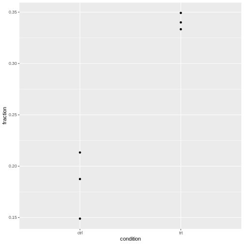 It’s normal that for lower counts, the fractions are jumping around
more. For eyeballing purposes, it’s therefore recommended to use stacked
bar plots.
The question is whether the counts vary more than expected by a binomial model.
Intuitive approach
- Compare expected to observed variance and calculate a ratio of these
- don’t over-interpret, because we calculate this from 3 replicates only
- show exemplary for control
To be added: Source, or theory for this?
Determine overdispersion through model
Take the model without the replicate and check for overdispersion:
R
library(performance)
check_overdispersion(glm.binom.1var)
ERROR
Error:
! Package `DHARMa` required for this function to work.
  Please install it by running `install.packages("DHARMa")`.
Or the one with the replicate included:
R
check_overdispersion(glm.binom.repl)
ERROR
Error:
! Package `DHARMa` required for this function to work.
  Please install it by running `install.packages("DHARMa")`.
For our cell data, we are fine.
Content from Overdispersed data
Last updated on 2026-05-05 | Edit this page
Overview
Questions
- Which models account for biological variability?
Objectives
- Provide a workflow for modeling count additional variability
NOTE: This episode is work in progress.
For the theory in this section, see this study.
The data for this episode
I simulate data that has the same structure and covariates as in the last episode, but different counts:
- Again, we have
roundandstretchedas possible cell shapes. - We compare the fraction of round and stretched in a control and
treatment
condition. - There are three replicates of the resulting \(2\times 2\) table.
- I simulate negative binomial cell counts where
- the probability of a cell being round is constant \(p=1/3\) in all replicates and conditions.
- I.e.: Neither treatment nor replicate have an effect.
In biological terms, imagine we have new data of the same type, but unlike last time, replicates are now taken on different days by three different technicians.
data generation
R
set.seed(4)
mysize <- 2
ctrl_round <- rnbinom(3,size =mysize , mu = 10)
ctrl_stretched <- rnbinom(3, size = mysize, mu=20)

trt_round <- rnbinom(3, size = mysize, mu= 10)
trt_stretched <- rnbinom(3, size=mysize, mu=20)

cells2 <- data.frame(
  condition = c(rep("ctrl",6), rep("trt",6)),
  shape = rep(c(rep("round",3), rep("stretched",3)),2),
  count = c(ctrl_round, ctrl_stretched, trt_round, trt_stretched),
  replicate = rep(c("1","2","3"),4)
)
This is what the data looks like.
R
cells2
OUTPUT
   condition     shape count replicate
1       ctrl     round     7         1
2       ctrl     round     5         2
3       ctrl     round    11         3
4       ctrl stretched     3         1
5       ctrl stretched    59         2
6       ctrl stretched    22         3
7        trt     round     9         1
8        trt     round     8         2
9        trt     round     4         3
10       trt stretched    49         1
11       trt stretched    59         2
12       trt stretched    26         3
We bring the data in a suitable format:
R
cells2F <- cells2 %>%
  pivot_wider(
    names_from = "shape",
    values_from = "count"
  ) %>%
  mutate(total = round + stretched) %>%
  mutate(fraction = round/total)

cells2F$replicate <- factor(cells2F$replicate)

cells2F
OUTPUT
# A tibble: 6 × 6
  condition replicate round stretched total fraction
  <chr>     <fct>     <dbl>     <dbl> <dbl>    <dbl>
1 ctrl      1             7         3    10   0.7
2 ctrl      2             5        59    64   0.0781
3 ctrl      3            11        22    33   0.333
4 trt       1             9        49    58   0.155
5 trt       2             8        59    67   0.119
6 trt       3             4        26    30   0.133
We add a variable called obs for “observation”. Each
fraction of round cells is an observation in this experiment. We’ll need
this variable for modeling variability.
R
cells2F <- cells2F %>%
  mutate(obs = factor(1:n()))

cells2F
OUTPUT
# A tibble: 6 × 7
  condition replicate round stretched total fraction obs
  <chr>     <fct>     <dbl>     <dbl> <dbl>    <dbl> <fct>
1 ctrl      1             7         3    10   0.7    1
2 ctrl      2             5        59    64   0.0781 2
3 ctrl      3            11        22    33   0.333  3
4 trt       1             9        49    58   0.155  4
5 trt       2             8        59    67   0.119  5
6 trt       3             4        26    30   0.133  6
Binomial model
Start by setting up a model as in last episode:
R
binomial.model <- glm( cbind(round,stretched) ~ condition + replicate ,
      data= cells2F,
      family= binomial("logit")
)

summary(binomial.model)
OUTPUT
Call:
glm(formula = cbind(round, stretched) ~ condition + replicate,
    family = binomial("logit"), data = cells2F)

Coefficients:
             Estimate Std. Error z value Pr(>|z|)
(Intercept)   -0.4504     0.4182  -1.077  0.28151
conditiontrt  -0.8821     0.3770  -2.340  0.01930 *
replicate2    -1.3813     0.4481  -3.083  0.00205 **
replicate3    -0.3438     0.4491  -0.765  0.44401
---
Signif. codes:  0 '***' 0.001 '**' 0.01 '*' 0.05 '.' 0.1 ' ' 1

(Dispersion parameter for binomial family taken to be 1)

    Null deviance: 25.212  on 5  degrees of freedom
Residual deviance: 10.495  on 2  degrees of freedom
AIC: 39.205

Number of Fisher Scoring iterations: 4
Model assumptions:
- This model allows the fraction to vary by replicate
- We assume the replicate doesn’t change how the condition impacts the
fractions (otherwise there would be an interaction between
replicateandcondition). - We don’t assume variability on the observation level that goes beyond binomial variability.
Model finding:
- According to
binomial.model, the fractions are significantly different for control and treatment (in each replicate). The Wald test forconditiontrtgives \(p = 0.019\).
We can now check for overdispersion, based on this model:
R
library(performance)
check_overdispersion(binomial.model)
ERROR
Error:
! Package `DHARMa` required for this function to work.
  Please install it by running `install.packages("DHARMa")`.
This test doesn’t find sufficient evidence for overdispersion – which
doesn’t mean it’s not present. Overdispersion in this case means that on
top of the between-replicate variability, the fractions vary on the
observation level. It is hard to detect, because a lot of the
variability will be attributed to the replicate variable in
the model.
We can check visually:
R
cells2F %>%
  ggplot(aes(x=condition, y=fraction))+
  geom_point()
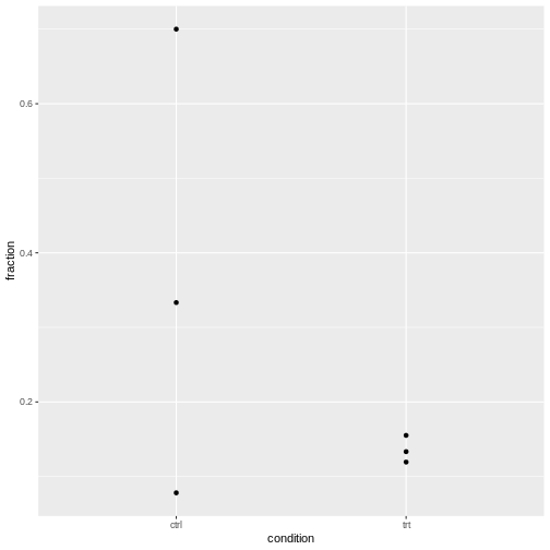
We should account for the overdispersion, to ensure the differences between control and treatment were not due to overdispersion.
Including overdispersion in models
We try two ways:
- observation-level random effects
- Beta-binomial model
OLRE
Fit linear model with random effect replicate observation level (OLRE). This is accounting for unmodeled, random variability at the observation level (replicate).
R
library(lme4)
glmer.olre <- glmer(cbind(round,stretched) ~ condition  + (1|replicate) + (1|obs),
      data= cells2F,
      family= binomial("logit"))
This model has two random effects:
-
(1|replicate)for the effect of the replicate on fractions. -
(1|replicate:condition): observation-level random effect (fractions are allowed additional variability within the replicates)
R
summary(glmer.olre)
OUTPUT
Generalized linear mixed model fit by maximum likelihood (Laplace
  Approximation) [glmerMod]
 Family: binomial  ( logit )
Formula: cbind(round, stretched) ~ condition + (1 | replicate) + (1 |      obs)
   Data: cells2F

      AIC       BIC    logLik -2*log(L)  df.resid
     43.4      42.5     -17.7      35.4         2

Scaled residuals:
     Min       1Q   Median       3Q      Max
-0.83577 -0.02100  0.04574  0.12325  1.14415

Random effects:
 Groups    Name        Variance Std.Dev.
 obs       (Intercept) 0.4256   0.6523
 replicate (Intercept) 0.1388   0.3725
Number of obs: 6, groups:  obs, 6; replicate, 3

Fixed effects:
             Estimate Std. Error z value Pr(>|z|)
(Intercept)   -0.9341     0.5184  -1.802   0.0715 .
conditiontrt  -0.9657     0.6547  -1.475   0.1402
---
Signif. codes:  0 '***' 0.001 '**' 0.01 '*' 0.05 '.' 0.1 ' ' 1

Correlation of Fixed Effects:
            (Intr)
conditintrt -0.660
The OLRE model estimates a variance for both random effects. Note that it attributes the majority of the variance to the observations, not the replicate. This implies that obser
Betabinomial model
The betabinomial mode below - models the replicate as a random effect (drawn from a normal distribution), - and on top of that, it assumes that individual probabilities (on the observation level) are drawn from a betabinomial distribution.
Citing from Harrison, 2015:
“[…] instead of drawing observed counts directly from a Binomial distribution with mean \(p_i\), we draw the Binomial probabilities from a beta distribution with parameters \(a\) and \(b\):
\(\text{beta}.p_i ~ \text{Beta}(a_i, b_i)\)
\(a_i = \frac{p_i}{\phi}\)
\(h_i ~ \text{Binomial}(c_i, \text{beta}.p_i)\)”
Load required library:
R
library(glmmTMB)
Set up the model and look at the summary:
R
model.glmmTMB <- glmmTMB(cbind(round,stretched) ~ condition + (1|replicate),
                            family=betabinomial(link = "logit"),
                            data=cells2F)
R
summary(model.glmmTMB)
OUTPUT
 Family: betabinomial  ( logit )
Formula:          cbind(round, stretched) ~ condition + (1 | replicate)
Data: cells2F

      AIC       BIC    logLik -2*log(L)  df.resid
     44.2      43.4     -18.1      36.2         2

Random effects:

Conditional model:
 Groups    Name        Variance Std.Dev.
 replicate (Intercept) 0.217    0.4659
Number of obs: 6, groups:  replicate, 3

Dispersion parameter for betabinomial family (): 22.1

Conditional model:
             Estimate Std. Error z value Pr(>|z|)
(Intercept)   -0.8986     0.4747  -1.893   0.0584 .
conditiontrt  -0.9135     0.6060  -1.508   0.1317
---
Signif. codes:  0 '***' 0.001 '**' 0.01 '*' 0.05 '.' 0.1 ' ' 1
Finding Both models conclude that there is no difference in the fraction of round cells between control and treatment. Accordingly, in the data generation process, I used equal fractions. None of the model is perfect in telling where the variability is coming from. They both attribute some of the variability to the replicate, which was not how the data was generated.
