All Images
Introduction to Categorical Data
Figure 1
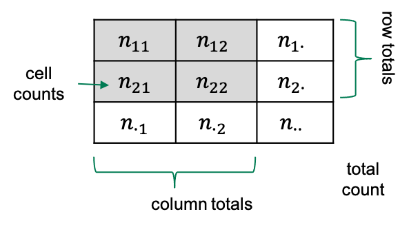
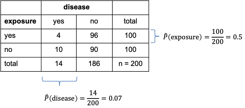
Quantifying association
Figure 1
Consider the following data: 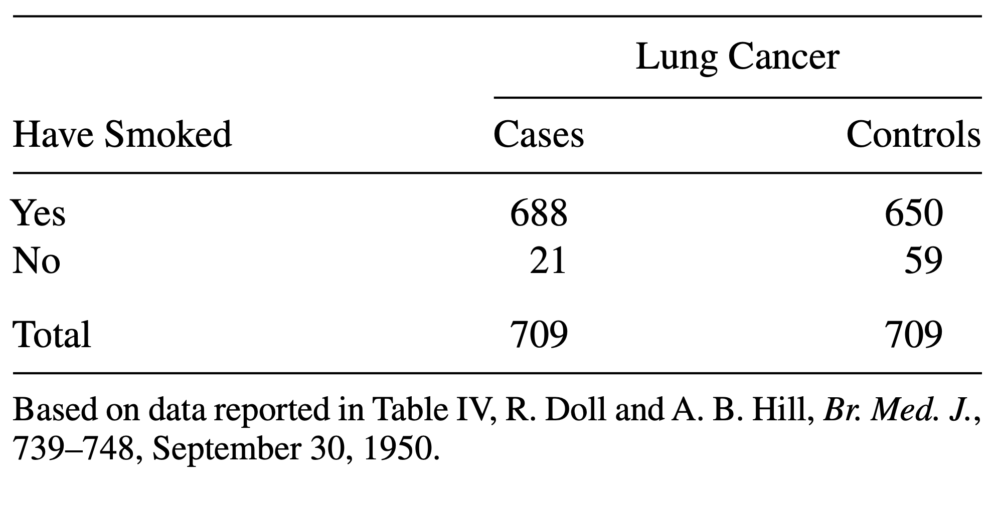
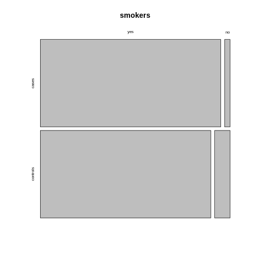
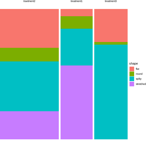
Visualizing categorical data
Figure 1
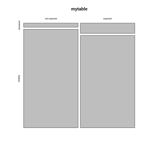 The mosaic plot consists of rectangles representing the
contingency table’s cells. The areas of the rectangles are proportional
to the respective cells’ count, making it easier for the human eye to
compare the proportions.
The mosaic plot consists of rectangles representing the
contingency table’s cells. The areas of the rectangles are proportional
to the respective cells’ count, making it easier for the human eye to
compare the proportions.
Figure 2
 Using the argument
 sort, you can determine how the
rectangles are aligned. You can align them by rows as follows:
Figure 3
 Alternatively, you can run the plotting function on the
transposed contingency table:
Alternatively, you can run the plotting function on the
transposed contingency table:
Figure 4
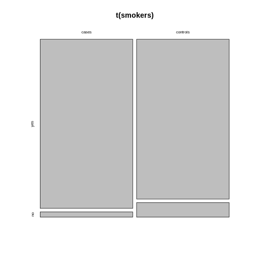
Figure 5
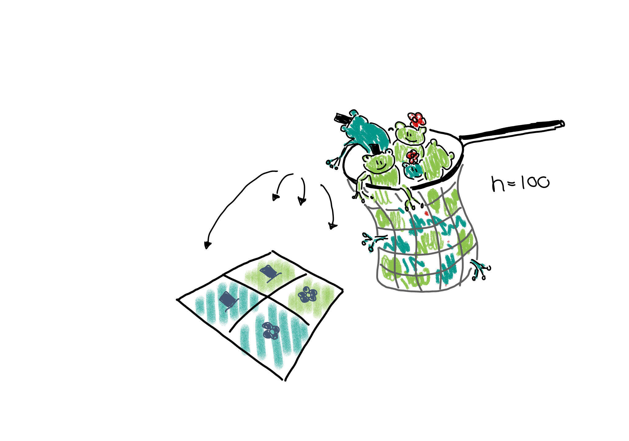
Sampling schemes and probabilities
Figure 1
Figure 2
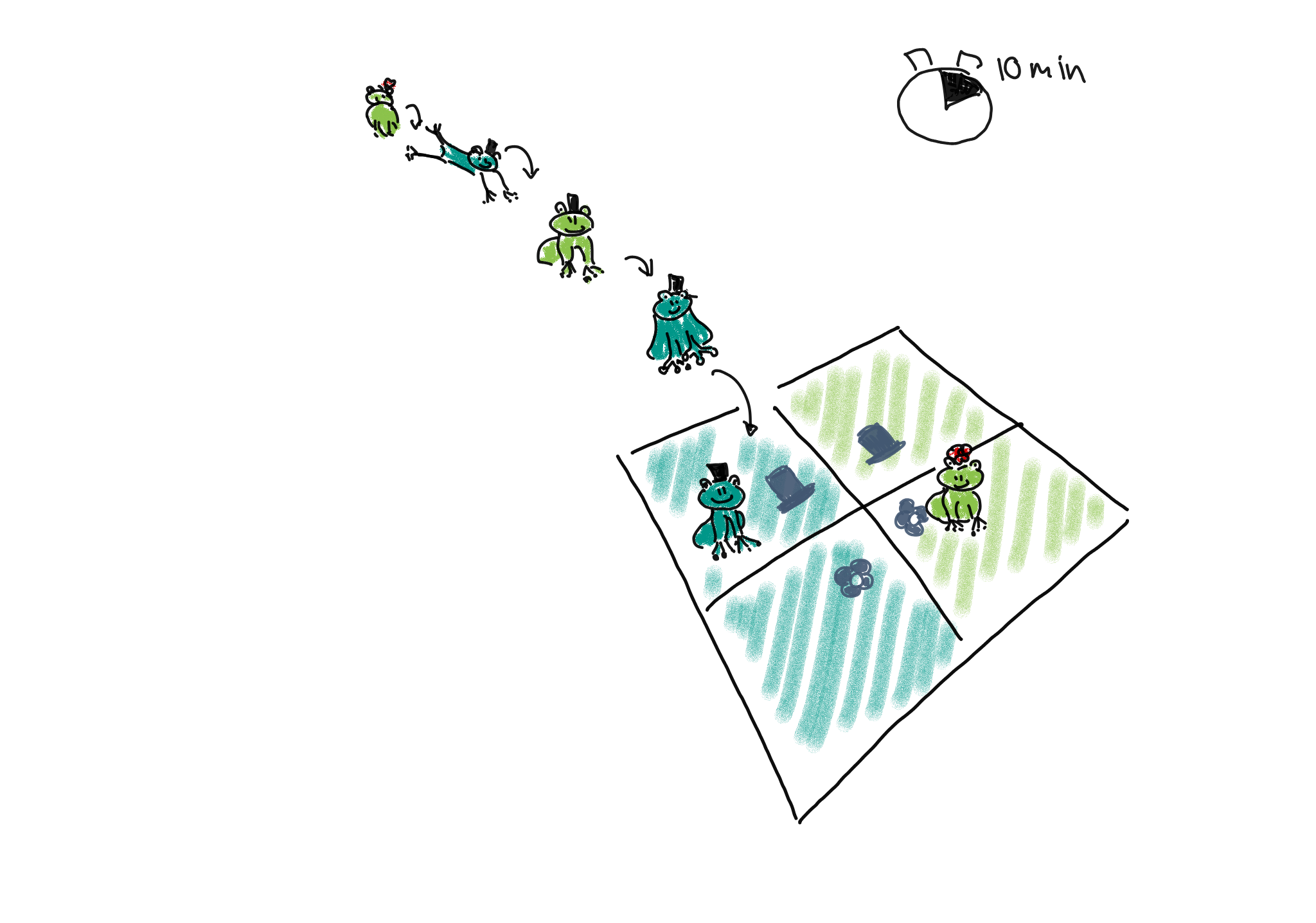
Figure 3
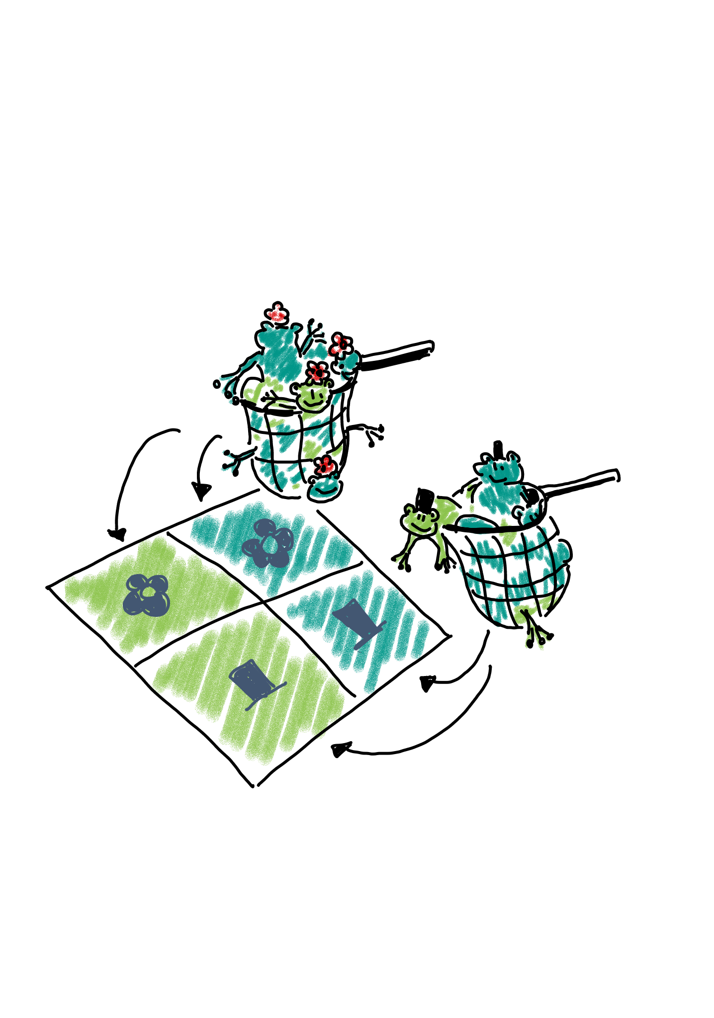
Figure 4
The Chi-Square test
Figure 1
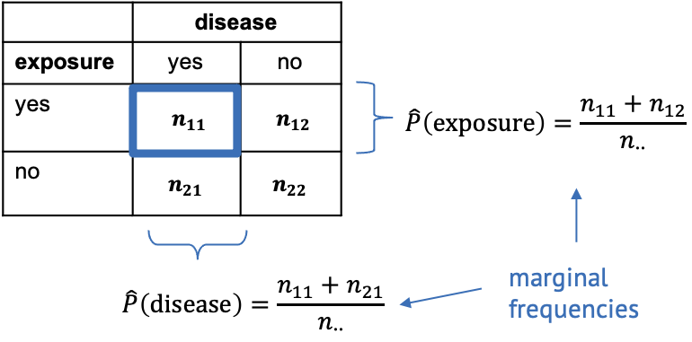
Figure 2
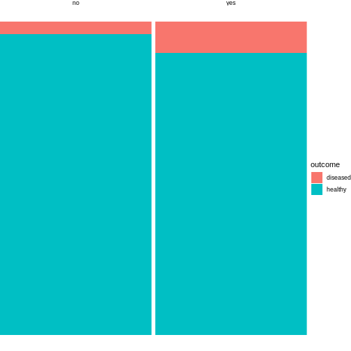
Categorical data and statistical power
Figure 1
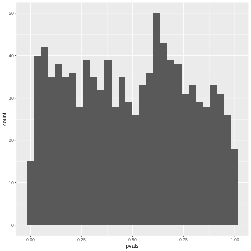
Figure 2
 In theory, the histogram should show a uniform distribution (the
probability of getting a p-value \(<0.05\) is \(5\%\), the probability of getting a p-value
\(<0.1\) is \(10\%\), and so on…). But here, instead, the
p-values are discrete: They can only take certain values,
because there’s only a limited number of options how 25 observations can
fall into two categories (dogs/cats).
In theory, the histogram should show a uniform distribution (the
probability of getting a p-value \(<0.05\) is \(5\%\), the probability of getting a p-value
\(<0.1\) is \(10\%\), and so on…). But here, instead, the
p-values are discrete: They can only take certain values,
because there’s only a limited number of options how 25 observations can
fall into two categories (dogs/cats).
Complications with biological data
Figure 1
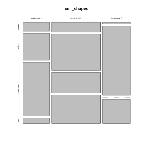
Figure 2
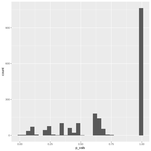
 Looks much nicer, doesn’t it?
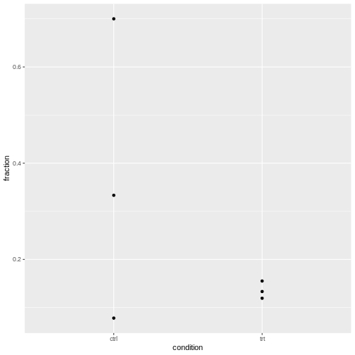
Modeling count dataHow to model fractionsHow to model odds ratiosHow to add replicatesHow to check for overdispersion
Figure 1
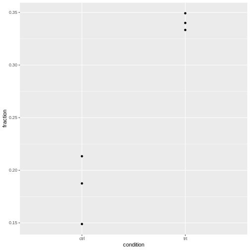 It’s normal that for lower counts, the fractions are jumping around
more. For eyeballing purposes, it’s therefore recommended to use stacked
bar plots.
It’s normal that for lower counts, the fractions are jumping around
more. For eyeballing purposes, it’s therefore recommended to use stacked
bar plots.
Overdispersed dataThe data for this episode
Figure 1