Histograms in R
Last updated on 2024-03-12 | Edit this page
Overview
Questions
- How can I plot a histogram of my data in R?
- How can I compare my data to a distribution using histograms?
Objectives
- Give examples for and practice plotting histograms with
ggplotandgoodfit. - Learn to interpret the results.
Start with some data
For demonstration, let’s simulate frog counts and sizes with random draws from a Poisson and a Gaussian distribution. This code should by now look familiar to you:
R
set.seed(51) # set a seed for reproducibility
frog_counts <-rpois(n = 200, lambda = 4)
frog_sizes <- rnorm(n = 200, mean = 7, sd = 2)
frog_counts_different_lakes <- rnbinom(n=200, size=2, mu=4)
Plotting a histogram
We can then use ggplot2 to plot histograms from the
simulations. The histogram will have a shape that is specific for the
distribution:
R
data.frame(frog_counts) %>%
  ggplot(aes(x=frog_counts))+
  geom_histogram(binwidth=1)
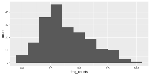
An automatic bin-width of 30 is chosen. Decide for yourself whether
this gives you a good overview over your data. It’s often a good idea to
play around with the binwidth parameter.
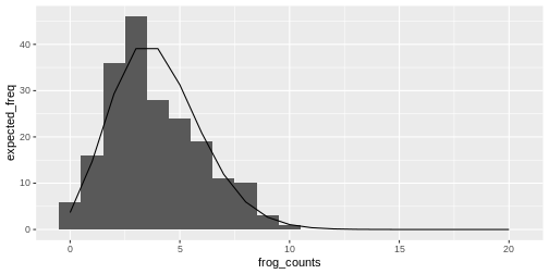
Relation between histogram and distribution function
The theoretical distribution gives the expected frequency of the random numbers.
For example for the Poisson frog counts, we can calculate the expected frequency of the counts from 0 to 20:
R
counts <- 0:20
expected_freq <- dpois(counts, lambda = 4) * length(frog_counts)
Then we can plot the expected counts as a line on top of the histogram:
R
data.frame(frog_counts) %>%
  ggplot(aes(x=frog_counts))+
  geom_histogram(binwidth=1)+
  geom_line(data=data.frame(counts,expected_freq), aes(counts,expected_freq))
The goodfit function
You might not want to code this plot every time you visually inspect a fit. Luckily, there are convenient functions that do this for you.
The goodfit function from the vcd package
allows you to fit a sample to a discrete distribution of interest.
Here, we fit the frog counts to a Poisson:
R
library(vcd)
my_fit <- goodfit(frog_counts,"poisson")
my_fit$par
OUTPUT
$lambda
[1] 3.83
R
plot(my_fit)
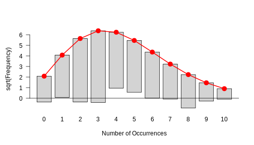
This is how a good fit looks like: The bars all roughly stop at zero, some above and some below, which is due to the sample’s randomness.
This histogram in the above challenge should show you that there is a systematic problem: The bars at the periphery hang very low and those around the peaks hang high. This indicates that the fit isn’t too good.
Exercise: Fit a Gamma-Poisson
Start with the following set-up:
R
set.seed(51) # set a seed for reproducibility
frog_counts_different_lakes <- rnbinom(n=200, size=2, mu=4)
- Fit the frog counts from different lakes with a Gamma-Poisson
distribution instead (hint: in the
goodfitfunction, it is callednbinomial). - Can you make out the visual difference between a good and a bad fit?