The QQ-plot
Last updated on 2024-03-12 | Edit this page
Overview
Questions
- What is the QQ-plot?
- How can I create a QQ-plot of my data?
- Why is it useful?
Objectives
- Demonstrate the calculation of quantiles in R.
- Explain the QQ-plot.
- Introduce functions to make a qq-plot in R.
The QQ-plot
The qq-plot compares the quantiles of two distributions.
Quantiles are the inverse of the cumulative distribution, i.e., the
qnorm function is the inverse of pnorm:
You can use pnorm to ask for the probability of seeing a
value of \(-2\) or smaller:
R
pnorm(q = -2,mean=0, sd=2)
OUTPUT
[1] 0.1586553Then you can use qnorm to ask that is the value for
which 15% of the other values are smaller. Here, I demonstrate this by
plugging the result into the pnorm function into the
qnorm function:
R
qnorm(p= pnorm(q = -2,mean=0, sd=2), mean=0, sd=2)
OUTPUT
[1] -2Let’s compare the quantiles of the simulated frog sizes to the theoretical quantiles of a normal distribution. There are specialized functions for qq-plots, so we don’t have to calculate the theoretical values by hand:
R
data.frame(frog_sizes) %>%
  ggplot(aes(sample=frog_sizes))+
  geom_qq()+
  geom_qq_line()
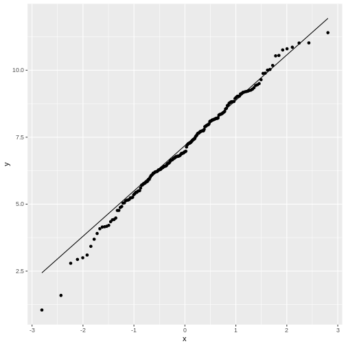
By default, the geom_qq function assumes that we compare
to a standard normal distribution.
This fit doesn’t look too bad, although for low values the points stray
away from the line. This shouldn’t surprise you, because remember: The
normal distribution approximates the Poisson distribution (with which
the simulation was generated) well for large values, but has limitations
for low-valued counts.
Let’s set up a qq-plot where we compare to a Poisson distribution:
R
data.frame(frog_counts) %>%
  ggplot(aes(sample=frog_counts))+
  geom_qq(distribution=qpois, dparams=list(lambda=mean(frog_counts)))+
  geom_abline()
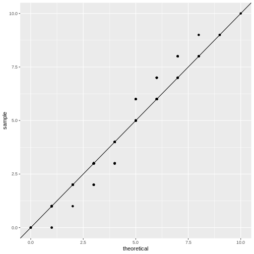
This fit looks better. We can still argue whether a qq-plot is the best representation for a Poisson fit, because due to the distribution’s discreteness, many data points end up on the exact same spot in the plot (overplotting). Thus, we loose information in this visualization.
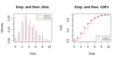
One fits all - fitdistrplus package
If you want a quick overview, you can use the
fitdistrplus package, which produces a series of plots.
Suppose you fit the frog counts to a normal distribution:
R
library(fitdistrplus)
my_fit <- fitdist(frog_counts, dist = "norm")
my_fit # gives you the parameter estimates
OUTPUT
Fitting of the distribution ' norm ' by maximum likelihood
Parameters:
     estimate Std. Error
mean 3.830000  0.1495176
sd   2.114498  0.1057248
R
plot(my_fit)
With some practice, this plot quickly allows you to see that you are comparing discrete data to a continuous distribution. Also, the QQ-plot doesn’t really give a straight line and the histogram seems to be skewed to the left, compared to theory.
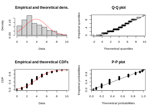
R
my_fit <- fitdist(frog_counts, dist = "pois")
plot(my_fit)