The distribution of t in practice
Last updated on 2024-03-12 | Edit this page
Estimated time: 12 minutes
Overview
Questions
- Is the t-statistic normally distributed?
- What is the t-distribution?
Objectives
- Introduce the t-distribution and why it’s useful for small samples.
The big question is: Is the central limit theorem valid for this example? After all, it says something like “if we have enough data points”… do we have enough data points?
The following code snipped will read a file with mice weights from a
URL, and apply some transformations on it. If you run this, you will
have a vector called population with 841 mice
measurements.
R
mice_pheno <- read_csv(file= url("https://raw.githubusercontent.com/genomicsclass/dagdata/master/inst/extdata/mice_pheno.csv"))
mice_pheno <- filter(mice_pheno, !is.na(Bodyweight))
population <- mice_pheno$Bodyweight
We will assume that those 841 measurements constitute the population
of mice.
We can calculate the the population average and use it as \(\mu_0\).
R
mu0 <- mean(population)
Now we draw a sample of 20 mice again and again, and calculate the statistic \(t\) each time. This way, we have a scenario where the null hypothesis is true (the population average doesn’t differ from \(\mu_0\)) and we can check how \(t\) behaves.
R
# set a seed for reproducibility
set.seed(21)

# choose sample size
N <- 20

# initialize vector for a loop,
# we will sample 10000 times
null_t <- rep(NA, 10000)

for(i in seq_along(null_t)){ # loop for sampling 10000 times
  null_sample <- sample(population, N) # draw a sample from the population
  se <- sqrt(var(null_sample)/N) # calculate the standard error
  null_t[i] <- (mean(null_sample)-mu0) / se # calculate t
}
- The histogram is not very suspicious.
R
data.frame(t = null_t) %>%
  ggplot(aes(x=t)) +
  geom_histogram()
OUTPUT
`stat_bin()` using `bins = 30`. Pick better value with `binwidth`.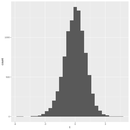
- The qq-plot
R
data.frame(t = null_t) %>%
  ggplot(aes(sample=t))+
  stat_qq()+ stat_qq_line()
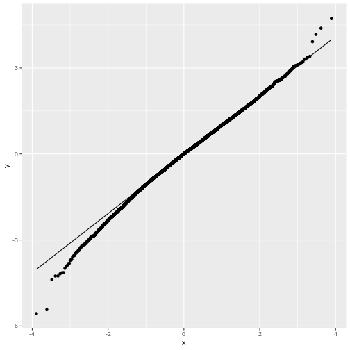
You may notice that in general, around 0 the distribution looks like
a normal distribution. But at low and high values (called: the tails)
the distribution of null_t doesn’t behave like a normal
distribution. This becomes more obvious in the QQ-plot, where the points
don’t match the line at the sides.
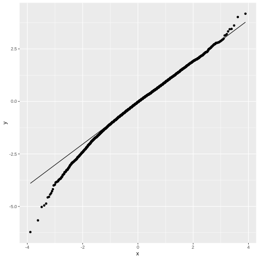
Feel free to play with the sample size N in the below
code chunk, to see how the distribution of \(t\) changes with the sample size:
R
# choose sample size
N <- 20

# initialize vector for a loop,
# we will sample 10000 times
null_t <- rep(NA, 10000)

for(i in seq_along(null_t)){ # this is the loop in which we sample
  null_sample <- sample(population, N) # draw a sample from the population
  se <- sqrt(var(null_sample)/N) # calculate the standard error
  null_t[i] <- (mean(null_sample)-mu0) / se # calculate t
}

data.frame(null_t) %>%
  ggplot(aes(sample=null_t))+
  stat_qq()+ stat_qq_line()
The t-distribution
We have seen that for small sample sizes, the central limit theorem doesn’t hold, and the values of \(t\) that we calculate from the data, don’t follow a normal distribution.
The distribution of \(t\)s looks perfectly normal “in the middle”, but not at the tails: We say that the distribution has heavy tails, because \(t\) tends to take extreme values (extremely small or extremely large) more often than we would expect from a normal distribution.
The good news is, we can still run a test on small samples, by using the \(t\)-distribution as a null distribution for \(t\). This distribution looks like the normal distribution, but with heavy tails. It has one parameter, \(\nu\), which specifies the degrees of freedom. Without going into detail, \(\nu\) is closely connected to the number of data points (for a one-sample t-test, \(\nu=N-1\)). In the figure below, you see how the t-distribution changes with the sample size:

For large samples, i.e. high values of \(\nu\), the heavy tails vanish and the t-distribution becomes more and more similar to a normal distribution, which is exactly what the central limit theorem tells us.
Summary: We can use the t-distribution as a null distribution for \(t\), without worrying about the sample size.
T-test in R
For our example, you already calculated \(t=2.57\) from the data for the mice on diet, and the probability of \(t\) under the standard normal distribution. As a reminder:
R
t_stat <- 2.567434
(1-pnorm(t_stat, mean=0, sd=1))*2
OUTPUT
[1] 0.01024543- Get a p-value by calculating the probability of \(t\) under the t-distribution. You will need to specify the degrees of freedom, which is \(N-1\) for a one-sample t-test.
R
t_stat <- 2.567434 # this is the value for t
N <- 20 # the sample had 20 data points
- Try the function
t.testto calculate the p-value:
R
weights <- c(31.41, 28.29, 22.82, 26.07, 31.97, 22.60, 31.47, 29.18, 22.98, 23.26, 23.48, 20.88, 28.44, 30.34, 23.14, 22.80, 24.47, 39.73, 25.71, 22.74)
mu0 <- 23.89338
- Calculating the p-value using the t-distribution:
R
t_stat <- 2.567434
N <- 20
(1-pt(t_stat,df=N-1))*2
- Using
t.test
R
weights <- c(31.41, 28.29, 22.82, 26.07, 31.97, 22.60, 31.47, 29.18, 22.98, 23.26, 23.48, 20.88, 28.44, 30.34, 23.14, 22.80, 24.47, 39.73, 25.71, 22.74)
mu0 <- 23.89338

t.test(weights, mu = mu0)
The latter two outcomes should match (except for rounding errors). The first result should be similar to the other two.