Content from Overview and motivation
Last updated on 2024-03-12 | Edit this page
Estimated time: 5 minutes
Overview
Questions
- What is a hypothesis test used for?
- What are the general steps of a hypothesis test?
Objectives
- Introduce an example scenario for hypothesis testing.
- Describe null and alternative hypothesis.
An example
What is a hypothesis test, and why do we need it? Consider the following example:
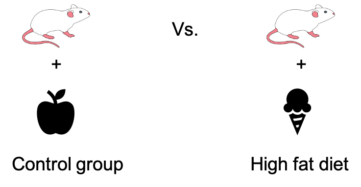
Researchers want to show that mice that are fed with a special “high fat” diet, grow to a different weight than mice that live on a normal, control diet. They feed a group of mice with the control diet, and another group of mice with the high fat diet. After a couple of weeks, they measure the weight.
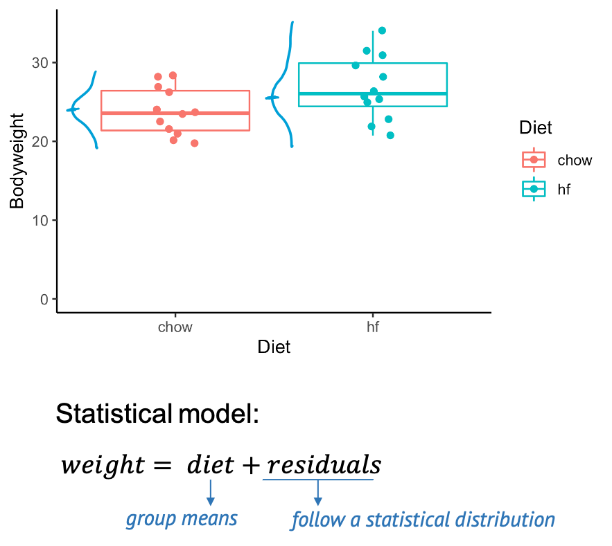
The above graph shows you a subset of a real data set from this paper. You see the individual control mice on the left, and the high fat mice on the right. The boxes that are overlaid indicate the median weights of both groups. The scientific question is whether the high fat diet has an impact on the weight. And phrased in a quantitative manner, we can ask whether there is a difference in weight between the mice from the two different groups. On the graph we certainly see a difference in means, but the problem is, of course, that this difference could be due to chance. Because we only have a sample of mice for each diet, and there is obviously some variation in the mouse weights. The good news is: If we know the rules for this variation, we can calculate how likely it is to see this difference by chance – which is exactly what a statistical test does.
A statistical model
When testing, we assume a statistical model for the data, for example we say that the weight of the individual mice is the composed of the diet effect (in this case the group means), plus something called residuals, which describe the effect of variation, and which follow a some distribution. If we measure mice weights, we will most likely assume that the residuals follow a Gaussian distribution, that means the weights show a bell shaped distribution around the group means.
Null and alternative model
Actually, it’s not only one model, but two: The null model, and the alternative model, which describe the null and the alternative hypothesis.
| Hypothesis | Description | Corresponding model |
|---|---|---|
| Null hypothesis (H0) | There is no difference between the two diet groups. | \(\text{weight} = \text{grand mean} + \text{residuals}\) |
| Alternative hypothesis (H1) | There is a difference between the two diet groups. | \(\text{weight} = \text{group means} + \text{residuals}\) |
We start by assuming that there is nothing to see in the data. This
is called the null hypothesis. In this case, the null hypothesis is that
there is no difference between the two groups of mice. This is described
by the null model, where the data are sufficiently
described by an overall average weight (not distinguishing between
diets) and individual differences, called residuals. We reject the null
hypothesis when – assuming it was true – it would be very unlikely to
observe a difference as extreme as in our data just by chance.
In this case, we accept the alternative hypothesis – that there is a
difference in weights. This hypothesis is described by an
alternative model, which includes the diet as a
variable. So in summary, we use quantitative models to be able to
calculate the probability of our data under the hypothesis that we want
to test.
Steps of hypothesis testing
Let’s recapitulate what happens during hypothesis testing. Ideally, you undertake the following steps:
- Set up a null model or null hypothesis
- Collect data
- Calculate the probability of the data in the null model
- Decide: Reject the null model if the above probability is too small.
Content from Our first test: Disease prevalence
Last updated on 2024-03-12 | Edit this page
Estimated time: 17 minutes
Overview
Questions
- What is the null distribution?
- How can we use the null distribution to make a decision in
hypothesis testing?
- How can we run a hypothesis test in R?
Objectives
- Give an example for a simple hypothesis test, including setting up
the null and alternative hypothesis and the corresponding null model,
and decision making.
- Demonstrate how p-values can be calculated from either cumulative
probabilities or the
.testfunctions in R.
Throughout the next episodes, we consider a research project where we want to find out whether the prevalence of a disease in a test group is different from the population average. We’ll conduct a very simple test to answer that question.
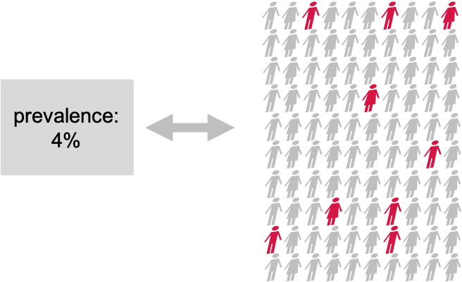
Suppose There is a disease with a known prevalence of 4%. This means, 4% of the whole population have this disease. Now you are interested in whether a certain pre-condition, let’s say overweight, or living in a certain area, changes the risk of getting the disease. You take 100 persons with this precondition and you check the disease prevalence within the test group. 9 out of the 100 test persons have the disease.
Null and alternative hypothesis
This is how we can formalize the hypotheses: Our null hypothesis is the “boring” outcome. If there is nothing to see in the data, then the prevalence in the test group is also 4%, just as in the whole population. We want to collect evidence against this hypothesis. If we have enough evidence against the null, we reject it, and accept the alternative hypothesis that the prevalence in the test group differs from 4%. This test is so easy, because the null model is simply the well-known binomial distribution with a sample size of 100 and a probability of 4%:
\[ H_O: X \sim Bin(N=100, p=0.04)\]
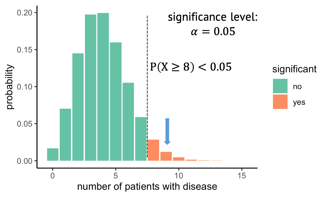
The null distribution
We can look at this distribution:
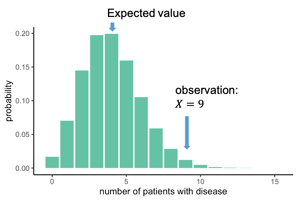
It gives us the probabilities of seeing \(X\) cases out of 100 with the disease, given that each individual has a probability of 4% of having this disease. This distribution peaks at 4 out of a 100, which makes sense: You expect to see around 4 out of a 100 when the probability is 4%. We, on the other hand, observed 9 out of a 100. Now we can ask: How likely is it to see an event at least as extreme as 9 out of 100, assuming the null hypothesis, and thus the distribution above, is true. In this case, the probability of observing 9 or more persons with the disease is 0.019, this is rather unlikely, and we will conclude that the null hypothesis is likely false.
Decision: Do we reject the null hypothesis?
At what probability should you decide to reject the null hypothesis? This choice is rather arbitrary. It depends on how sure you want to be that there is really something to see in the data set. A wide-spread convention is to call the result significant if the probability under the null hypothesis is smaller than 5%. We say that you choose a significance level alpha of \(\alpha=5 \%\). In our example, with a significance level of 5%, all observations above 8 out of 100, shown in red, would be called significant.
Recap
Here is what we have just seen:
- In a test group of persons with a precondition, 9
out of 100 have the disease of interest.
- We compare to a known prevalence of 4%, that means
4% of the entire population have the disease, when not distinguishing
between persons with and without the precondition.
- We want to know whether the observed 9 out of 100 are significantly different from 4%. The null hypothesis thus is that they are not.
- The alternative hypothesis is that the prevalence
in the test group differs from 4%.
- As we have 100 cases and a binary outcome (disease or no disease), a suitable null model is a binomial distribution with \(n=100\) and success probability \(p=0.04\).
Binomial test in R
R is very convenient for calculating probabilities under different distributions, and also has functions for the common statistical tests.
As a reminder, functions in R that calculate numbers for the binomial
distribution all end with binom, and the prefix specifies
what to calculate:
- dbinom: density
- pbinom: cumulative distribution function (percentage of
values smaller than)
For example, you can calculate the probability of observing 5 persons out of 100 with a disease, given a prevalence of 4%:
R
n = 100 # number of test persons
p = 0.04 # given prevalence
dbinom(x=5, size=n, prob=p)
OUTPUT
[1] 0.1595108Challenge: Binomial test
Can you perform the test demonstrated above, using
pbinom? For this, you need to calculate the probability of observing 9 or more persons with a disease out of 100, given a “null prevalence” of 4%.Look up
binom.test. This function performs a binomial test – which is what you have just done manually by calculating a binomial probability under a null hypothesis. Use this function to perform the test. Do you get the same result as withpbinom?
You can look up the function as follows:
R
help(binom.test)
- Calculate the probability as follows:
R
pbinom(q=8, size=100, prob=0.04, lower.tail=FALSE)
OUTPUT
[1] 0.01899192Note: We use q=8, because if
lower.tail=FALSE, the probability \(P(X>x)\) is calculated. Check
help(pbinom) for this.
- Using
binom.test:
R
binom.test(9,100,p=0.04)
OUTPUT
	Exact binomial test

data:  9 and 100
number of successes = 9, number of trials = 100, p-value = 0.01899
alternative hypothesis: true probability of success is not equal to 0.04
95 percent confidence interval:
 0.0419836 0.1639823
sample estimates:
probability of success
                  0.09
Discussion
Before we continue to the next episode, I have to tell you that something is very wrong (conceptionally) with the test we just performed.

… and think about what the initial alternative hypothesis was, and whether this is in line with what we calculated.
(Image: Wikimedia)
Content from One-sided vs. two-sided tests, and data snooping
Last updated on 2024-03-12 | Edit this page
Estimated time: 10 minutes
Overview
Questions
- Why is it important to define the hypothesis before running the test?
- What is the difference between one-sided and two-sided tests?
Objectives
- Explain the difference between one-sided and two-sided tests
- Raise awareness of data snooping / HARKing
- Introduce further arguments in the
binom.testfunction
A one-sided test
What you’ve seen in the last episode was a one-sided test, which means we looked at only at one side of the distribution. In this example, we observed 9 out of 100 persons with disease, then we asked: What is the probability under the null, to observe at least 9 persons with that disease. And we rejected all the outcomes where this probability was lower than 5%. The alternative hypothesis that we then take on is that the prevalence is larger than 4%. But we could just as well have looked in the other direction and have asked: What is the probability of seeing at most the observed number of diseased under the null, and then in case of rejecting the null, we’d have accept the alternative hypothesis that the prevalence is below 4%.
Let me remind you how we initially phrased the research question and the alternative hypothesis: We wanted to test whether the prevalence is different from 4%. Well, different can be smaller or larger. So, to be fair, this is what we should actually do:
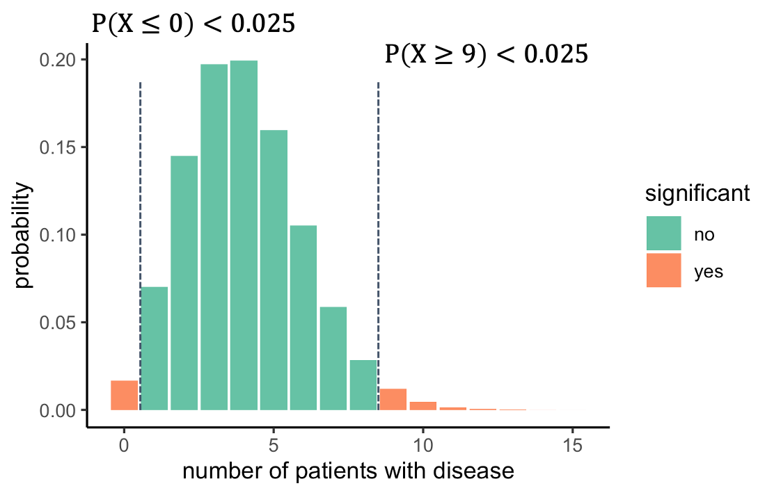 We should look on both sides of the distribution and ask
what outcomes are unlikely. For this, we split the 5% significance to
2.5% on each side. That way, we will reject everything below 1, or above
8. The alternative hypothesis is now that the prevalence is different
from 4%.
We should look on both sides of the distribution and ask
what outcomes are unlikely. For this, we split the 5% significance to
2.5% on each side. That way, we will reject everything below 1, or above
8. The alternative hypothesis is now that the prevalence is different
from 4%.
But what exactly was wrong with a one-sided test? An observation of 9 is clearly higher than the expected 4, so no need to test on the other side, right? Unfortunately: no.
Excursion: Data snooping / HARKing
What we did is called HARKing, which stands for
“hypothesis after results known”, or, also data snooping.
The problem is, we decided on the direction to look at after having seen
at the data, and this messes with the significance level \(\alpha\). The 5% is just not true
anymore, because we spent all the 5% on one side, and we cheated by
looking into the data to decide which side we want to look at. But if
the null were true, then there would be a (roughly) 50:50 chance that
the test group gives you an outcome that is higher or lower than the
expected value. So we’d have to double the alpha, and in reality it
would be around 10%. This means, assuming the null was true, we actually
had an about 10% chance of falsely rejecting it.
Side note
Above it says that there is a ~50% chance of the observation being below 4, and that a one-sided test after looking into the data had a significance level of ~0.1. The numbers are approximate, because a binomial distribution has discrete numbers. This means that
- there’s not actually an outcome where the probability of seeing an
outcome as high as this or higher is exactly 5%.
- it’s actually more likely to see an outcome below 4 (\(p=0.43\)), than seeing an outcome above (\(p=0.37\)). The numbers don’t add up to 1, because there is also the option of observing exactly 4 (\(p=0.2\)).
One-sided and two-sided tests in R
Many tests in R have the argument alternative, which
allows you to choose the alternative hypothesis to be
two.sided, greater, or less. If
you don’t specify this argument, it defaults to two.sided.
So it turns out, in the exercise above, you did the right thing
with:
R
binom.test(9,100,p=0.04)
OUTPUT
	Exact binomial test

data:  9 and 100
number of successes = 9, number of trials = 100, p-value = 0.01899
alternative hypothesis: true probability of success is not equal to 0.04
95 percent confidence interval:
 0.0419836 0.1639823
sample estimates:
probability of success
                  0.09
A one-sided test would be:
R
binom.test(9,100, p=0.04, alternative="greater")
OUTPUT
	Exact binomial test

data:  9 and 100
number of successes = 9, number of trials = 100, p-value = 0.01899
alternative hypothesis: true probability of success is greater than 0.04
95 percent confidence interval:
 0.04775664 1.00000000
sample estimates:
probability of success
                  0.09
It’s a little bit confusing that both tests give a similar p-value here, which is again due to the distribution’s discreteness. Using different numbers will show how the p-value for the same observation is lower if you choose a one-sided test:
R
binom.test(27, 100, p=0.2)$p.value
OUTPUT
[1] 0.102745R
binom.test(27, 100, p=0.2, alternative="greater")$p.value
OUTPUT
[1] 0.05583272Challenge: one-sided test
In which of these cases would a one-sided test be OK?
- The trial was conducted to find out whether the disease prevalence
is increased due to the precondition. In case of a significant outcome,
persons with the preconditions would be monitored more carefully by
their doctors.
- You want to find out whether new-born children already resemble their father. Study participants look at a photo of a baby, and two photos of adult men, one of which is the father. They have to guess which of them. The hypothesis is that new-borns resemble their fathers and the father is thus guessed >50% of the cases. There is no reason to believe that children resemble their fathers less than they resemble randomly chosen men.
- When looking at the data (only 1 out of 100), it becomes clear that the prevalence is certainly not increased by the precondition. It might even decrease the risk. We thus test for that.
In the first and second scenario, one-sided tests could be used. There are different opinions to how sparsely they should be used. For example, Whitlock and Schluter gave the second scenario as a potential use-case. They believe that a one-sided test should only be used if “the null hypothesis are inconceivable for any reason other than chance”. They would likely argue against using a one-sided test in the first scenario, because what if the disease prevalence is decreased due to the precondition? Wouldn’t we find this interesting as well?
Content from Errors in hypothesis testing
Last updated on 2024-03-12 | Edit this page
Estimated time: 3 minutes
Overview
Questions
- What errors can occur in hypothesis testing?
Objectives
- List the possible errors in hypothesis testing and give the reasons why they occur.
We just learned about data snooping, or HARKing, which is one way of p-hacking, i.e. cheating to get significant results. Another example is method hacking, where you try different methods until one of them gives a significant result.
You might have heard people say that p-hacking (or other things) increase type I error. Here’s what this means:
If you perform a test and either reject the null hypothesis or not, there are four possible outcomes:
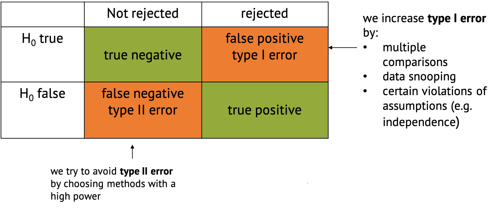
- The favorable classifications are true negative,
where you correctly don’t reject the null, and true
positive, where you correctly reject it and decide that there
is something interesting to see in your data.
- There are also two ways in which the classification can go wrong.
One is said false positive, also called type I
error, where the null is incorrectly rejected. This just
happens by chance in a certain percentage of cases. For example, per
definition it happens in 5% of the cases when you choose a significance
level of \(\alpha=0.05\). But there are
other things that can increase the chances for false positives,
including p-hacking, multiple comparisons (which is part of the next
tutorial), or certain violations of the assumptions
(e.g. independence).
- False negative classification or type II error describes the case when the null hypothesis isn’t rejected even though something interesting is happening. This is likely to happen if we have too little data, or use methods that are not powerful enough to detect what we’re looking for. We try to avoid type II error by choosing methods with a high power.
Content from One-sample t-test
Last updated on 2024-03-12 | Edit this page
Estimated time: 22 minutes
Overview
Questions
- What is a one-sample t-test?
- Why is \(t\) a useful test statistic?
Objectives
- Give an example for the one-sample t-test.
- Explain null and alternative hypothesis, and why we use test statistics.
- Explain that \(t\) weighs sample size and effect size against variance.
Let’s get back to the mice example we saw in the beginning. We’ll first simplify the example a bit: Let’s suppose you measure the weight of a couple of mice that have been fed with high-fat diet (black dots). We now want to know whether the mice weights in the test group differ significantly from a known average mouse weight (blue line).
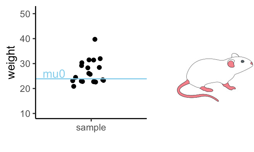
In the graph above you see one sample of 20 mice weights, from mice that had special diet, which average to \(\bar{x}=26.6\,g\). We will compare their weights to a known average mouse weight \(mu_0=23.9\,g\). That means, we compare a sample mean to \(mu_0\).
Road map for the next three episodes
In this example, I will explain a t-test, one of the most commonly used tests. It is used for comparing two groups, or for comparing one group’s average to a known average. I use the example to demonstrate the steps of performing a test that are valid for every test:
- Set up the null hypothesis (and the alternative). In this case, that
the mice in the test group (black dots) weigh on average the same as the
known average weight (blue line).
- Come up with a test statistic, that is, a number
that summarizes the data points in a useful way. In the t-test, this
statistic is called \(t\).
- Calculate value for the statistic (\(t\)) for the given data.
- Calculate how likely it is to observe this value by chance, if the
null hypothesis is true. For the t-test, this means calculating the
probability of \(t\) under the
t-distribution. I will give you two explanations for why the
t-distribution is a useful distribution for this example.
- The calculated probability is the p-value, from which we can decide whether or not to reject the null hypothesis.
Null and alternative hypothesis
Null hypothesis: Mice fed with special diet are no
different from other mice, and the observed difference between sample
mean and mu0 was just by chance.
Alternative hypothesis: The diet makes a difference,
and the sampled mice come from a population where the average weight
differs from \(mu_0\).
The t-statistic
In the previous example, we had measured one number, namely 9 persons with disease, of which we could calculate the probability under the null. This is not the case here: Here we have 20 numbers. Therefore, we have to help ourselves by summarizing these 20 numbers into something meaningful.
Here’s what we calculate:
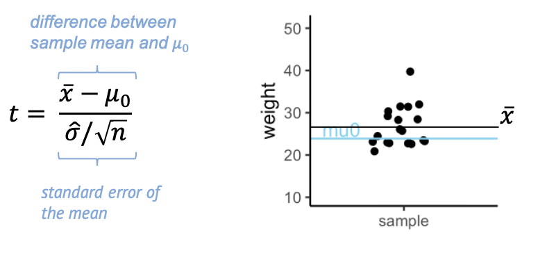
The t- statistic is one value made out of the 20 values in the sample – a scaled sample mean. In the numerator, we have the difference between \(\bar{x}\), the sample mean, and \(\mu_0\). The denominator is the standard error of the mean (SEM), which is the sample standard deviation over the square root of the sample size.
Why is this a useful summary of the data? Because \(t\) summarizes how much evidence we have against the null hypothesis. This means, \(t\) is close to 0 if there is little evidence, and it becomes large when we have a lot of evidence.
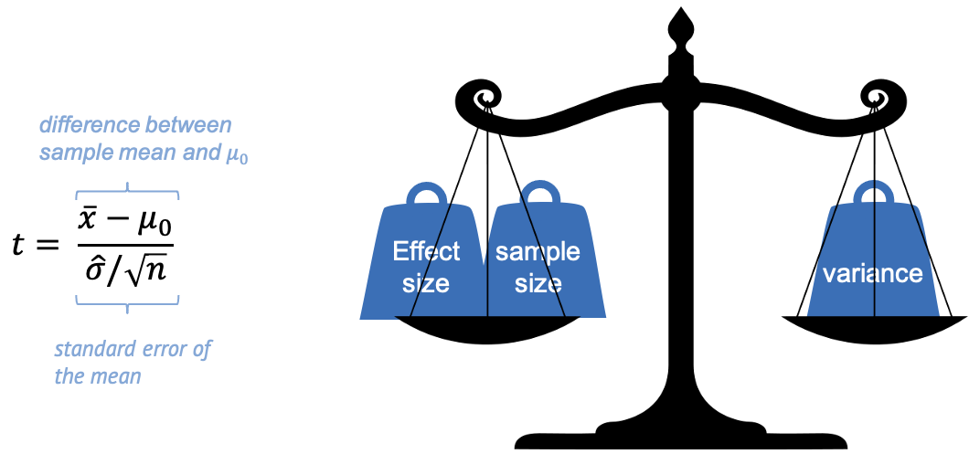
In other words, we can say that \(t\) weighs effect size and sample size against the variance.
Evidence for a true difference between the weight of high-fat diet mice and \(\mu_0\) increases (the absolute value of) \(t\):
-
\(\bar{x}-\mu_0\) is the observed
difference between sample mean and \(\mu_0\). If this difference is increased,
then \(t\) is increased also.
-
\(\hat{\sigma}\) is the sample
standard deviation (and in the denominator). If the sample has a high
variance, this decreases the evidence – and \(t\).
- \(n\) is the sample size. Increasing \(n\) also increases \(t\), since more data points mean more evidence.
Keep this picture in mind, because this weighing of effect size, sample size, and variance, is essentially what every test does, not only the t-test. It’s just the calculation, or the statistic used, that depends on the type of data.
Performing the t-test
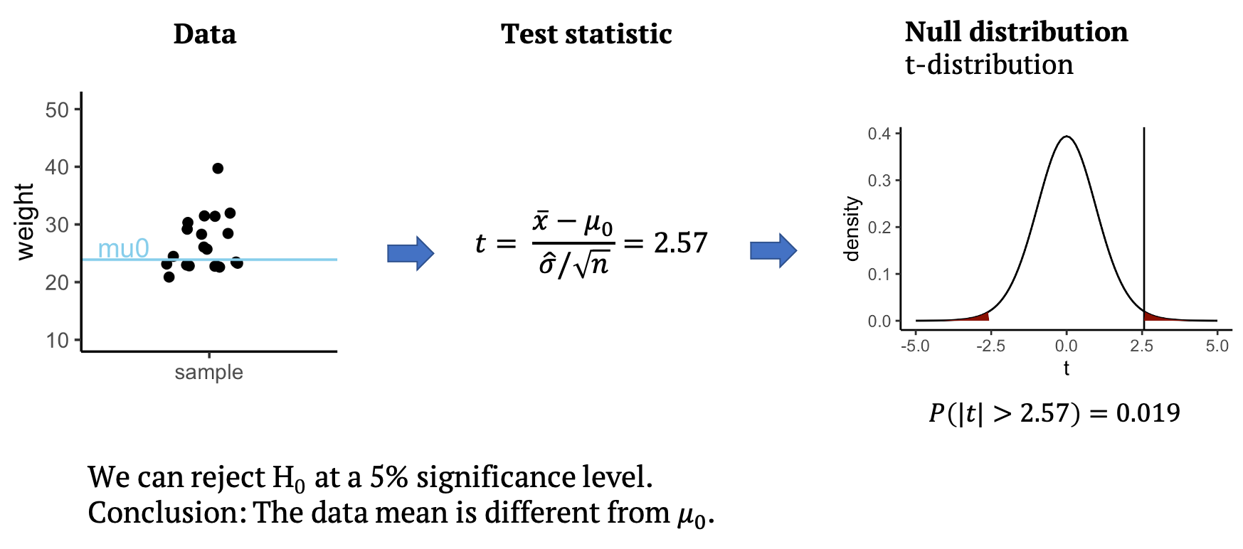
Back to our example: From the data, we can calculate the test statistic \(t\), which in this case is \(t=2.57\). All that’s left to do is to look up whether a value as large as \(2.57\) is surprising or not under the null distribution, which for the t-test is the t-distribution. The null distribution allows us to calculate how likely it is to observe a \(t\) with an absolute value as large or larger than \(2.57\), assuming that the data mean is \(mu_0=23.9\). This probability under the null is \(p=0.019\) for the given data. This means we can reject the null at a 5% significance level. We conclude that the data mean is different from \(mu_0\), and that the mice on the special diet have a different weight from the known average. In the next section, you will learn what the t-distribution is and why it is a good distribution for \(t\).
Calculate t
Do the first step of your own t-test! Below, the values I used for
the above graph are summarized in the weights vector.
R
weights <- c(31.41, 28.29, 22.82, 26.07, 31.97, 22.60, 31.47, 29.18, 22.98, 23.26, 23.48, 20.88, 28.44, 30.34, 23.14, 22.80, 24.47, 39.73, 25.71, 22.74)
mu0 <- 23.89338
- Calculate \(t\)
- Add an outlier with a weight of \(50\) to the
weightsvector. How does this affect \(t\)?
- Calculate t:
R
tstat <- (mean(weights) - mu0) *sqrt(length(weights)) / sd(weights)
tstat
OUTPUT
[1] 2.567434- Add an outlier
R
weights <- c(weights,50)
tstat <- (mean(weights) - mu0) *sqrt(length(weights)) / sd(weights)
tstat
OUTPUT
[1] 2.545858Content from The distribution of t according to the Central Limit Theorem
Last updated on 2024-03-12 | Edit this page
Estimated time: 7 minutes
Overview
Questions
- What is the central limit theorem?
- What does it predict for the distribution of \(t\)?
Objectives
- Introduce the Central limit theorem.
- Explain that it gives a theoretical distribution for \(t\).
Calculate a p-value using the central limit theorem
Let me sum up what we know now:
- We have a sample of mice weights and a weight \(\mu_0\) that we compare these weights to.
We want to know whether the average weight differs from \(\mu_0\).
- We calculated \(t\) for this
specific sample. \(t\) is a scaled
difference between sample mean and \(\mu_0\). In case the sample mean is the
same as \(\mu_0\), \(t\) should be close to zero.
- Moreover, the central limit theorem tells us that, if high fat diet mice in general don’t differ from \(\mu_0\) in their weight, we can expect \(t\) to come from a standard normal distribution.
This means, that if we sample again and again (i.e. the experiment
where 20 mice were fed with special diet and weighed, and a \(t\) was calculated), we should measure a
different \(t\) each time, and plotting
the a histogram or density of \(t\)s
will give a Gaussian bell shape.
This is enough knowledge to calculate a p-value. You can do this :)
The distribution of t
We start with the mouse weights and the resulting \(t\) from the last section.
What is the probability of observing a \(t\) with value at least as high as that seen here in a standard normal distribution (normal distribution with mean 0 and standard deviation of 1)?
Remember that in this scenario the question is not whether the weight is “higher than”, but “different from” \(\mu_0\). How do you have to adapt the above calculation to make this a two-sided test?
R
weights <- c(31.41, 28.29, 22.82, 26.07, 31.97, 22.60, 31.47, 29.18, 22.98, 23.26, 23.48, 20.88, 28.44, 30.34, 23.14, 22.80, 24.47, 39.73, 25.71, 22.74)
mu0 <- 23.89338
tstat <- (mean(weights) - mu0) *sqrt(length(weights)) / sd(weights)
pnorm(tstat, mean=0, sd=1,lower.tail=FALSE)
OUTPUT
[1] 0.005122719- Just multiply by 2: that gives the probability to get something larger than the observed t, or smaller than -t. Multiplying works, because the normal distribution is symmetric.
R
pnorm(tstat, mean=0, sd=1,lower.tail=FALSE)*2
OUTPUT
[1] 0.01024544
Content from The distribution of t in practice
Last updated on 2024-03-12 | Edit this page
Estimated time: 12 minutes
Overview
Questions
- Is the t-statistic normally distributed?
- What is the t-distribution?
Objectives
- Introduce the t-distribution and why it’s useful for small samples.
The big question is: Is the central limit theorem valid for this example? After all, it says something like “if we have enough data points”… do we have enough data points?
The following code snipped will read a file with mice weights from a
URL, and apply some transformations on it. If you run this, you will
have a vector called population with 841 mice
measurements.
R
mice_pheno <- read_csv(file= url("https://raw.githubusercontent.com/genomicsclass/dagdata/master/inst/extdata/mice_pheno.csv"))
mice_pheno <- filter(mice_pheno, !is.na(Bodyweight))
population <- mice_pheno$Bodyweight
We will assume that those 841 measurements constitute the population
of mice.
We can calculate the the population average and use it as \(\mu_0\).
R
mu0 <- mean(population)
Now we draw a sample of 20 mice again and again, and calculate the statistic \(t\) each time. This way, we have a scenario where the null hypothesis is true (the population average doesn’t differ from \(\mu_0\)) and we can check how \(t\) behaves.
R
# set a seed for reproducibility
set.seed(21)

# choose sample size
N <- 20

# initialize vector for a loop,
# we will sample 10000 times
null_t <- rep(NA, 10000)

for(i in seq_along(null_t)){ # loop for sampling 10000 times
  null_sample <- sample(population, N) # draw a sample from the population
  se <- sqrt(var(null_sample)/N) # calculate the standard error
  null_t[i] <- (mean(null_sample)-mu0) / se # calculate t
}
- The histogram is not very suspicious.
R
data.frame(t = null_t) %>%
  ggplot(aes(x=t)) +
  geom_histogram()
OUTPUT
`stat_bin()` using `bins = 30`. Pick better value with `binwidth`.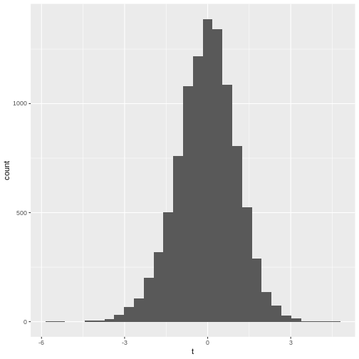
- The qq-plot
R
data.frame(t = null_t) %>%
  ggplot(aes(sample=t))+
  stat_qq()+ stat_qq_line()
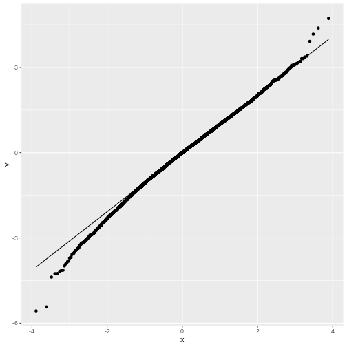
You may notice that in general, around 0 the distribution looks like
a normal distribution. But at low and high values (called: the tails)
the distribution of null_t doesn’t behave like a normal
distribution. This becomes more obvious in the QQ-plot, where the points
don’t match the line at the sides.
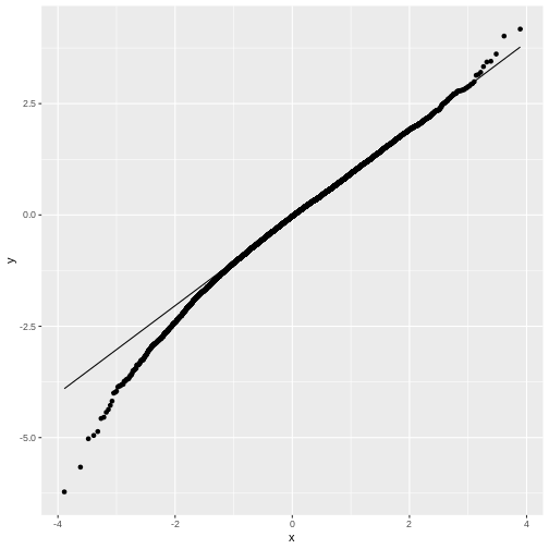
Feel free to play with the sample size N in the below
code chunk, to see how the distribution of \(t\) changes with the sample size:
R
# choose sample size
N <- 20

# initialize vector for a loop,
# we will sample 10000 times
null_t <- rep(NA, 10000)

for(i in seq_along(null_t)){ # this is the loop in which we sample
  null_sample <- sample(population, N) # draw a sample from the population
  se <- sqrt(var(null_sample)/N) # calculate the standard error
  null_t[i] <- (mean(null_sample)-mu0) / se # calculate t
}

data.frame(null_t) %>%
  ggplot(aes(sample=null_t))+
  stat_qq()+ stat_qq_line()
The t-distribution
We have seen that for small sample sizes, the central limit theorem doesn’t hold, and the values of \(t\) that we calculate from the data, don’t follow a normal distribution.
The distribution of \(t\)s looks perfectly normal “in the middle”, but not at the tails: We say that the distribution has heavy tails, because \(t\) tends to take extreme values (extremely small or extremely large) more often than we would expect from a normal distribution.
The good news is, we can still run a test on small samples, by using the \(t\)-distribution as a null distribution for \(t\). This distribution looks like the normal distribution, but with heavy tails. It has one parameter, \(\nu\), which specifies the degrees of freedom. Without going into detail, \(\nu\) is closely connected to the number of data points (for a one-sample t-test, \(\nu=N-1\)). In the figure below, you see how the t-distribution changes with the sample size:

For large samples, i.e. high values of \(\nu\), the heavy tails vanish and the t-distribution becomes more and more similar to a normal distribution, which is exactly what the central limit theorem tells us.
Summary: We can use the t-distribution as a null distribution for \(t\), without worrying about the sample size.
T-test in R
For our example, you already calculated \(t=2.57\) from the data for the mice on diet, and the probability of \(t\) under the standard normal distribution. As a reminder:
R
t_stat <- 2.567434
(1-pnorm(t_stat, mean=0, sd=1))*2
OUTPUT
[1] 0.01024543- Get a p-value by calculating the probability of \(t\) under the t-distribution. You will need to specify the degrees of freedom, which is \(N-1\) for a one-sample t-test.
R
t_stat <- 2.567434 # this is the value for t
N <- 20 # the sample had 20 data points
- Try the function
t.testto calculate the p-value:
R
weights <- c(31.41, 28.29, 22.82, 26.07, 31.97, 22.60, 31.47, 29.18, 22.98, 23.26, 23.48, 20.88, 28.44, 30.34, 23.14, 22.80, 24.47, 39.73, 25.71, 22.74)
mu0 <- 23.89338
- Calculating the p-value using the t-distribution:
R
t_stat <- 2.567434
N <- 20
(1-pt(t_stat,df=N-1))*2
- Using
t.test
R
weights <- c(31.41, 28.29, 22.82, 26.07, 31.97, 22.60, 31.47, 29.18, 22.98, 23.26, 23.48, 20.88, 28.44, 30.34, 23.14, 22.80, 24.47, 39.73, 25.71, 22.74)
mu0 <- 23.89338

t.test(weights, mu = mu0)
The latter two outcomes should match (except for rounding errors). The first result should be similar to the other two.
Content from The two-sample and paired t-test
Last updated on 2024-03-12 | Edit this page
Estimated time: 12 minutes
Overview
Questions
- How is the one-sample t-test extended to two samples?
- What is pairing?
- What is pairing good for?
Objectives
- Introduce two-sample and paired t-test.
- Introduce the concept of statistical power.
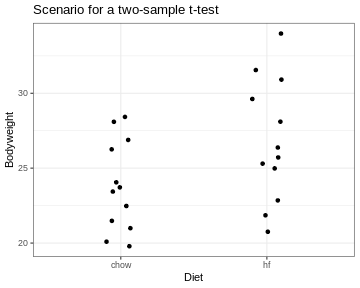
The two-sample t-test
So far, I explained the t-test using one sample that was compared to a known number. More commonly, two samples are compared. For example, in the scenario I depicted at the beginning of this tutorial, the sample of mice on high fat diet were compared to a group of mice fed with a control diet.
The approach for testing stays the same. We still summarize the data into a statistic called \(t\) and then calculate its probability under the null hypothesis.
The only thing that changes is the formula for \(t\). For two samples, it’s
\[t= \frac{\bar{x}-\bar{y}}{SE}\] with
\[SE=
\sqrt{\frac{\hat{\sigma}_x^2+\hat{\sigma}_y^2}{n}}.\]
for equal variances and sample size. If \(H_0\) is correct, \(t\) follows a t-distribution with \(n_x+n_y-2\) degrees of freedom.
This means \(t\) still compares effect size, sample size and variance. The effect size is now the difference between the two sample means.
The formula gets more complicated when the assumptions of equal variances and sample sizes don’t hold, which is often the case. But the good news is: You don’t have to remember any of these formulae, nor the parameters of the null distribution. Any statistics program will do this for you. The important thing is that you know how to interpret the results.
By the way, for the two samples comparing the diets, we get \(t=-2.05\) and a p-value of \(p=0.053\). For this sample, we can’t reject the null hypothesis at a 5% significance level. Fortunately, the data for this example was only a small subset of the original data set. The researchers who performed the experiment had enough data points (and thus evidence) to clearly demonstrate that the high-fat diet leads to heaver mice.
Pairing data
Let’s assume the experiment had looked a little different: Let’s say there is only one group of mice, and each mouse in that group was measured, then fed with special diet for a month, and then measured again. For each mouse we have now two data points. This is visualized below:

We see a trend that after one month, the mice might be a bit heavier. The difference in means is \(2.06\,g\), but due to the high variance, a non-paired two-sample t-test is not significant (\(p=0.31\)).
R
t.test(Bodyweight ~ Time, data=paired_mice, paired=FALSE)
OUTPUT
	Welch Two Sample t-test

data:  Bodyweight by Time
t = -1.037, df = 27.899, p-value = 0.3086
alternative hypothesis: true difference in means between group before and group after is not equal to 0
95 percent confidence interval:
 -6.148611  2.015965
sample estimates:
mean in group before  mean in group after
            24.64443             26.71076
However, this test completely neglects the information of which two data points come from the same mouse. Therefore, let’s consider another plot, where each two data points that belong to the same mouse are connected with a line. We say that these data points are paired by the mouse identity.
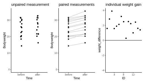
Now it seems clear that each mouse gained a small amount of weight, something that has been obscured before by the high variance of the individual mice weights. In fact, we can also plot the individual weight differences only (right plot) to make the point that every single mouse has gained a small amount of weight.
The paired t-test is based on the individual difference between paired data points. It has the null hypothesis that these differences are zero. This brings the scenario down to a one-sample t-test: We look at the individual weight differences and test whether they are different from zero. The estimated effect size, namely the weight difference, stays the same. But the p-value drops dramatically, as you can see in the below code:
R
t.test(Bodyweight ~ Time, data=paired_mice, paired=TRUE)
OUTPUT
	Paired t-test

data:  Bodyweight by Time
t = -8.9263, df = 14, p-value = 3.742e-07
alternative hypothesis: true mean difference is not equal to 0
95 percent confidence interval:
 -2.562816 -1.569830
sample estimates:
mean difference
      -2.066323
Pairing increases power
Therefore we say that the paired t-test has an increased power compared to the unpaired two-sample t-test. Power describes the chance of detecting an effect with your test, if this effect exists. In this example, there is an effect (I can assure you, because I simulated the data). And the paired test detected it, while the unpaired didn’t. The reason is simple: There are two sources of randomness in the data:
- The individual responses to the treatment and
- mice have different weights to start with.
In the paired design, we can control for the latter of these sources of noise.
Diving seals
(This exercise is from Whitlock and Schluter (2015).)
Weddell Seals take long, exhausting dives to feed on fish. Researchers wanted to test whether the seals’ exhaustion comes from diving alone, or whether feeding itself is also energetically expensive. They compared the oxygen consumption (\(ml\,O_2/kg\)) of feeding and non-feeding dives that lasted the same amount of time, in the same individual.
The measurements of 10 individuals are summarized in the
oxygen_data data frame as follows:
R
oxygen_data <- data.frame(
  type = c(rep("non-feeding",10),rep("feeding",10)),
  individual = as.character(c(1:10,1:10)),
  consumption = c(42.2,51.7,59.8,66.5,81.9,82.0,81.3,81.3,96.0,104.1,
                  71.0,77.3,82.6,96.1,106.6,112.8,121.2,126.4,127.5,143.1)
)
Copy the above lines of code and consider the
oxygen_data. Can you plot the data to compare the oxygen consumption in a feeding and non-feeding dive?Perform a paired t-test that compares feeding and non-feeding dives. You can either combine
filterandpullto extract two vectors from the data frame, or use thet.testin conjunction with a formula.
- plotting the data
R
oxygen_data %>%
  ggplot(aes(x=type, y=consumption)) +
  geom_point() +
  geom_line(aes(group=individual))
- paired t-test
R
# extract two vectors and perform the test
feeding <- oxygen_data %>%
  filter(type=="feeding") %>%
  pull(consumption)
nonfeeding <- oxygen_data %>%
  filter(type=="non-feeding") %>%
  pull(consumption)

t.test(feeding,nonfeeding,
       paired=TRUE)
# OR
t.test(consumption~type, data=oxygen_data, paired=TRUE)
Content from Interpreting p-values
Last updated on 2024-03-12 | Edit this page
Estimated time: 6 minutes
Overview
Questions
- What are common mistakes when interpreting p-values?
Objectives
- Emphasize the importance of effect size to go along with p-values
- Point out common mistakes when interpreting p-values and how to avoid them
Have a look at this plot:
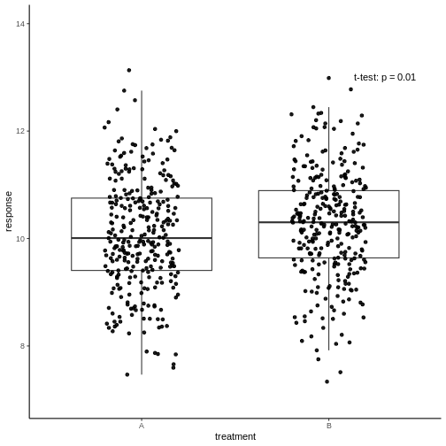
The responses in two treatment groups A and B were compared to decide whether the new treatment B has a different effect than the well-known treatment A. All measurements are shown, and a p-value of an unpaired two-sample t-test was reported.
Have a coffee and think about what you conclude about the new treatment…
So, if you were in pharmaceutical business: Would you decide to
continue research on treatment B? It evokes a higher (presume: better)
response than A, and will therefore sell better. The difference is
clearly significant. Right…?
Yes, right. But how much better is the response in B? The average
difference in response is \(0.2\),
which is only 2%. To distract from that, the y-axis of the above graph
starts at 7 – while to be honest with the viewer, it should start at
zero. Remember that a p-value can be small due to a large effect size,
low variance, or large sample size. In this case, it’s the latter. A
huge number of data points will make even the smallest difference
statistically significant. It is questionable whether an improvement of
2% is biologically relevant, and make drug B the new bestseller.
The lesson to be learned here is therefore, that statistically
significant is not the same as biologically relevant, and
reporting, or relying on a p-value alone will not give the full picture.
You should always report the effect size as well, and ideally also show
the data.
Note: In other fields, 2% can, of course, be a highly relevant difference.
Other fallacies to be aware of
- The p-value is the probability that the observed data could happen,
under the condition that the null hypothesis is true. It is not
the probability that the null hypothesis is true.
- Keep in mind that absence of evidence is not evidence of
absence. If you didn’t see a significant effect, it doesn’t
mean that there is no effect. It could also be that your data simply
doesn’t hold enough evidence to demonstrate it – i.e. you have too
little data points for the given variance and effect size.
- Significance levels are arbitrary. It therefore makes no sense to interpret a p-value of \(p=0.049\) much different from \(p=0.051\). They are both suggesting that there is likely something to see in your data that is worth following up, and none of them should terminally convince us that the alternative hypothesis is true.
Content from Summary and practical aspects
Last updated on 2024-03-12 | Edit this page
Estimated time: 3 minutes
I hope this tutorial allowed you to notice a pattern in the tests you have seen.

The “cook book” for a test goes as follows:
Set up a hypothesis \(H_0\) that you want to reject.
Find a test statistic that should be sensitive to deviations from \(H_0\).
Find the null distribution of the test statistic – the distribution that it follows under the null hypothesis.
Compute the actual value of the test statistic.
Compute the p–value: The probability of seeing a value as least as extreme as the computed value in the null distribution.
Decide (based on significance level) whether to reject the null hypothesis.
Cook book in practice
In practice, you usually don’t have to perform steps 2-6 on your own – standard procedures, i.e. statistical tests, exist for most kind of data, and the computer does the calculation for you. So… what is left for you to do?

Look at your data!
Decide on a distribution that your data follow.
Possibly transform your data to match a suitable distribution (suitable means: a convenient test is available for this distribution).
Find a test that answers your question and is suitable for the distribution the properties of your data.
Perform the test and decide. Report the p-value and the effect size.
Content from References
Last updated on 2024-03-12 | Edit this page
Estimated time: 0 minutes
Books
- Whitlock, Michael, and Dolph Schluter. The analysis of biological data. Vol. 768. Roberts Publishers, 2015.
Data
The mice data originate from:
- Winzell, M. S., & Ahrén, B. (2004). The high-fat diet-fed mouse: A model for studying mechanisms and treatment of impaired glucose tolerance and type 2 diabetes. Diabetes, 53(SUPPL. 3).
Data are were downloaded here.
You may download them as follows:
R
mice_data <- read_csv(file= url("https://raw.githubusercontent.com/genomicsclass/dagdata/master/inst/extdata/mice_pheno.csv"))
Images
Coffee: By Julius Schorzman - Own work, CC BY-SA 2.0, https://commons.wikimedia.org/w/index.php?curid=107645
Cook book: adapted from https://www.kindpng.com/downpng/oJwTbo_book-clipart-square-blank-book-cover-clip-art/
Laptop: adapted from https://www.kindpng.com/downpng/TTJTJb_images-of-laptop-icon-vector-png-mockup-computer/
t-distribution: By Skbkekas - Own work, CC BY 3.0, https://commons.wikimedia.org/w/index.php?curid=9546828
fireworks: https://www.pngwing.com